Almost no one will ask you to show them more ads.
We know ads are a powerful advertising medium and great for generating leads and sales.
But your website users? A recent WARC report found that 53% of survey respondents felt that “too many ads” could actually damage a brand.
There is a delicate interplay between ads, websites, users, and behavior. Whether you notice it or not, everything from the color of a line in a background image to the corners of a buy button on an ad can subtly influence your opinions, intentions, and choices.
For example, research shows that adding a second ad spot can increase the click-through rates (CTRs) of a solo ad spot.
And if you’ve ever purchased via an ad on your favorite social network, you know that ads can be vital in a successful customer journey.
As a publisher whose business model is based on advertising, we tussle with one question that comes up perennially: What is the right balance between ads and content? What happens when our site has ‘too many ads’?
I teamed up with Vahan Petrosyan, Search Engine Journal’s Director of Technology to discover how our advertisements shape user preferences, content consumption patterns, reader journeys, and user behavior on our site.
The Problem: “Too Many Ads!”
Marketers rely on ads to drive traffic, awareness, leads, and conversions. Publishers rely on them for revenue. For users, ads can cause friction in the user experience if they are deemed too intrusive, or even hinder website performance.
The web relies on a social contract: the rule of reciprocity 14. Website users generally accept advertising as a pseudo-currency in exchange for free content.
However, this “…only works if the website’s offering is attractive, with high utility and quality” 14. In fact, marketers usually point to ad quality first when dealing with page abandonment issues, declines in traffic, or search rankings problems.
So, with this in mind, we felt that we needed to answer two questions:
- Which types of ads do users prefer? High-quality ads relevant to the content? And/or ads reflecting their previous online behavior?
- What is the ideal balance of ads to content, where ad revenue is optimized while preserving our visitor’s experience?
Experiment 1: Which Ads Do Users Prefer?
While SEJ’s in-house ads align with the content we deliver and suit our audience of career marketers, programmatic ads offer something our in-house ads do not: thanks to targeting technology, programmatic ads align with a user’s browsing habits and their topical interests beyond SEO and marketing.
But are programmatic ads the best option? Do users get annoyed by seeing personalized ads while they’re in “work mode?”
We hypothesized that:
- When only SEJ brand ads were visible, user engagement would be higher: they would spend more time reading, scroll farther through the content, and read more pages.
- When only programmatic ads were visible, user engagement would be lower: they would spend less time reading, see less of the content, and read fewer pages.
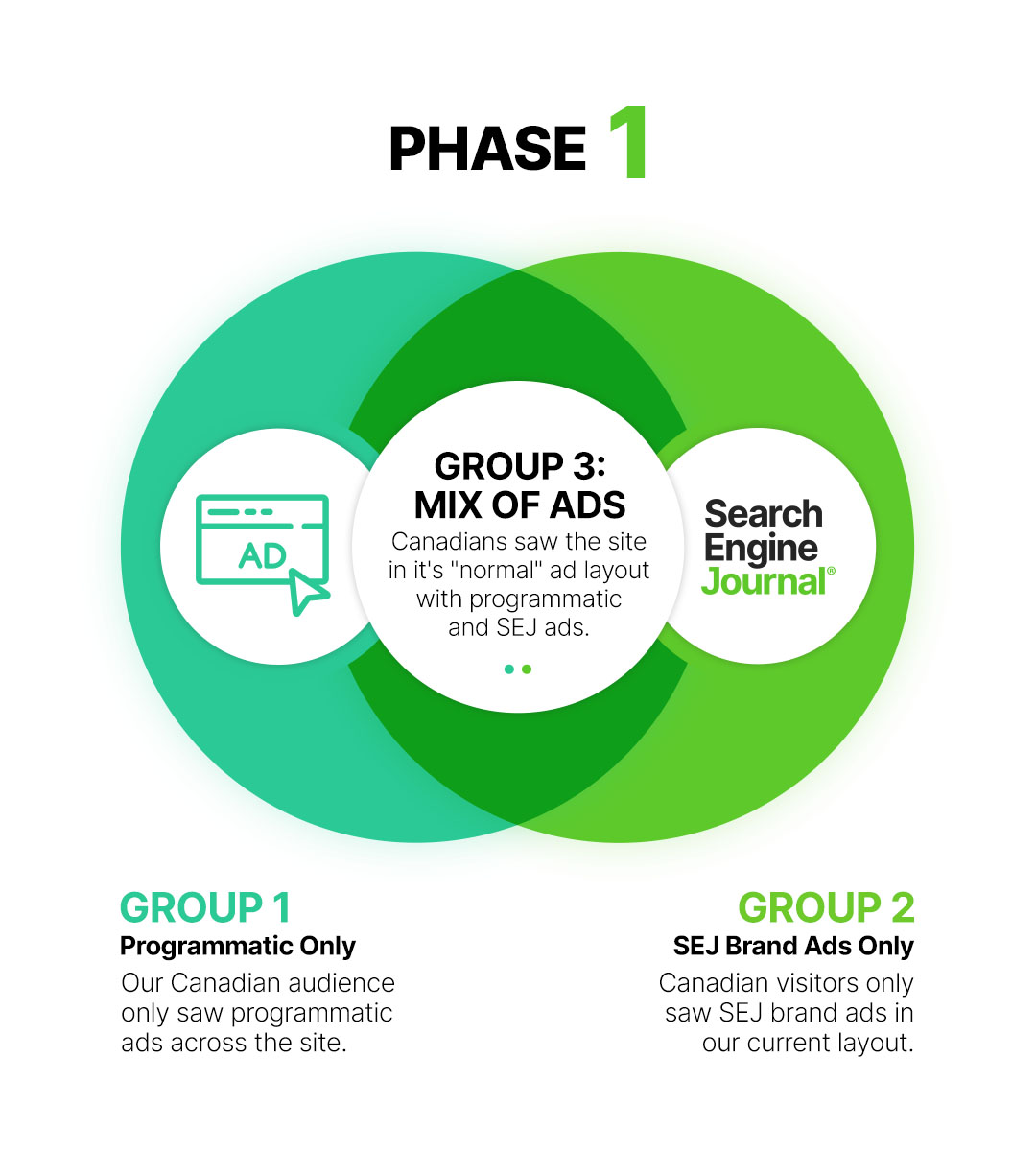
To test these assumptions, we randomly divided our Canadian audience into one of three groups:
Group 1: “Programmatic only” – Users only received programmatic ads when visiting our site in the same standard layout as before the experiment.
Group 2: “SEJ ads only” – Users only saw house ads made and managed by us. These included ads for our webinars and ebooks and were displayed in our usual layout.
Group 3: “Control group” – Users received both ad types in the same layout. In other words, they saw our site in its normal configuration.
If our hypothesis was right and users preferred SEJ brand ads over programmatic ads, users in the programmatic and control groups would view fewer pages, spend less time on the site, and spend less time reading.
Interestingly, that was not the result…
Experiment 1 Findings – Users Spent More Time On-Site When They Received A Mix Of Ads
When we compared the programmatic and SEJ-only conditions to our current layout (mix of ads), here’s what we found:
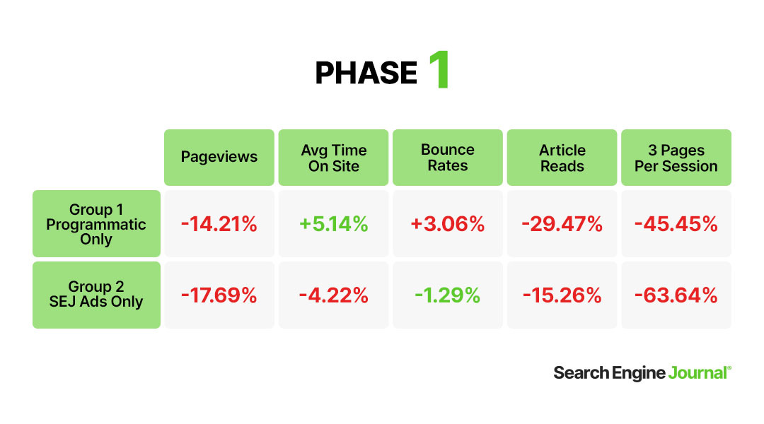
As you can see, serving only one ad type failed to have the expected results. Readers receiving only one type of ad spent far less time browsing SEJ and reading.
One possible explanation for the unexpected findings could be device type. However, when comparing mobile users in the 3 groups, we found that 52.71% fewer mobile users viewed 3 pages or more when visiting our site.
When only programmatic ads were delivered to users, this metric fell further, with 65.12% fewer mobile users viewing 3 pages or more. The type of content, browser used, and other variables all revealed similar results.
Regardless of the reason, it’s clear that users spend more time reading content on SEJ when they see a mix of ads.
Experiment 2: Do Users Prefer Fewer Ads?
Once we knew which ad types our readers preferred, it was time to find out what would happen if they saw fewer of them.
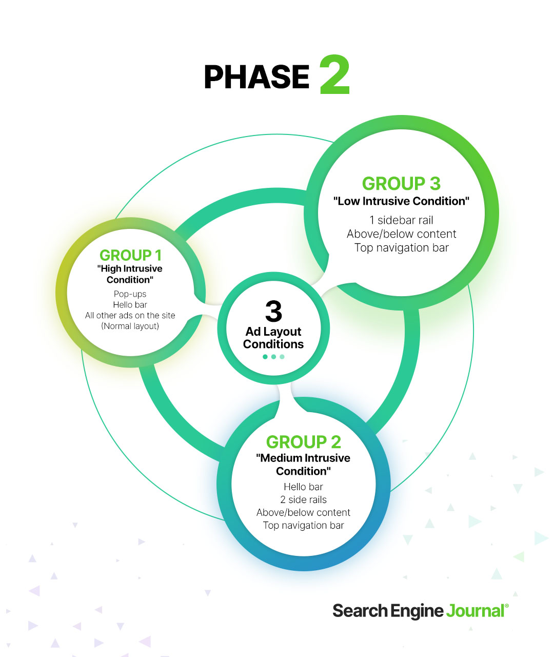
So, we returned our site to the original mixture of programmatic and SEJ-brand ads and set up a second experiment, dividing our Canadian audience into three groups:
Group 1: “High intrusive” condition – Acting as our control group, this group of Canadian traffic received our standard ad layout, including pop-ups that tell readers about upcoming webinars and new ebooks, the persistent footer bar across the bottom of the screen, and all the ads normally seen throughout our content.
Group 2: “Medium intrusive” condition – This ad layout condition removed only the most intrusive ads on the site. So, readers in this group would only see the footer bar, two rails on the right sidebar, above and below the content, and in the top navigation bar. Anything that may interfere with or interrupt the content, such as pop-ups, was removed.
Group 3: “Low intrusive” condition – Readers in this group saw only the bare minimum of ads delivered in the least intrusive way possible. Therefore, they only saw one rail of ads in the sidebar, above and below the content, and the top navigation bar ad.
Our hypothesis:
Fewer ads should increase pageviews, time on site, and the number of returning users. With less pesky ads in the way, readers should engage longer, more deeply, and come back for more.
Our hypothesis was wrong.
Experiment 2 Findings – User Engagement Increases with More Ads
We failed to see the hypothesized results when we compared our current ad layout (Group 1) to the other two conditions with fewer ads:
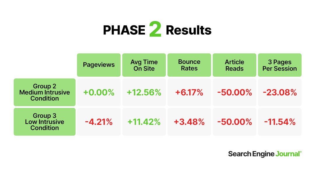
While the average time on-site improved when we reduced the number of ads, we can see that 50% fewer users read articles (calculated using time, scroll depth, and word count). The number of users reading 3 pages or more per session, decreased.
Also unexpected: with fewer ads, our bounce rate increased.
Lastly, our pageviews declined as the number of ads shown declined.
We were scratching our heads at this point.
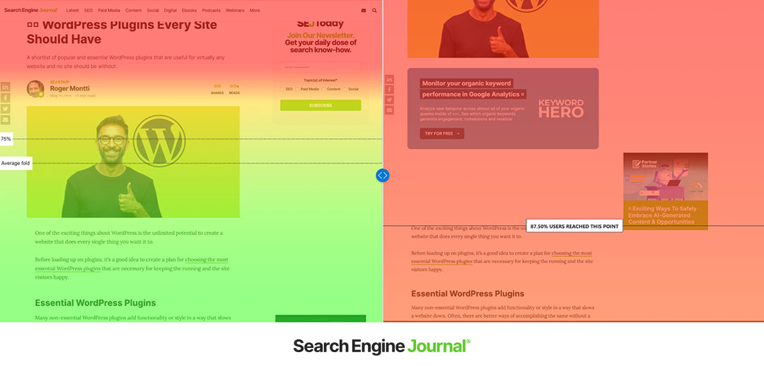
To verify our data, we used Microsoft Clarity. In the normal, “high intrusive” condition (on the right in the following screencap), we found that desktop users got significantly farther into the body of the content before abandoning the page. This is what we expected.
Users who view our site with ads would need to scroll further down the page, since ads push the content further below the fold.
However, our results revealed something very different when we compared results for high intrusive vs. low intrusive.
When there were fewer ads (low-intrusive condition on the left in the screen cap below), 74% of desktop users abandoned the page before reaching the content.
Hmmm. Maybe this is only the case with our desktop users. Mobile users would definitely respond to fewer ads… right?
Inexplicably, this isn’t what happened.
Mobile users who saw our standard ad layout got significantly farther into the content, clicked more, and read more than those who saw few ads.
And when we compared retention rates across time, there were no significant differences on desktop or mobile.
In other words, users were not more likely to return to our site when we reduced the number of ads.
Why Are Users Spending More Time Reading When There Are More Ads?
To be honest, we don’t know why users seem to prefer our site with more ads. We can’t be sure without more experiments, but we have a few theories…
Ad Competition
We tend to judge the attractiveness of something by comparing it to what it’s adjacent to, known as ‘the halo effect’. Some research has shown that when multiple ad types appear on the same site, one ad type can increase the attractiveness, clicks, and attention of the other type 16.
If the ads are highly targeted and users like the items advertised, the halo effect could carry over to other products and offerings on the site and improve the reader’s perception of our site.
Repetition
Studies have shown that repetition can help or hurt ads depending on how users view them. If you like an ad, you’ll view it as less intrusive and more positive the more you see it 7.
If you don’t like an ad, you’ll see it more negatively the more times you see it 5. Is it possible that, with fewer ads and, therefore, less variety in ads on a page, visitors saw the ads as more repetitive, increasing their negative opinions of them?
IKEA Effect
We value, are increasingly satisfied by, and are more loyal to things we actively work for or invest in. That’s why fraternities and sororities use hazing rituals, and IKEA makes you spend hours putting together its furniture 2, 3, 10.
Ads could work similarly.
In alignment with the IKEA effect, seeing ads on a site could be seen by users as “paying” to view the free content. However, SEJ-brand ads are self-promotional and don’t generate revenue simply by viewing them. This could partly explain why users seem to prefer programmatic ad layouts or a mix of ads.
Early research on this digital marketing theory found mixed results, suggesting there may be confounding variables. However, it was completed in the late 90s and early 2000s, and users (and the online world) have changed drastically since then.
Do we subconsciously identify and sort programmatic ads from other ad types? It’s certainly possible.
Reciprocity
The SEJ-brand-ads-only condition could have been “too much of a good thing.” As mentioned, behavioral scientists have theorized that websites and readers exchange content for ad views in a sort of unspoken social contract 8, 14.
When we only serve in-house ads, the ad views no longer act as a payment, violating the rule of reciprocity, which could make users less tolerant.
Again, is it possible? Absolutely, but it’s likely not the only factor.
Belonging
We all want to belong. In fact, the feeling of belonging is a significant factor for general well-being and life satisfaction 1.
How do you make site visitors feel like they belong in an online space? Research says three themes encourage this feeling in site users: interaction/engagement, a culture of learning, and support 11.
So, if the ads on a website match our previous online behaviors, blending our work and personal life together or simply reflecting our past, present, and future concerns, that feeling could reflect on the website as a whole and the brand 4, 17.
In other words, it looks familiar and like the site really knows us, making us feel like we belong there.
This theory also plays on something known as the endowment effect 9. We value something far more when it belongs to us than when it belongs to someone else. If we make readers feel like they “belong” on our site, could users feel like our site has a higher value and, therefore, justify seeing more ads?
Familiarity
Behavioral science has found that we’re happy and comfortable in familiar settings. But when something is off, we notice and pay more attention to the thing that doesn’t belong.
Here’s an example:
If you carry a briefcase into a bank, most people in the bank won’t pay attention. In fact, they may not even notice you. But these same bystanders will definitely notice if you carry a pink flamingo into the bank.
In fact, they’ll pay so much attention to the unusual object you’re carrying that they’ll struggle to recall details about your appearance later. This effect is heightened if we perceive the unusual item in a setting as a threat 6. (It’s called the weapon effect.)
What if our readers are so used to the site layout that it feels unfamiliar when we deliver fewer ads? If that is the case, they would notice the ads more, even if there are fewer of them, and perceive the ads as being more intrusive. Is ad tracking enough to be perceived as a ‘threat’? Maybe.
If this theory is at play, users may actually prefer the site with fewer ads, but only after they’ve had time to get used to the new look and feel of the site.
User Intent
Previous studies have found that intent influences how users view and interact with ads. While users are simply browsing, they will see and interact with more ads than when their behavior is goal-directed 13.
That’s why users will click ads while scrolling on their favorite social network than when they land on your site while researching hotels.
Since much of the behavior analyzed in this experiment was goal-directed (users clicked for the specific purpose of reading an article or finding answers to a question), it would make sense that they would pay less attention to ads and possibly not notice that there are fewer of them.
This theory fails to explain why the use of our site decreases as the number of ads decreases, but it could help explain why fewer ads failed to increase site usage.
Attention
Previous research found that when ads don’t match the content regarding topics or visual aesthetics, users spend less time looking at and reading the content 12, 15. There were various theories about why this might occur, but the simplest is how our brains might process web pages.
When ads fail to match the content or look out of place, our brains may process the ads (the context) and the content (the target of our attention) separately.
When the ads match, we process the entire page as a whole, making the ads look less like context and more like they were meant to be there. This cohesive view frees up cognitive resources, which our brains can dedicate to reading, reducing attention to the ads overall.
During our experiment, conversions in our Canadian test groups declined as ads declined, dropping to zero in some instances, which provides some support for this theory.
Conclusion
Our experiment provided evidence that fewer ads resulted in a decrease in engagement– the opposite of what we expected. And ads that match the user’s browsing history (programmatic) may actually improve engagement more than just house ads.
The important takeaway here is that it’s worth testing. Not all sites will see the same results, and not all audiences will behave similarly.
The biggest lesson to take away from this experiment? Just because everyone says a thing, doesn’t make it true.
Question everything and test it for yourself.
Methodological notes:
- While not as good as running an experiment site-wide, limiting our experiment to our Canadian audience allowed us to check our findings against our US readers, who would all be exposed to the same content, algorithm changes, social posts, ads, etc. It also helped control the financial costs, data size, and upheaval.
- Users were randomly assigned to a condition on each visit, allowing us to randomize groups to reduce bias.
- Findings were verified with subsequent testing and within-group analysis, which tracked users across sessions.
- Users running ad and script blocking may have been omitted from the dataset.
- Sample size: 100,000+.
Works Cited
- Baldwin, M., & Keefer, L. A. (2020). Being here and now: the benefits of belonging in space and time. Journal of Happiness Studies, 3069-3093.
- Belk, R. W. (1988). Possessions and the extended self. Journal of Consumer Research, 139-168.
- Furby, L. (1991). Understanding the psychology of possession and ownership: a personal memoir and an appraisal of our progress. Journal of Social Behavior and Personality, 457–463.
- Gravett, K., & Ajjawi, R. (2022). Belonging and situated practice. Studies in Higher Education, 1386-1396.
- Jankowski, J., Hamari, J., & Wątróbski, J. (2018). A gradual approach for maximising user conversion without compromising experience with high visual intensity website elements. Internet Research, 194-217.
- Mansour, J. K., Hamilton, C. M., & Gibson, M. T. (2019). Understanding the weapon focus effect: The role of threat, unusualness, exposure duration, and scene complexity. Applied Cognitive Psychology, 991-1007.
- McCoy, S., Everard, A., Galletta, D. F., & Moody, G. D. (2017). Here we go again! The impact of website ad repetition on recall, intrusiveness, attitudes, and site revisit intentions. Information & Management, 14-24.
- McDonald, A. M., & Cranor, L. (2009). An empirical study of how people perceive online behavioral advertising.
- Morewedge, C. K., & Giblin, C. E. (2015). Explanations of the endowment effect: an integrative review. Trends in Cognitive Sciences, 339-348.
- Norton, M. I., Mochon, D., & Ariely, D. (2012). The “IKEA Effect”: When labor leads to love. Journal of Consumer Psychology, 453-460.
- Peacock, S., Cowan, J., Irvine, L., & Williams, J. (2020). An exploration into the importance of a sense of belonging for online learners. The International Review of Research in Open and Distributed Learning, 18-35.
- Petty, R., & Cacioppo, J. (1986). The elaboration likelihood model of persuasion. Advances in Hydroscience, 124-205.
- Rutz, O. J., & Bucklin, R. E. (2012). Does banner advertising affect browsing for brands? Clickstream choice model says yes, for some. Quantitative Marketing and Economics, 10(2), 231–257. https://doi.org/10.1007/s11129-011-9114-3
- Schumann, J. H., von Wangenheim, F., & Groene, N. (2014). Targeted online advertising: using reciprocity appeals to increase acceptance among users of free web services. Journal of Marketing, 78(1), 59-75.
- Wojdynski, B. W., & Bang, H. (2016). Distraction effects of contextual advertising on online news processing: an eye-tracking study. Behaviour & Information Technology, 654-664.
- Yang, C., Li, L., & Yao, R. (2018). Research on spillover effect of paid search advertising channels. Wuhan International Conference on e-Business (pp. 476-483). Wuhan, China: Association for Information Systems Electronic Library (AISeL).
- Zhao, L., Lu, Y., Wang, B., Chau, P. Y., & Zhang, L. (2012). Cultivating the sense of belonging and motivating user participation in virtual communities: A social capital perspective. International Journal of Information Management, 574-588.
