Landing pages – they’re powerful, aren’t they?
When we click on an ad, it’s the landing page that helps us decide what to do next.
Ideally, it makes you do a double-take and proclaim, “I must have this!”
It can also fall flat and go viral for all the wrong reasons. (I’m looking at you Rainbow capitalism.)
The design of a good landing page is an intersection of art, marketing, and psychology.
And, if you’re reading this article, that means you’re looking for guidance and inspiration to improve your own landing pages.
That’s exactly what we’re going to do.
We are going to share the features of what makes an amazing landing page and break down five examples to learn from.
Features Of An Amazing Landing Page
The hard truth: Getting people to opt in is tricky.
Even when the tech is amazing and the product is innovative.
If you send visitors to a webpage that fails to communicate the value, all of your market research and product development efforts go right down the drain.
The good news is this article is all about helping you create amazing landing pages that encourage more conversions – and, ultimately, generate more customers.
Improve your success rate by weaving these six features into your landing page design.
Poppin’
Landing pages should be distraction-free in order to focus on the task at hand – getting the visitor to convert.
This means that top navigation can be ditched in favor of a sleek, one-page design. Just be sure to leave a clickable logo in case users want a way out but still want to interact with your brand.
Revealing the product with clear annotated product visuals, helps visitors picture themselves using it.
Most importantly, the page has to pop! An eye-catching hero image and visuals help to capture the visitor’s attention and convey what the offer is in a way our brains can process quicker.
Free Of Fluff
The copy on a landing page is one of the most important elements. It’s what convinces website visitors to convert.
Great landing page copy uses strong headlines, clear value propositions, and explains “why” they matter.
Content should focus on user benefits over product features and address any doubts so visitors don’t leave.
The copy should be focused and free of fluff; every word should serve a purpose.
FOMO
FOMO is real. One of the most powerful persuasion techniques that landing pages can use is social proof.
If we see that others (we respect) are doing it, we are more likely to do it, too. This is the business equivalent of your mom asking you, “If everyone else jumped off a bridge, would you?”
…Yes, yes I would.
You can create FOMO by featuring testimonials from happy (relatable) customers or including statistics about how many people are using and loving the service or product.
Ready, Set, Go
A landing page shouldn’t feel like trying to break out of an escape room.
You need a strong call-to-action (CTA) if you want the visitor to convert.
A strong CTA is clear, concise, and explains why it’s important for the visitor to take this action.
A clear and concise call-to-action is just one action and the button contrasts with the page – this is so users can’t miss it.
Need For Speed
Page speed is how quickly a webpage loads. Basically, make sure it loads fast so people don’t leave. That’s it.
5 Examples Of Landing Pages
An amazing landing page is one that helps website visitors feel that this is the right company (or the right product) for the job.
And, there’s no better way to learn about what makes an amazing landing page than by exploring real-world examples from some of the best landing pages on the web.
Here are five examples of amazing landing pages.
1. ASOS
British online retailer ASOS is among the world’s most valuable apparel brands, competing with Nike, Adidas, and Zara.
This means there must be something really special behind those marketing strategies that online retailers can learn from.
Let’s see what they’re doing right.
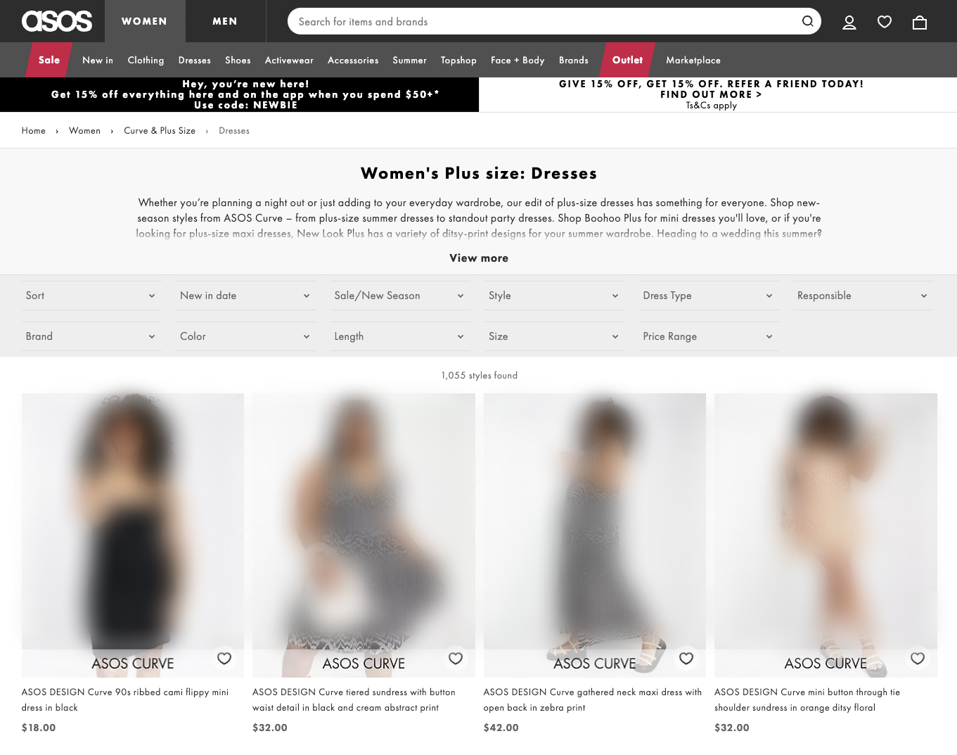
I searched for [wedding guest plus size dresses] and saw a search network ad from ASOS which took me to a landing page for women’s plus size dresses for U.S. web visitors.
 Screenshot from ASOS, June 2022.
For starters, the ad took me directly to a landing page related to my search query – I love when that happens.
The full-length thumbnails of plus size models, moving in the dresses, helps me immediately know that I’m in the right place and I can begin to imagine myself in the product.
Top navigation breadcrumbs let me know exactly where I am on the site, so if I want to go back and see all the curve clothing, that’s really simple to do.
Filters are front and center for me to further refine my search by how new it is, eco-responsibility, color, price, and more.
Sales copy is free of fluff allowing the user to focus on the product (clothes). Description of the category page does include reference to which brands to check out for trending styles.
All in all, it’s a clean, well-organized landing page that keeps attention directly on the product.
ASOS may want to test adding social proof to their landing page by adding a filter based on user reviews or engage FOMO by highlighting that an item is selling fast.
2. DRIFT
B2B commerce startup Drift is a conversational marketing and sales technology company, well known for its live chatbot.
It is one of the only Latino-founded companies to ever achieve a valuation over $1 billion.
“Our purpose as a company remains simple and consistent: Build a platform that makes it simpler for customers to buy from you,” Drift CEO David Cancel said in a statement.
Let’s see how simple Drift makes their product to buy and check out their live-chat landing page.
 Screenshot from DRIFT, June 2022.
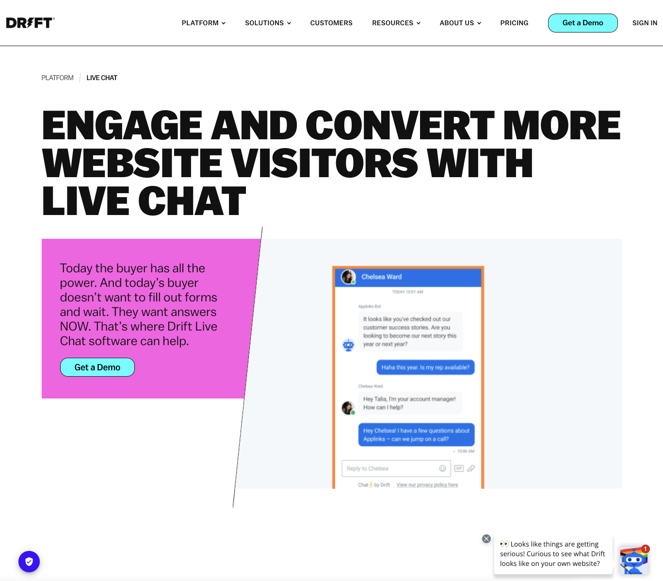
Ok, I am geeking out over the bright and minimalistic design (slight 90s vibes); it looks so sharp on all devices.
Above the fold, we see a big, bold headline immediately addressing how the app helps business owners “engage and convert” with Drift’s solution “live chat.”
Below the headline, the content block explains why users are not engaging or converting: “Today’s buyer doesn’t want to wait.”
Nice contrasting color on the CTA inviting web visitors to “Get a Demo.”
The header image uses the product as the example which is 10x better than a stock photo.
And, I have to call out the shield icon in the bottom left-hand corner that opens privacy settings. This small addition provides site visitors with a subconscious affirmation that the company takes data privacy seriously.
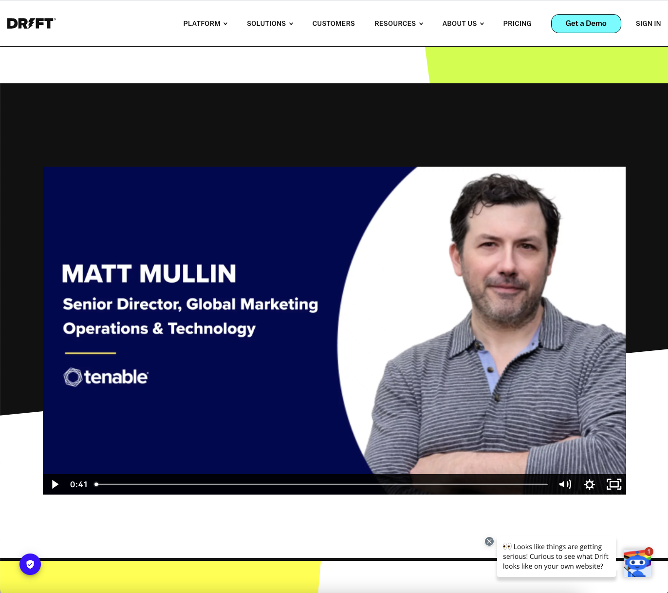
As we scroll down the page, we see social proof with a video review by the senior director of a global marketing operations and technology company.
 Screenshot from DRIFT, June 2022.
If you can get video reviews, do it! They are way more engaging than a standard text review because they’re really hard to fake.
Continuing to scroll down the page, the content teeter-totters between sharing different use cases with a summary and image or .gif and social proof in the form of a text quote or case study.
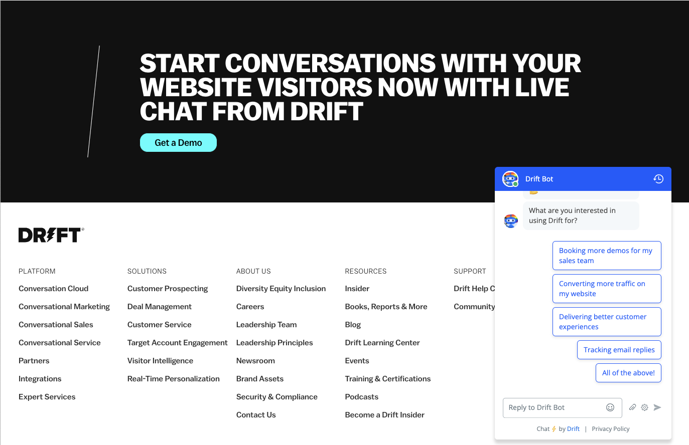
At the end of the long-form landing page, there is a solid call to action “start conversations with your website visitors now.” With a contrasting button, “Get a Demo.”
 Screenshot from DRIFT, June 2022.
When you click on “Get a Demo” it launches the product itself and you interact with the Drift bot to book a demo.
Drift’s live chat page checks off all the features of an amazing landing page, making it extremely easy to buy from them.
3. LawnDoctor.com
Lawn Doctor offers lawn maintenance and pest control services, but it’s not your run-of-the-mill landscaping company.
This lawn care brand has grown to more than 630 locations, increasing its year-over-year sales by 16% in 2020.
Local service providers can learn a lot from Lawn Doctor’s landing page. Let’s take a look at how they’ve designed their landing page to attract new customers.
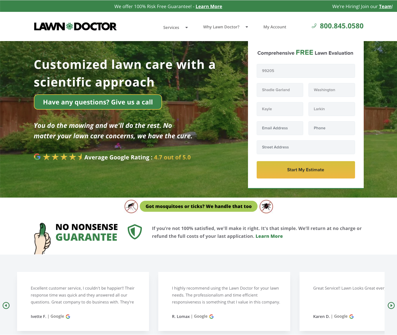 Screenshot from Lawn Doctor, June 2022.
Lawn Doctor is such a great example for local service companies.
The color palette uses the rich color of green consumers wants to attain with a hero image featuring what the site visitor wants, a beautifully landscaped backyard.
Social proof is visualized with the 4.7 star average Google rating overlay on the image. The exact number of 4.7 is helpful because it feels like a real number and not an approximation.
The estimate form is available at the top; users don’t have to go scrolling for it, and a phone number is available in the top right corner for those that don’t want to wait.
When I enter my zip code into the form, the city and state are automatically populated for me which is awesome because I get lazy and don’t want to enter every detail.
Sales copy gets right to the point; the header explains you’re getting customized lawn care with a scientific approach.
The word choice “custom” and “scientific” makes me think that I’m getting a better service than I would from anyone else.
Below the header image but above the fold, Lawn Doctor upsells me services that are highly relevant to the current season.
I can click on that CTA to learn more or I’m more likely to ask about it when a sales representative calls me.
Just in case a user had any hesitation, there is a 100% refund if I’m not fully satisfied, followed by Google reviews for social proof.
The only thing this page is missing is the fear of missing out which Lawn Doctor could do with a countdown discount timer.
4. Flywheel
Flywheel was acquired by WP Engine in 2019.
The financial terms of the deal were not disclosed but in an interview, Heather Brunner confirmed Flywheel’s annual recurring revenue was $18 million at the time of acquisition.
What made Flywheel so successful? Aside from being a great managed WordPress hosting platform, the company’s marketing was dialed in. Take a look!
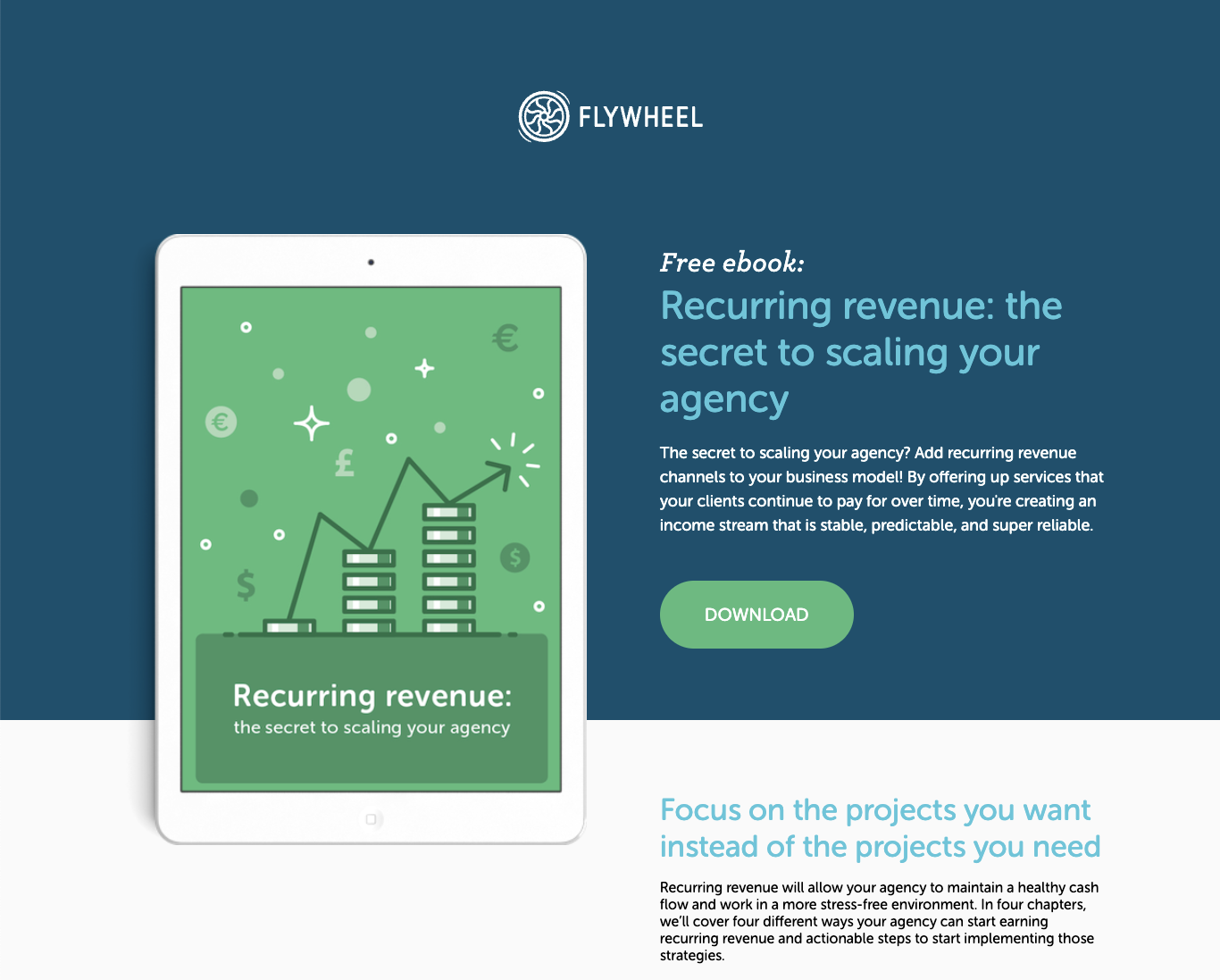 Screenshot from Flywheel, June 2022.
Top navigation is not present, helping the page visitor to stay focused on the content you want them to.
The logo reminds site visitors where they are and is clickable providing an easy escape back to the main domain.
The beautiful color scheme with the calm business blue and contrasting money green call-to-action button above the fold.
The headline includes the word “free” letting visitors know they won’t have to pay for the download.
Text is broken up into chunks making it easy to read on mobile.
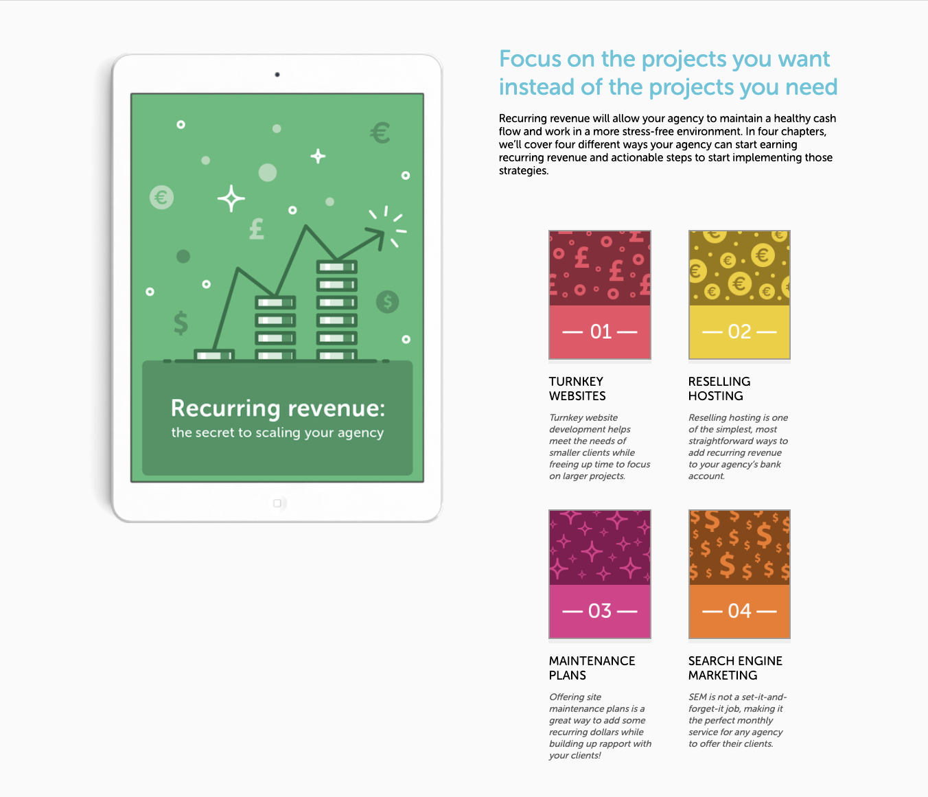 Screenshot from Flywheel, June 2022.
Below the fold is a mini-preview of the chapters so I know what I’m exchanging my personal information for. Gives me a sense of whether or not it’s worth it to me.
The final CTA at the bottom of the landing page reinforces that the ebook is completely free and filled with secrets! The download is a quick and simple company email.
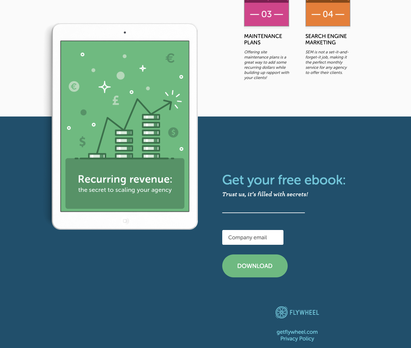 Screenshot from Flywheel, June 2022.
Form completion confirmation takes me to the product home page to further explore the product. All in all a beautiful ebook landing page that lead gen companies can learn from.
The only suggestion here is to add social proof near the bottom CTA to “seal the deal.”
5. Breathwrk
Breathwrk is a female-founded startup that raised an undisclosed amount from a total of 10 investors including Demo Lovato and BAM Ventures.
The breathing exercises app has over 1.2 million users worldwide.
Let’s see if the landing page can reduce our stress and improve landing page design?
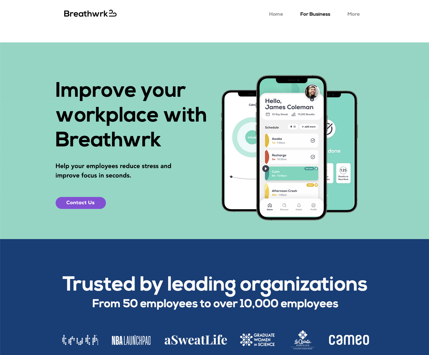
The search query for this landing page was, “how to handle stress at work.”
 Screenshot from Breathwrk, June 2022.
The main Navigation is simplified, which keeps the users focused on the information you want them to look at.
But if they click the “More” button a drop-down list of additional pages (Science, FAQ, Blog, and more) is available.
The color palette is calming tones of blue and green with a contrasting CTA button “contact us” in purple.
Just like Drift, Breathwrk shows the product which allows site visitors to see what they’re going to get.
The headline starts with the main idea, “Improve your workplace,” and the subheading tells us how to “help your employees reduce stress and improve focus…”
Followed by the FOMO by showcasing the companies who are using the Breathwrk app for their employees.
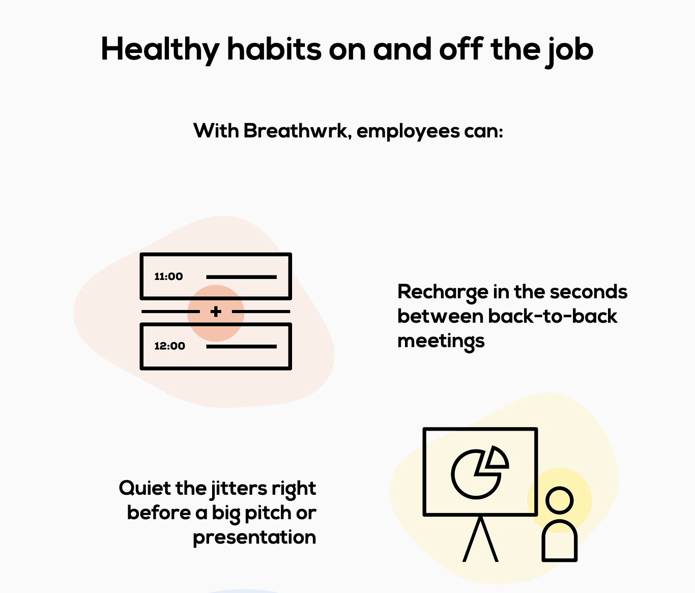
As we scroll down the landing page, Breathwrk does a brilliant job explaining the app’s features from the perspective of the user.
 Screenshot from Breathwrk, June 2022.
A user doesn’t really care that there’s an option for breathing exercises before meetings but a user is interested in reducing employee stress and improving focus between back-to-back meetings, and before a big pitch.
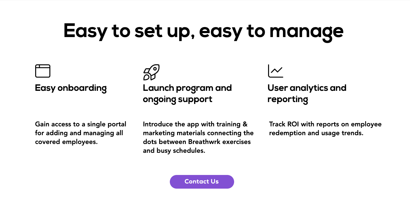
The sales copy minimizes objections by explaining that the app is easy to set up and easy to manage.
 Screenshot from Breathwrk, June 2022.
This is important because the last thing an organization needs is stress setting up an app to reduce stress.
Easy onboarding, ongoing support, and user analytics (so you can see if employees are using the app and how they’re using the app).
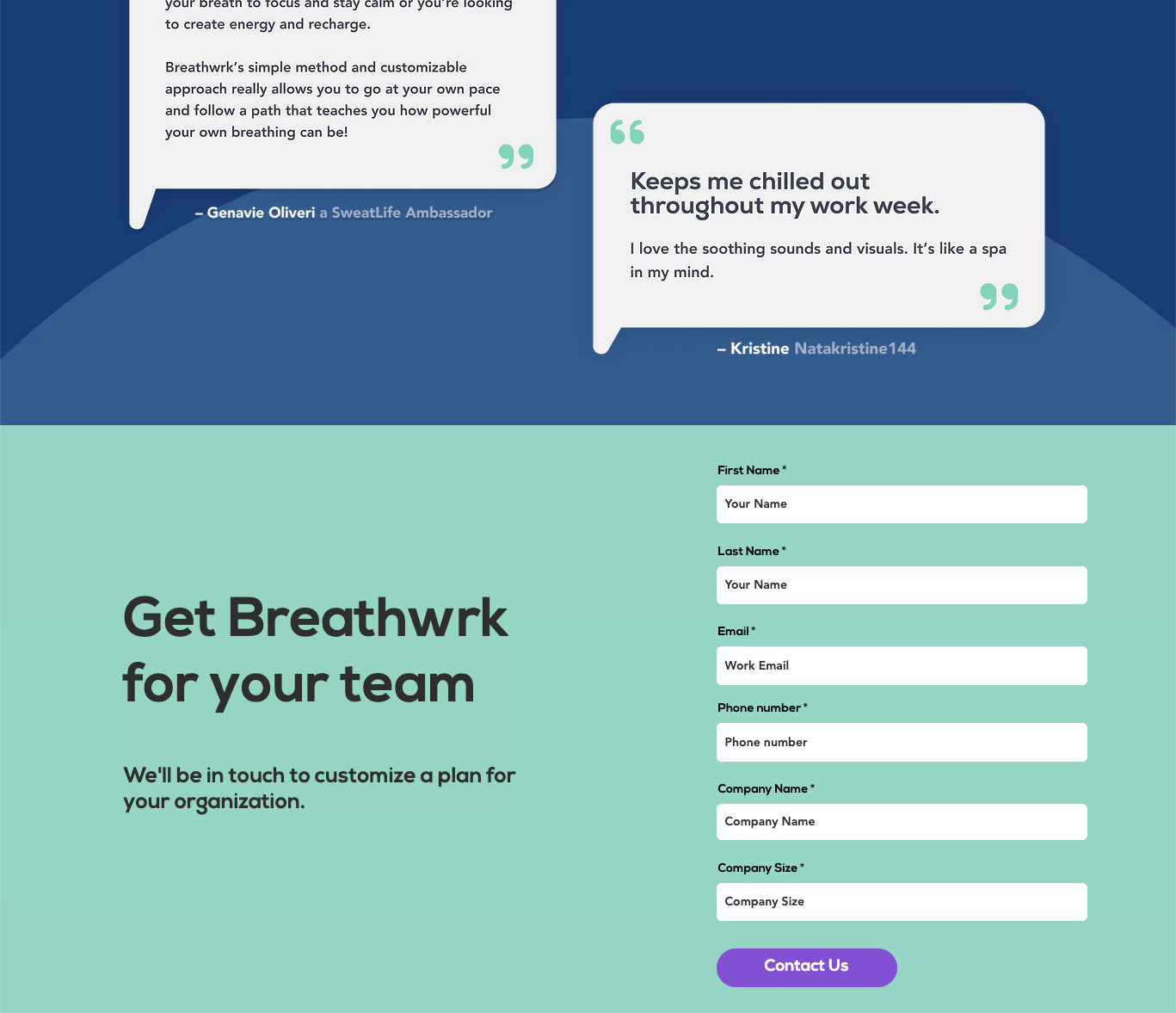
Breathwrk provides social proof in the form of text review quotes right before the CTA “Get Breathwrk for your team” and form fill.
 Screenshot from Breathwrk, June 2022.
An amazing example of an App landing page. It grabs attention, shows the product, and explains how it creates value for the site visitor.
Final Thoughts
Overall, an amazing landing page helps site visitors decide what to do next.
Some features to consider when designing a landing page is:
- The design captures visitors’ attention and keeps it on the end goal.
- Copy is focused and free of fluff.
- Use social proof and FOMO.
- Minimize objections and have a clear CTA.
- Make sure it loads fast.
And, don’t forget to set up Analytics to measure and learn from user activity. Testing is going to be your secret to success.
More Resources:
Featured Image: Mila Supinskaya Glashchenko/Shutterstock
