Yoast released version 20.0 introduces major changes to the user interface that are intended to make it easier to optimize a WordPress site.
New User Interface
The Yoast 20.0 user interface does away with the old method of making users click on multiple tabs to access pages with numerous choices.
The new version of Yoast introduces a card-style interface.
The card user interface doesn’t require users to make choices the way a tab interface does. It presents the information as a series of features that a user can turn on or off. It’s an easier and more intuitive way of doing things.
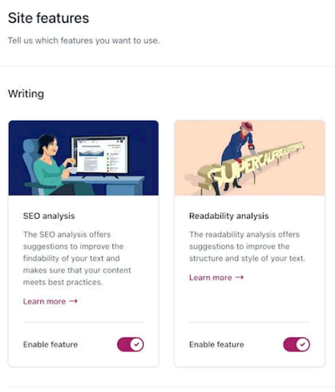
Each category has its own row, with cards representing settings that can be toggled on or turned off.
The structure of the settings page is like this:
Setting Category
Card – Card – Card
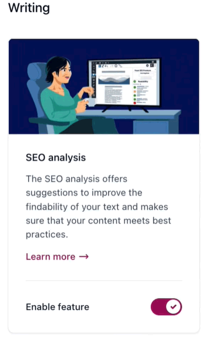
Each card, which is a setting, has an image at top, an explanation of the setting beneath the image, and in the footer area of the card is the on/off toggle and a Learn More link to a Yoast webpage that explains that particular setting.
A Yoast Settings Card

When a setting is turned off, the image is displayed in a gray scale (no color).
If the image has color that means the setting is enabled.
A user can know, literally with a glance, which settings in any category, are turned on or off just by whether a card has color or no color.
That’s a macro view of the entire settings page that allows the user to understand the overview quickly, something that isn’t possible with the old tab-and-click-and-scroll way of navigating the settings.

Each card that corresponds to an individual setting has a brief explanation of the setting.
A user also has the option of clicking the “learn more” button to visit a webpage that explains the specific setting in detail.
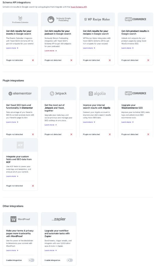
The “API Integrations” settings page follows a similar card-style user interface that also makes it easy to see what integrations are possible, like integrating Yoast into the Elementor workflow, and then enabling that integration.
Yoast API Integrations Page

I had the opportunity to install a preview version of Yoast 20.0 on a test site and was impressed with the initial setup and the new user interface.
I’ve been practicing SEO for almost 25 years and this version of Yoast is the easiest to use SEO plugin I’ve used to date.
The new user interface is so well thought out that virtually anyone of any knowledge level can use it without having to read a manual. But if one requires background information that information is just a click away.
Thijs de Valk, CEO of Yoast shared:
“I’m really proud of what the team has built in the Yoast SEO 20.0 release. …Our new user interface shows we’ll keep delivering the best possible experience to our users.”
I agree, Yoast SEO 20.0 is a great step forward, users are going to appreciate the changes.
Featured Image by Shutterstock/ViDI Studio
