Bing is rolling out a new version of Generative Search that displays information in an intuitive way that encourages exploration but also prioritizes clicks from the search results to websites.
Microsoft introduced their new version of AI search:
“After introducing LLM-powered chat answers on Bing in February of last year, we’ve been hard at work on the ongoing revolution of search. …Today, we’re excited to share an early view of our new generative search experience which is currently shipping to a small percentage of user queries.”
New Layout
Bing’s announcement discusses new features that not only make it easy for users to find information, Bing also makes it easy for users to see the organic search results and click through and browse websites.
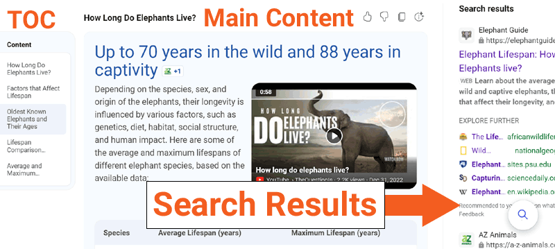
On the desktop view, Bing shows three panels:
- A table of content on the left
- AI answers in the center (with links to website sources)
- Traditional organic search results on the right hand side
- Even more organic search results beneath “the fold”
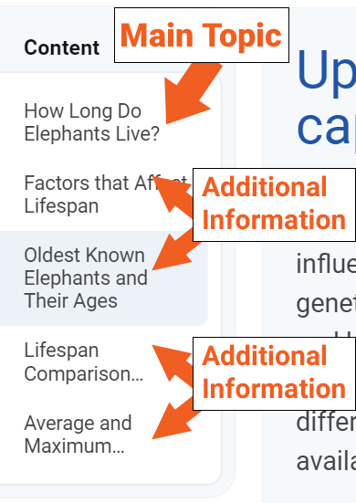
The table of contents that is on the right hand side is invites exploration. It has the main topic at the top, with directly related subtopics beneath it. This is so much better than a People Also Asked type of navigation because it invites the user to explore and click on an organic search result to keep on exploring.
Screenshot: Table Of Contents

This layout is the result of a conscious decision at Bing to engineer it so that that it preserves and encourages clicks to websites.
Below is a screenshot of the new generative AI search experience. What’s notable is how Bing surrounds the AI answers with organic search results.
Screenshot Of The New Bing AI Search Results

Bing makes a point to explain that they have tested the new interface to make sure that the search results will send the same amount of traffic and to avoid creating a layout that results in an increase in zero click search results.
When other search engines talk about search quality it is always from the context of user satisfaction. Bing’s announcement makes it clear that sustaining traffic to websites was an important context that guided the design of the new layout.
Below is a screenshot of a typical Bing AI search result for a query about the life span of elephants.
Note that all the areas that I bounded with blue boxes are AI answers while everything outside of the blue boxes are organic search results.
Screenshot Of Mix of AI And Organic Results

The screenshot makes it clear that there is a balance of organic search results and AI answers. In addition to those contextually relevant organic search results there are also search results on the right hand side (not shown in the above screenshot).
Microsoft’s blog post explained:
“We are continuing to look closely at how generative search impacts traffic to publishers. Early data indicates that this experience maintains the number of clicks to websites and supports a healthy web ecosystem. The generative search experience is designed with this in mind, including retaining traditional search results and increasing the number of clickable links, like the references in the results.”
Bing’s layout is a huge departure from the zero-click style of layouts seen in other search engines. Bing has purposely designed their generative AI layout to maintain clicks to websites. It cannot be overstated how ethical Bing’s approach to the web ecosystem is.
Bing Encourages Browsing And Discovery
An interesting feature of Bing’s implementation of generative AI search is that it shows the answer to the initial question first, and it also anticipates related questions. This is similar to a technique called “information gain” where an AI search assistant will rank an initial set of pages that answers a search query, but will also rank a second, third and fourth set of search results that contain additional information that a user may be interested in, information on related topics.
What Bing does differently from the Information Gain technique is that Bing displays all the different search results on a single page and then uses a table of contents on the left hand side that makes it easy for a user to click and go straight to the additional AI answers and organic search results.
Bing’s Updated AI Search Is Rolling Out Now
Bing’s newly updated AI search engine layout is slowly rolling out and they are observing the feedback from users. Microsoft has already tested it and is confident that it will continue to send clicks to websites. Search engines have a relationship with websites, what is commonly referred to as the web ecosystem. Every strong relationship is based on giving, not taking. When both sides give it creates a situation where both sides receive.
More search engines should take Bing’s approach of engineering their search results to satisfy users in a way that encourages discovery on the websites that originate the content.
Read Bing’s announcement:
Introducing Bing generative search
Featured Image by Shutterstock/Primakov
