What is a Category Page?
Category pages organize products into purchase paths for the consumer. At the highest level, they typically live close to the homepage in the website hierarchy and depending on the depth of an e-commerce site’s offering, can branch into multiple levels of sub-category pages. Regardless of their position in the website hierarchy, category pages feature multiple ways of sorting products, and their primary purpose is to help the user learn and discern between products, brands, price points, etc. Put more simply, they help shoppers shop.
Why Focus on Category Pages?
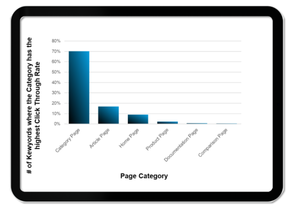
For e-commerce retailers, the ultimate goal is sales. With consumers transacting mainly on product pages, understandably, there is a lot of attention paid to the product page, its components and easing the path to a sale. So, how does a consumer find their way to a product page? If we trace back a sale to its origins, 87% of consumers start with search. In late 2021, BrightEdge published a research report on the e-commerce industry that gives insight into consumer search behaviors based on roughly 6,000 e-commerce keywords tracked across 10 categories over a period of three years. The study revealed that category pages – not product pages – earn the most clicks, and it’s not even close.
How not close is it? In the customer journey for the keywords we evaluated, category pages that appeared in the results had a 70% click-through rate.

The dominance of category pages in search clicks reflects a traditional search and compare shopping behavior, which differs from targeted buying behavior. Consider how consumers shop in-store at a grocery store, for example. Some portion of consumers know precisely what product and brand of that product they are looking for and go directly to purchase that item: house brand, low-fat milk, perhaps. This is a targeted product buyer. Another grocery shopper is looking to purchase a block of cheese but doesn’t have a particular variety or brand in mind. The cheese shopper will peruse the many options comparing varieties, brands, prices, etc. This is a category shopper.
With category pages capturing the large majority of clicks in search, we can infer those consumers coming from search are largely in a search and compare mindset. Lending additional credence to this conclusion are a couple of additional data points from the research:
- The sites winning the most clicks don’t necessarily rank for the most keywords, which further indicates that category pages are winning more high value keywords than unique product pages
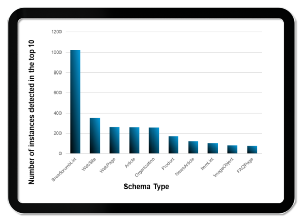
- Among the most common schema types that are winning e-commerce rankings, breadcrumb lists – a navigational element tying product pages to and from category pages – are the most common by nearly three times the next-most common schema type.

The Anatomy of an Effective Category Page
The perfect category page will depend somewhat on the unique audience and nature of the e-commerce product offering, but there are some best practices to ensure that category pages effectively secure meaningfully high search rankings for relevant keywords, and deliver an intuitive and positive customer experience.

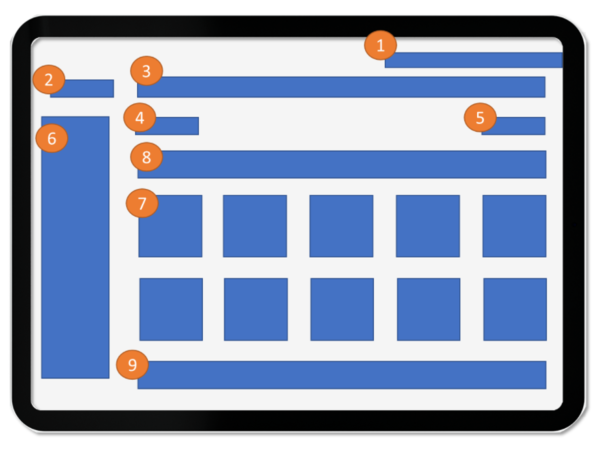
1. Address, phone numbers, live chat link – provides an alternative path for consumers who may prefer another method of contact or don’t immediately find what they’re searching for, helping convert sales both online and offline; From an SEO perspective, given what we know about shopping behaviors, these features could reduce click-backs and improve dwell times, which will help your SEO
2. Breadcrumb list (with markup) – serves as a navigational trail to quickly direct consumers either back to where they came from or to a neighboring page in the website hierarchy that better matches what they’re looking for; helps the search engine understand how the contents of the page relate to other topics or categories and makes it possible for the search engine to crawl adjacent content
3. Top level navigation for other categories – enables consumers to navigate more generally beyond the current category; helps the search engine crawl the larger site
4. H1 tag – tells both the consumer and the search engine what the page is about
5. Sorting option – enables the consumer to organize the contents of the page in a way that aligns with their shopping priorities; Helps with E-A-T (expertise, authoritativeness, trustworthiness) for SEO by establishing expertise for a given set of products
6. Faceted search (by price, color, size, etc.) – enables shoppers to narrow the contents of the category page to better identify options that match their requirements; helps search engines understand the context of your page and how the user can navigate it; helps build long tail keyword relevance
7. Categories – preset sub-categories help shoppers quickly navigate to relevant product pages (photos here can be especially helpful for the shopper who knows they need a bolt with a sharp end and a hex head, but doesn’t know that it’s called a lag bolt, for example); like with faceted search, helps search engines understand the context of your page and how the user can navigate it, and helps build long tail keyword relevance. ]
8. Promotions and relevant offers with hero image – while not strictly necessary, this real estate is often used to ratchet up interest from shoppers and help keep them on the site – especially for commodity categories and products – by giving them a reason to try to find what they’re looking for and purchase on the site
9. FAQ and supplemental content – Giving shoppers answers to common questions, brand reviews, links to new or popular products in the category and the like, offers another path to fulfilling the shopper’s search; helps the site form SEO content relevancy and influences “People Also Ask” results, expanding the content’s footprint in search results pages
Key Takeaways and Next Steps
One final observation from the BrightEdge e-commerce research is this: product carousels in search results have declined over the three-year period from 2019 – 2021. Category pages, instead, are the new product carousel.
To help you make the most of the upward trend in category page clicks, here are some guidelines to bear in mind as you evaluate and update your category pages:
- Ensure related categories and sub-categories are easily viewable
- Ensure phone numbers and store locator buttons are easy to locate on category pages
- If using faceted search elements, ensure they have schema elements to help search engines understand context
- Include FAQ content or easy links to it
Finally, to better understand how consumers are shopping on your site, examine the traffic patterns across your category page links, breadcrumb lists and other navigational elements. Are you seeing people entering the website from search primarily on category pages, too? Where do they go once they reach the site? How often do they abandon the website and can you spot any patterns of abandonment that indicate a problem or opportunity?
By implementing category page best practices, you will have a strong foundation for attracting search traffic, which in turn, can help inform tweaks and modifications that will maximize shopper interactions and transactions.
