
Imagine you’re looking at a bar chart of Google Ads conversions by month in Google Data Studio.
You want to know how brand campaigns are affecting performance.
-
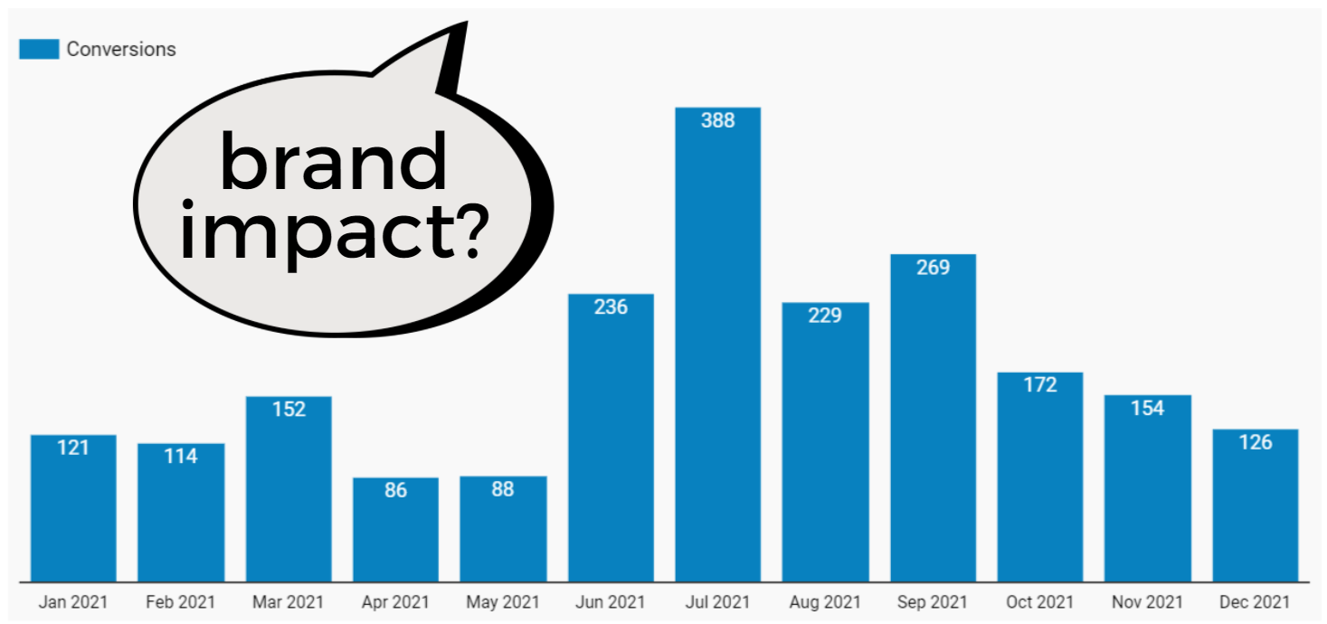 Image by author, April 2022
You decide to add Campaigns as a “breakdown dimension” so you can see conversions by campaign.
That segmentation doesn’t give you the result you’d hoped:
-
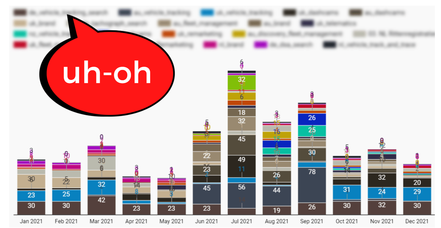 Image by author, April 2022
With dozens of campaigns across multiple accounts, this chart is far too noisy to be useful.
So… what now?
You could create a filter for brand campaigns.
However, that will filter out any non-brand campaign performance – which you don’t want to do.
If it were supported, importing your labels from Google Ads would solve the problem.
How can you create your own segments in Data Studio, so you’re fully in control of your visualizations and can drive better insights?
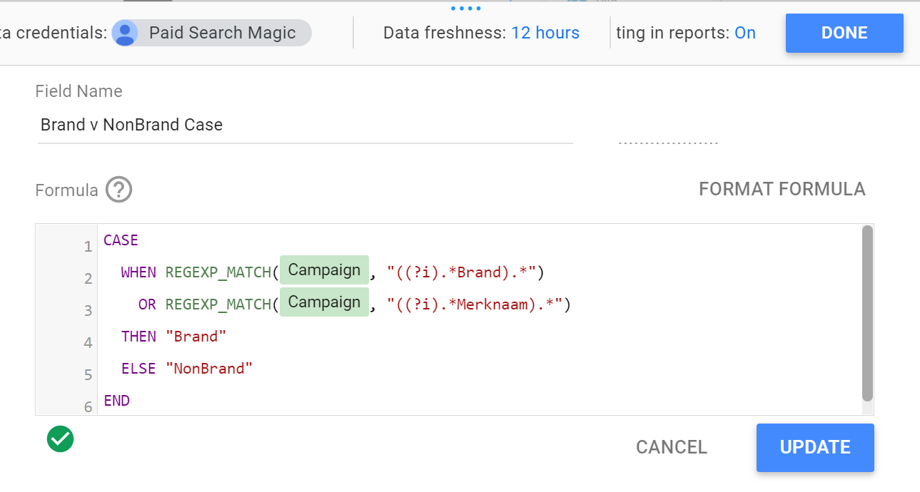
Answer: CASE.
This CASE statement lets you group the branded and non-branded campaigns into two separate segments:
-
 Screenshot taken by author, April 2022
Using the above code, campaigns that don’t include “Brand” (or the Dutch language “Merknaam”) will be grouped as “NonBrand.”
The final result is exactly what we hoped for: A stacked bar chart with a breakdown dimension showing conversion totals for only “Brand” and “NonBrand” campaign groups.
-
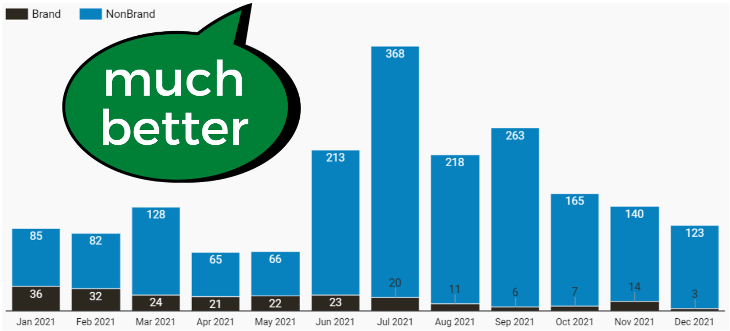 Image by author, April 2022
The trend in this chart is clear: Brand conversions have been steadily declining over the year.
That insight can now drive a strategy to address the issue.
If using CASE to get custom segments in Data Studio has left you frustrated and bewildered, fear not.
This article will show you how to use CASE with confidence, and give you some examples you can apply directly to your reports for better visualizations.
The Case For CASE
It’s hard to discuss CASE expressions without getting a little technical, so let’s start with W3 School‘s definition of a CASE statement:
The CASE statement goes through conditions and returns a value when the first condition is met (like an if-then-else statement). So, once a condition is true, it will stop reading and return the result.
If no conditions are true, it returns the value in the ELSE clause. If there is no ELSE part and no conditions are true, it returns NULL.
In other words, you set the conditions for your segment (“brand campaigns” in the example above).
If the condition is met (campaign name contains “brand”), it’s included in the Brand group. If the condition is not met (campaign name does not contain “brand”), it’s in the NonBrand group.
If that illustration sounds overly simplistic, let’s look at a slightly more complex scenario for using CASE from Google Data Studio’s Help pages:
A common use for CASE is to create new categories or groupings of data. For example, to group selected country values into a Sales Region dimension, you might create a CASE expression like this:
CASE
WHEN Country IN (“USA”,”Canada”,”Mexico”) THEN “North America”
WHEN Country IN (“England”,”France”) THEN “Europe”
ELSE “Other”END
In this example, five different countries are consolidated into two different continents, with an “other” category to catch any additional countries.
A list of dozens or even hundreds becomes a clean list of three.
The Power Of Data Studio CASE Expressions
Simplify, clarify and focus busy charts using custom groups and segments.
-
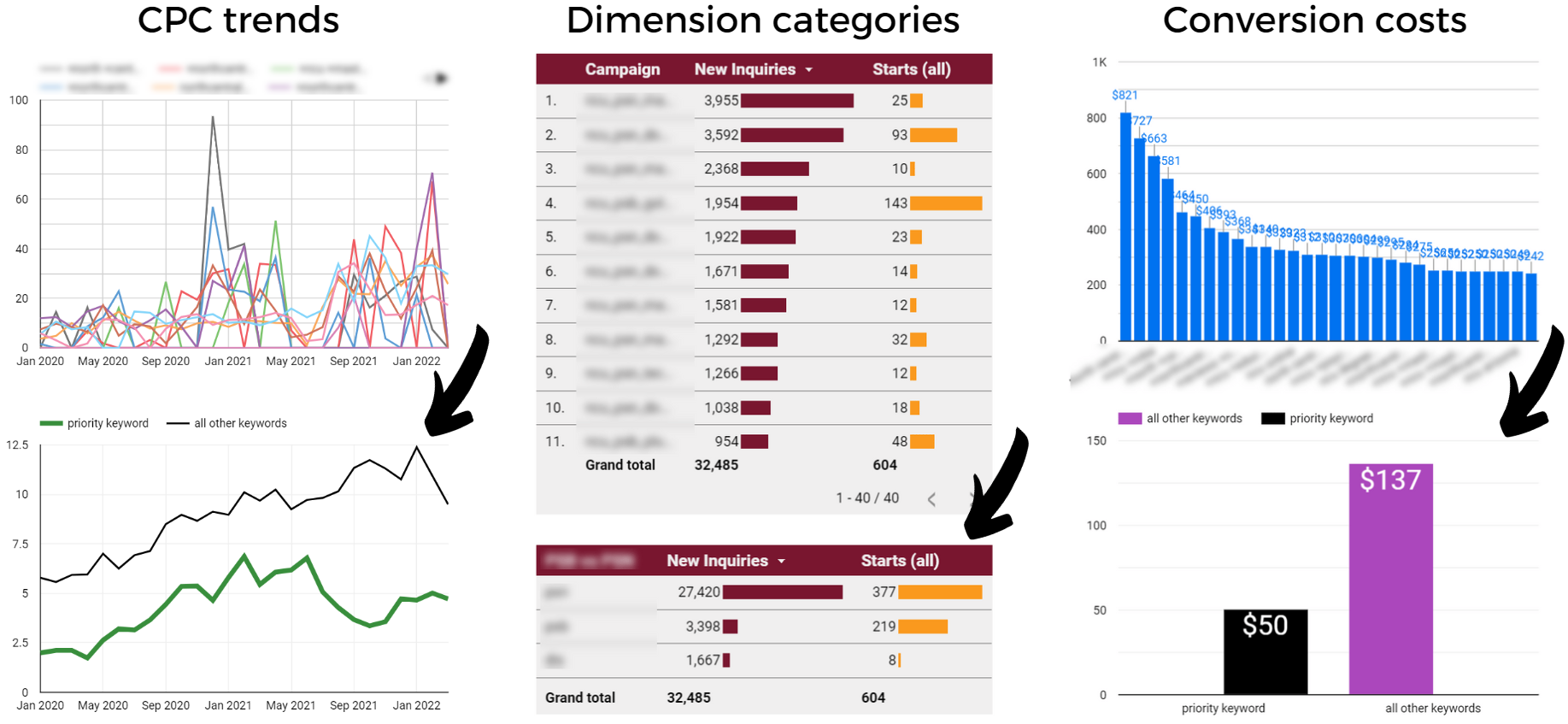 Image by author, April 2022
Using CASE expressions, you can:
- Rebuild the labels used in your Google Ads account.
- Group Google Ads campaigns by priority, targeted region, language, or theme.
- Consolidate or customize default dimensions in your data source (such as swapping Google Analytics default channel grouping with Custom Channel Grouping).
- Compare the performance of one keyword or asset against a group or category.
After learning some basic syntax and structure, you can create CASE expressions to solve your specific segmentation and classification challenges.
How To Use CASE Expressions In Data Studio
Looking for the step-by-step instructions for using Data Studio CASE expressions? Look no further.
Here we’ll review how to add a CASE statement and set up the formula.
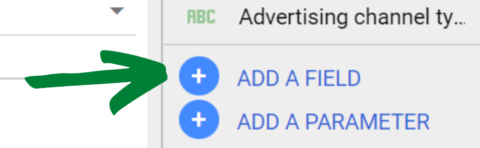
1. Create A Calculated Field
You’ll find this option at the bottom right section of the Data Panel. Click the blue “Add a Field” button.
-
 Screenshot taken by author, April 2022
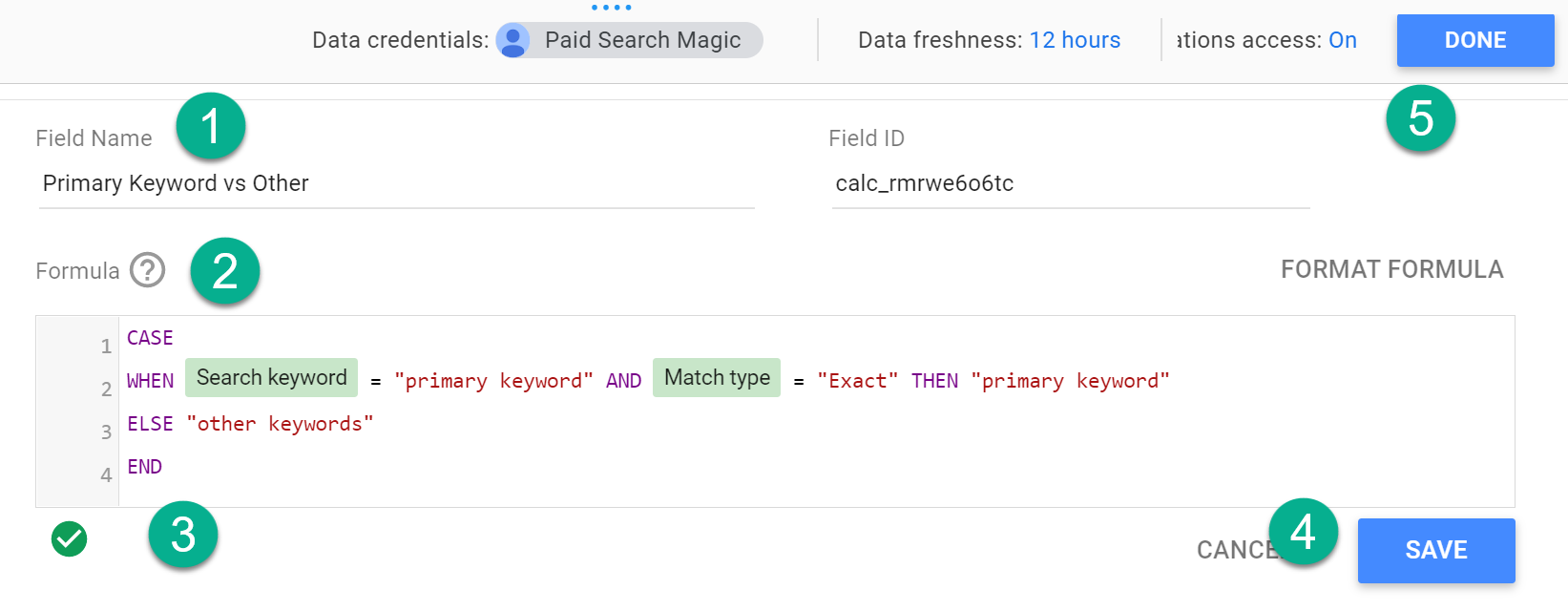
2. Enter And Save The CASE Statement
Give your field a name, then enter the statement into the formula box (more on that below).
-
 Screenshot taken by author, April 2022
A valid formula will show a small green arrow beneath the formula box.
Then hit “Save” (or “Update”) and “Done.” Skipping “Save” has the exact result you’d expect, so don’t forget to click both buttons.
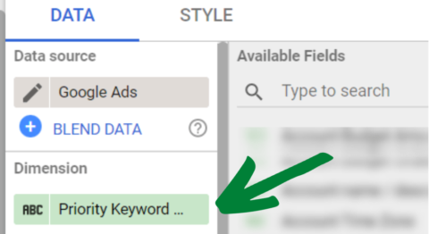
3. Add The Field As A Dimension In Your Chart
You’ll find your new field containing the CASE statement in your list of Available Fields from the Data Panel, and you can add it as a dimension for your chart.
-
 Screenshot taken by author, April 2022
You can edit the CASE expression any time by clicking on it from the “Available Fields” section of the Data Panel.
How To Write Your CASE Statement
Now that you know how to add a CASE expression in Data Studio let’s look at the syntax you’ll use to build your formula.
You’ll use the following components in the formula box for your CASE statement:
- CASE (opens the formula).
- WHEN (describes the condition).
- THEN (describes the result when the condition is met).
- ELSE (optional: describes the result when the condition is not met).
- END (closes the formula).
As you’ve already seen in this article, there are many ways to format a CASE statement.
Ultimately, you’ll want to find a “common denominator” that’s true only for the condition you’re defining with “WHEN.”
Here are some examples of how you could set up the WHEN / THEN formula:
- WHEN [field] = “condition” THEN “result”
- WHEN [field] != “condition” THEN “not result”
- WHEN [field] IN (“Value A”, “Value B”, “Value C”) THEN “result”
- WHEN REGEXP_MATCH ([field], “.*condition*”) THEN “result”
- WHEN CONTAINS_TEXT ([field], “condition”) THEN “result”
You can get much more advanced than this, but it should be enough to get you started.
CASE Limitations And Caveats
With the great power of CASE comes the great responsibility of making sure your data is actually… accurate.
Here are some things to watch for and fix.
Aggregation Errors And Solution
Your data source and metric aggregation method can lead to inaccurate or broken charts, including:
- Non-weighted average of an average: Averaging an average distorts actual performance metrics.
- Avg. metric summing: Showing the total of an average is just wrong.
- User configuration error: Some data sources will throw a configuration error instead of displaying improper aggregates.
-
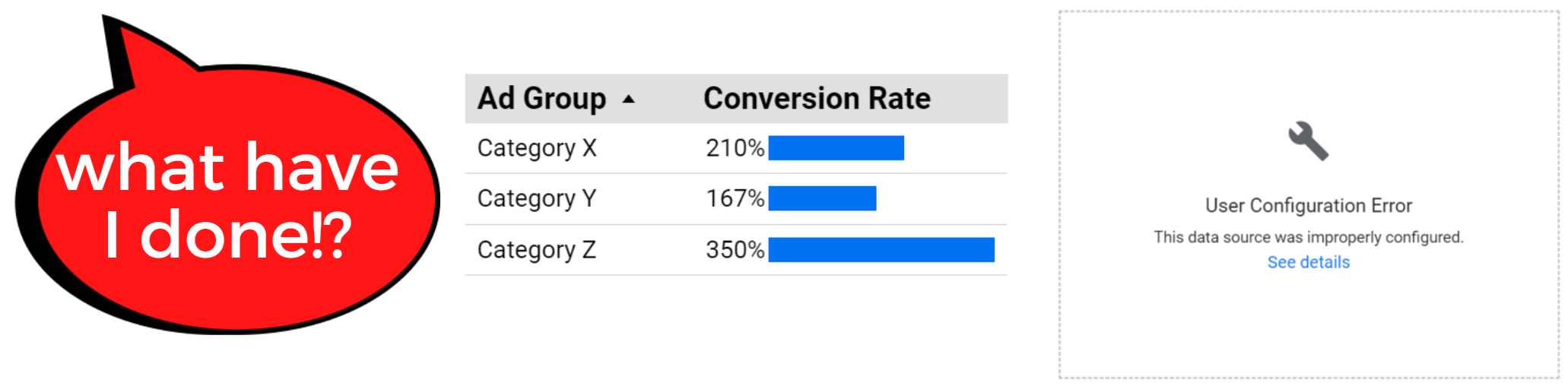 Image by author, April 2022
Solution: Don’t aggregate pre-calculated fields.
If you have a metric that’s a calculation (CPC, AOV) rather than a raw total (Cost, Sessions), here’s what to do instead:
Create a new calculated field. Enter the formula, and swap the metric in your chart’s Data Panel with your new field.
-
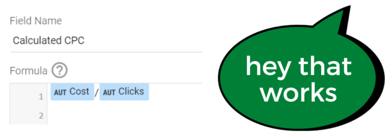 Image by author, April 2022
Segmentation Trap (Signal Vs. Noise)
There’s no limit to how you can slice and dice data, but there is a limit on how valuable some data segments will be.
Correlation is not causation, and identifying trends is not as valuable as knowing the cause.
So while you could segment your data by Avg CPC ranges, it’s the intent of the keyword, not the cost of the click, that drives post-click performance.
Be sure your segments relate to the effect shown in your chart, or you’ll find yourself optimizing for noise instead of signal.
Other Limitations
CASE has other constraints.
For instance:
- CASE operates in sequential order. If a value meets the criteria for multiple categories, it will only be included in the first one listed in the CASE statement.
- You can’t mix dimensions and metrics within a WHEN condition.
- You can’t use a formula within a WHEN or THEN clause.
- The CASE field you create is unique to the data source. If you need the same formula for multiple data sources, you’ll need to create new instances.
You’ll learn more about CASE by using it, but knowing the limitations means less time troubleshooting and searching help forums.
Conclusion
CASE statements are a powerful way to group and segment your data in Google Data Studio.
It’s not as simple as the drag-and-drop assembly you’re used to. But it’s also not out of reach.
Learn the basic rules and syntax, and before you know it, it’ll become a go-to tool in your visualizations toolbox.
More resources:
Featured Image: Billion Photos/Shutterstock