Social media is a ubiquitous part of the modern digital experience.
Even those holdouts who insist they don’t need a Facebook, TikTok, or Twitter account are still endlessly subjected to it in the form of linked posts, articles, and references.
And most organizations know the importance of maintaining a presence on these platforms.
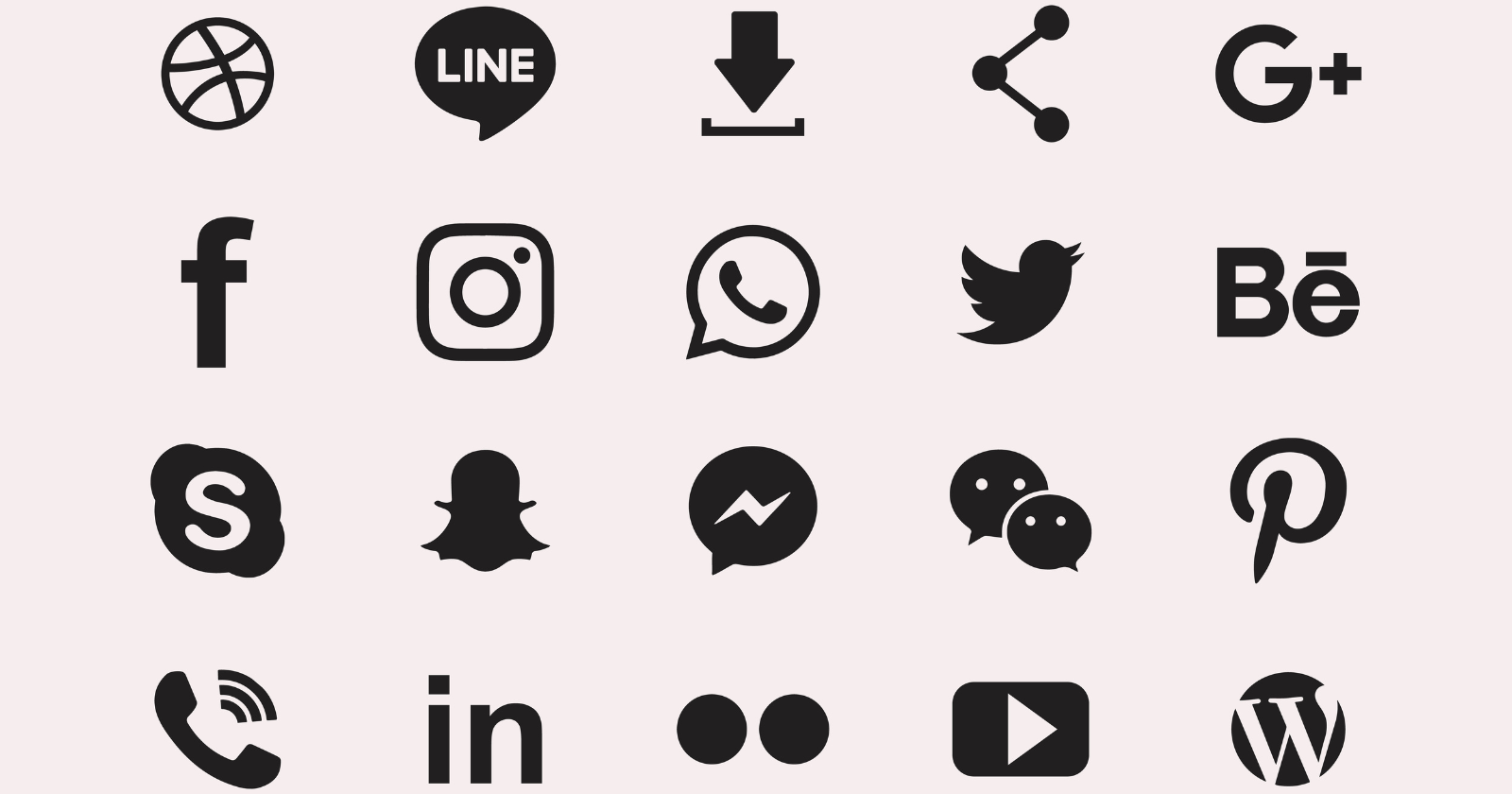
That’s why so many web pages, blog posts, and emails include familiar icons like the little blue bird for Twitter, the camera for Instagram, “in” for LinkedIn, etc.
Most people know that if they click on these instantly recognizable icons on a website or in an email, it will direct them to the business’ page on the corresponding social media site.
And these icons have even started showing up in offline settings: on outdoor advertising, television commercials, or printed on the bottom of collateral to encourage viewers to find and follow the advertiser on digital platforms.
But before you go slapping the red Pinterest “p” and the Facebook “f” on all your outward-facing materials, there are a few things you need to know – most importantly, that these icons are copyright protected and need to be used in accordance with the social media site’s mandated brand guidelines.
Improper usage or distortion can lead to legal ramifications for your business.
Not to worry, as this piece is intended to give you all the information you need to stay compliant with these guidelines, as well as where to find logos for 10 of the most popular social media platforms.
Everything You Need To Know About Using Social Media Icons
The approved Facebook icon can be downloaded from the Facebook Brand Resources page.
Usage Guidelines
- Facebook’s logo is a lowercase f in a circle.
- The “f” logo should be used to point to your presence on Facebook; this could be your page, profile, group, or event.
- You should use a clear call to action, e.g., “Follow us on Facebook.”
- The Facebook icon should be equal in size to other nearby icons, with adequate clear space between them. Its shape and proportions should be maintained.
- It should not be fabricated or animated onto physical objects.
- The icon should only be used in Facebook blue, or white, gray or black on color-limited websites or collateral.
- Use of Facebook brand assets on television, digital advertising or packaging requires permission.
YouTube
YouTube offers three downloadable icons (full-color light, full-color dark and monochrome) from its Brand Resources page.
Usage Guidelines
- The YouTube logo is a triangle inside a rounded square.
- Usage of the YouTube logo requires clear space equal to, or greater than, the size of the triangle in the icon.
- The logo must be clear and legible, no matter the size of the device. The minimum height is 20 pixels for digital media and .125 inches for print.
- The logo should not be altered in any way.
- The logo icon can be used as a call to action (CTA) or a shorter version of the YouTube logo.
- Logos and icons that serve as links must point to a YouTube channel.
WhatsApp brand assets, including icons, are available for download on the Brand Overview page.
Usage Guidelines
- The green and white WhatsApp logo should be used whenever possible, with the black or white versions employed when the content is mostly black or white.
- The green rounded square logo should be used to refer to the iOS version, not as a social media icon or share button.
- The WhatsApp icons should not be modified, including changing the design, combining it with other words or images, or modifying its colors.
- WhatsApp brand resources should never be used in a manner that implies partnership, sponsorship, or endorsement.
The icons for Instagram are available for download on the Brand Icons page.
Usage Guidelines
- The glyph (camera icon) should be used to point to your presence on Instagram. The app icon is only used to encourage people to download the app, or when it is shown on a device alongside other apps.
- There should be a CTA button alongside the glyph unless it’s shown in a lineup with other social media icons.
- The minimum clear space between the glyph and other visual elements is one-half of its size on all sides.
- You should never use a glyph that is not proportionate, rotated, or smaller than 29×29 pixels.
- You can use the glyph in any solid color, though Instagram recommends black or white.
TikTok
TikTok and logo and button packs can be downloaded on the Design Guidelines page.
Usage Guidelines
- The primary TikTok logo is a “note” icon and TikTok wordmark. The secondary uses only the note. When the first two are not appropriate because of size, format, or design restrictions, you can use the tertiary stacked logo, featuring the note above the wordmark.
- Icons should always have a margin of at least 5% of the format height.
- There should be clear space equal to the full width of the logo on all sides.
- The minimum size for the icon is 16 pixels for digital media and 3mm for print.
- The logo should not be scaled, recolored, rotated, or otherwise modified in any usage. Avoid using it on busy backgrounds.
Snapchat
Download the official Snapchat ghost logo from the Brand Guidelines page.
Usage Guidelines
- The Snapchat logo is a ghost in black or white, the only colors in which it should be shown.
- You should not alter, rotate, modify, or obstruct the logo in any way.
- The Snapchat logo should be the same size as any other logos it is displayed alongside.
- The app icon should not be used except in the context of mobile apps or an icon on a mobile phone.
- Snapcode emblems that make it easy for users to find your profile may be used on the web, social media, packaging, and print.
Pinterest icons can be downloaded on the site’s Brand Guidelines page.
Usage Guidelines
- The Pinterest icon is a script “P” on a red, black or white circle.
- You should only use the Pinterest badge – not the wordmark.
- All usage should be accompanied by a CTA proportional to the icon.
- The red icon should be used whenever possible.
- Do not add an outline, filter, or effects to the logo. If contrast isn’t sufficient, consider using an alternate color.
- The P shouldn’t be removed from the circle or placed in another shape.
The Reddit logo, wordmark, and share icons can be downloaded from the Brand Resources page.
Usage Guidelines
- Reddit’s logo is a white smiling alien, a.k.a, “Snoo” head on an Orangered background.
- The icon and wordmark should be used together whenever possible.
- Icons and the wordmark should be surrounded by clear space of at least 140% of the icon size.
- The Snoo icon can only be used without the wordmark as a share icon or on Reddit itself.
- The icon should not be recolored, outlined, distorted, reversed, or modified in any way.
LinkedIn’s logos and icons are available on its Downloads page.
Usage Guidelines
- LinkedIn’s icon is a lowercase “in” inside a rounded box. Its default color is blue, but a black version can be used on black and white layouts and a white one on dark backgrounds.
- The minimum clear space surrounding the logo should be 200% the width of the “i.”
- The minimum size requirement is 21 pixels in digital media and .25 inches in print.
- The ® and ™ symbols must clearly visible and legible.
- Design elements and dimensions should never be modified.
Twitter assets are available on the Brand Toolkit page.
Usage Guidelines
- Twitter’s icon is a bird, either blue or white depending on the background.
- Unlike other social media sites, Twitter prefers that its icon be used as is, without being placed in a box or circle – though you can place it in a circle, square or rounded square if you wish.
- It may not be skewed, rotated, animated, or otherwise modified.
- Only the latest version of the logo should be used.
- The minimum size requirement is 32 pixels.
Using Social Media Icons
As you can see, there is some variation in the ways in which you can employ social media icons, but they all have a few things in common – namely, that they do not allow modifications and they should be used to connect to your brand’s page on the respective platform.
If you’re using multiple icons, make sure they’re consistent in terms of size and resolution.
This means that while LinkedIn’s minimum size is 21 pixels, it should be at least 32 pixels when placed alongside the Twitter bird.
Speaking of placement, you should choose a prominent location when placing them, but take care that they don’t overshadow your own branding.
Two of the most common locations for these icons on web pages are at the very top, and in the footer. In these places, they’re easily found by users, while becoming a seamless part of the page’s design.
In addition to including them on web pages, you can also include them in your email signature or in email newsletters.
They can also be used in non-hyperlinking marketing like television commercials, on billboards, and in print ads. Just be aware that these uses only serve to acknowledge that your brand has a presence on these platforms.
Social media icons are a great way to boost your follower numbers while providing a way for people to connect with your business. Just be aware that there are reasonably strict guidelines about how and when they can be used.
More resources:
Featured Image: branding66/Shutterstock