
Pillar pages are high-level introductions to a topic. They then link to other pages, which are usually more detailed guides about parts of the main topic.
Altogether, they form a content hub.

But not all pillar pages look the same.
In this guide, we’ll look at eight examples of pillar pages to get your creative juices flowing.

Key stats
Estimated organic traffic: 1,200
Backlinks: 6,900
Referring domains: 899
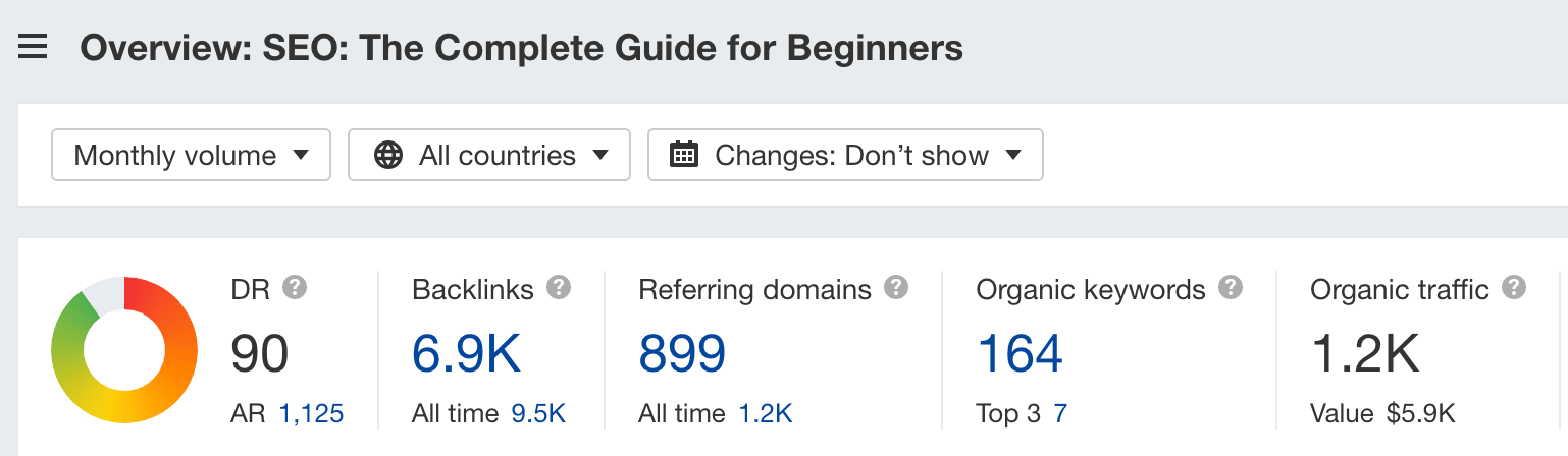
This is our very own pillar page, covering the broad topic of search engine optimization (SEO).
Why I like it
Besides the fact that I’m biased, I like the custom design we created for this page, which makes it different from the articles on our blog.
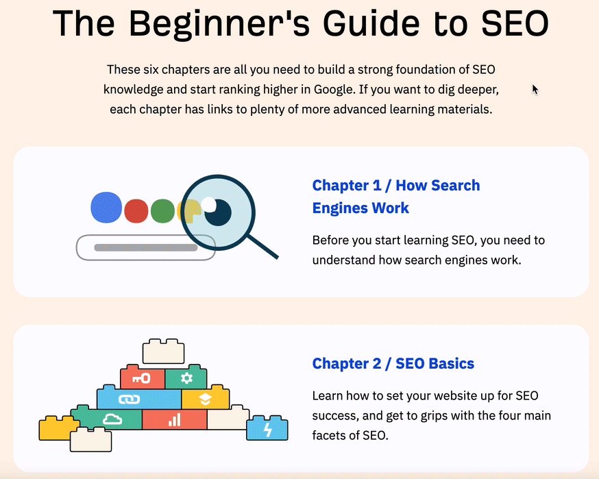
Even though the design is custom, our pillar page is still a pretty classic “hub and spoke” style pillar page. We’ve broken the topic down neatly into six different chapters and internally linked to guides we’ve created about them. There are also custom animations when you hover over each chapter:
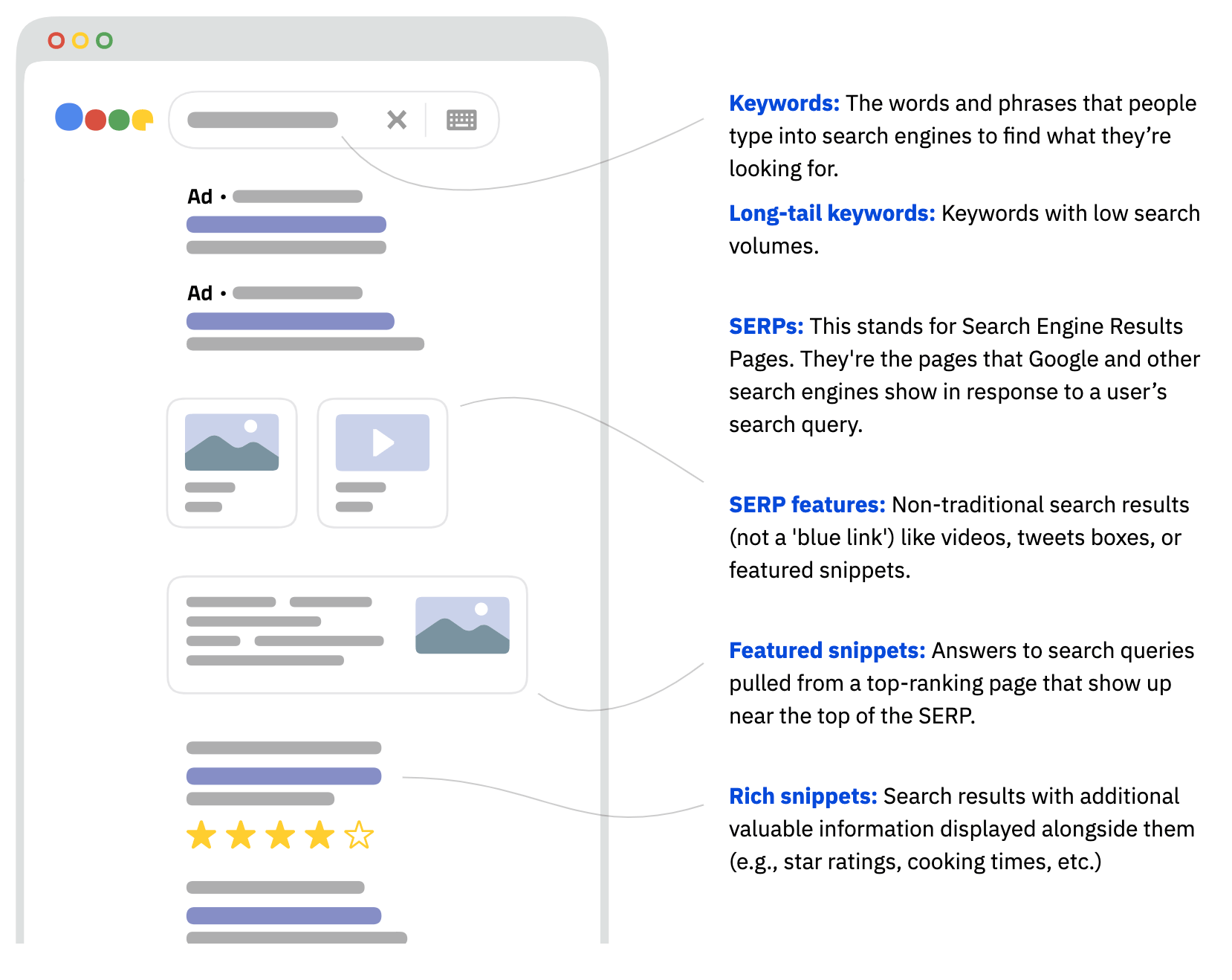
We’ve also added a glossary section that comes with a custom illustration of the SERPs. We have explanations of what each element means, with internal links to more detailed content:
Finally, it links to another “pillar page”: our SEO glossary.
Takeaway
Consider creating a custom design for your pillar page so that it stands out.

Key stats
Estimated organic traffic: 92,200
Backlinks: 21,600
Referring domains: 1,700
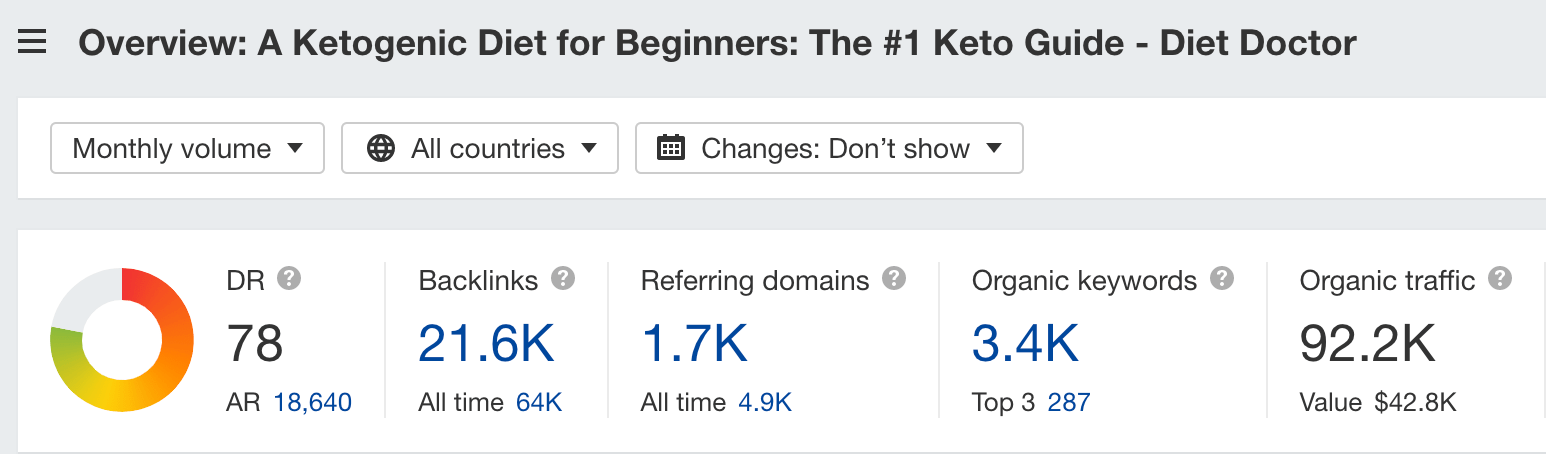
Diet Doctor is a health company focusing on low-carb diets. Its pillar page is a comprehensive guide on the keto diet.
Why I like it
On the surface, it doesn’t exactly look like a pillar page; it looks like every other post on the Diet Doctor site. But that’s perfectly fine. It’s simply a different approach—you don’t have to call out the fact that it’s a pillar page.
Diet Doctor’s guide is split into 10 different sections with links to its own resources. The links bring you to different types of content (not just blog posts but videos too).

Unlike the classic pillar page, Diet Doctor’s guide goes into enough detail for anyone who is casually researching the keto diet. But it also links to further resources for anyone who’s interested in doing additional research.
Takeaway
Pillar pages need not always just be text and links. Make it multimedia: You can add videos and images and even link to your own multimedia resources (e.g., a video course).

Key stats
Estimated organic traffic: 5,600
Backlinks: 2,800
Referring domains: 247
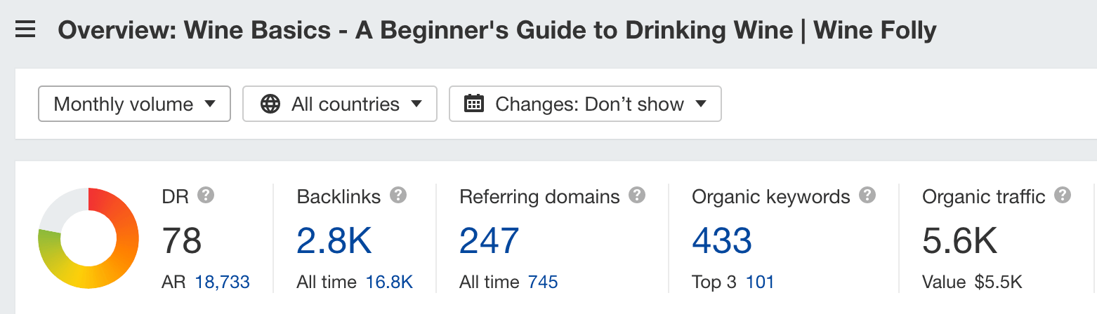
Wine Folly is a content site devoted to wine knowledge and appreciation. Its pillar page, as expected, is about wine.
Why I like it
Wine Folly’s pillar page is a classic example of a “hub and spoke” style pillar page—split into multiple sections, with some supporting text, and then internal links to other resources that support each subsection.

This page doesn’t just serve as a pillar page for ranking purposes, though. Given that it ranks well and receives quite a significant amount of search traffic, the page also has a call to action (CTA) to Wine Folly’s book:

Takeaway
While most websites design pillar pages for ranking, you can also use them for other purposes: capture email addresses, sell a book, pitch your product, etc.

Key stats
Estimated organic traffic: 11,100
Backlinks: 3,400
Referring domains: 457
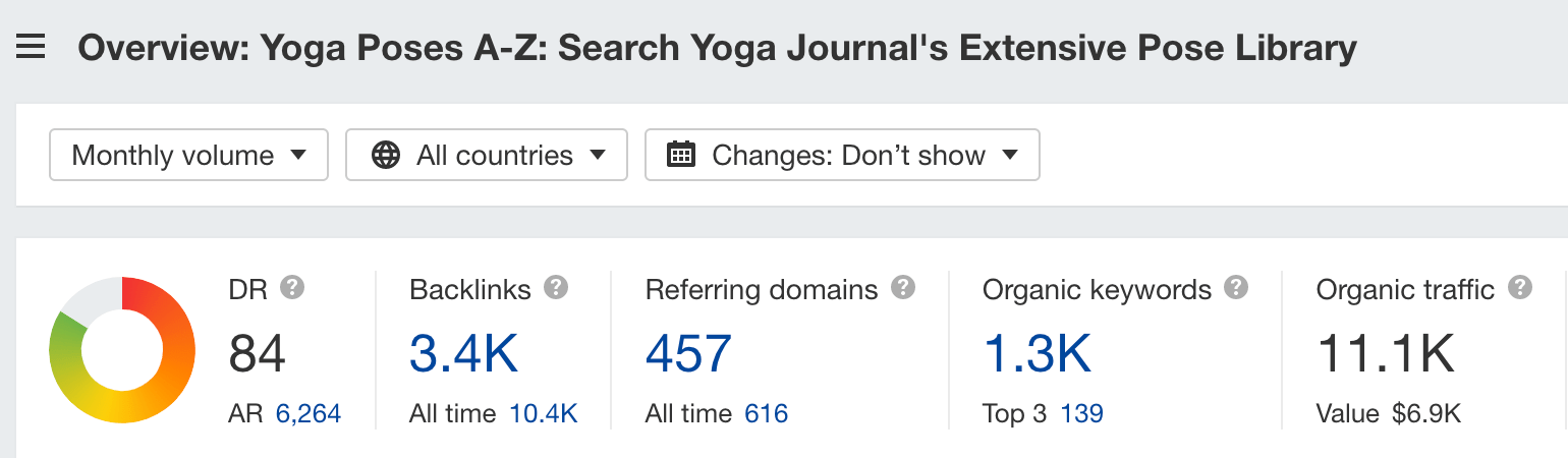
Yoga Journal is an online and offline magazine. Its pillar page is an A-Z directory of yoga poses.
Why I like it
Yoga Journal’s pillar page is straightforward and simple. List down all possible yoga poses (in both their English and Sanskrit names) in a table form and link to them.
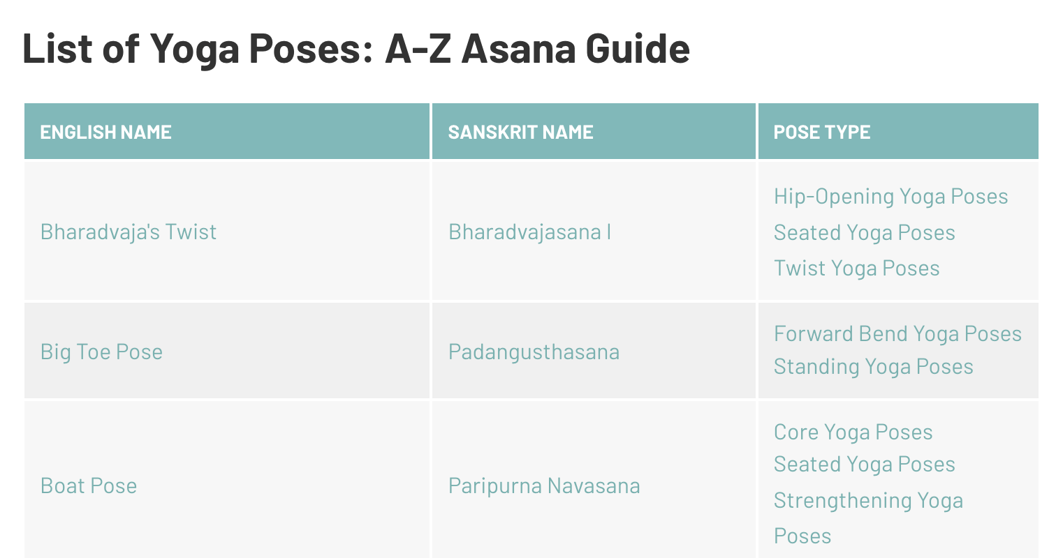
Since it’s listed in alphabetical order, it’s useful for anyone who knows the name of a particular pose and is interested in learning more.
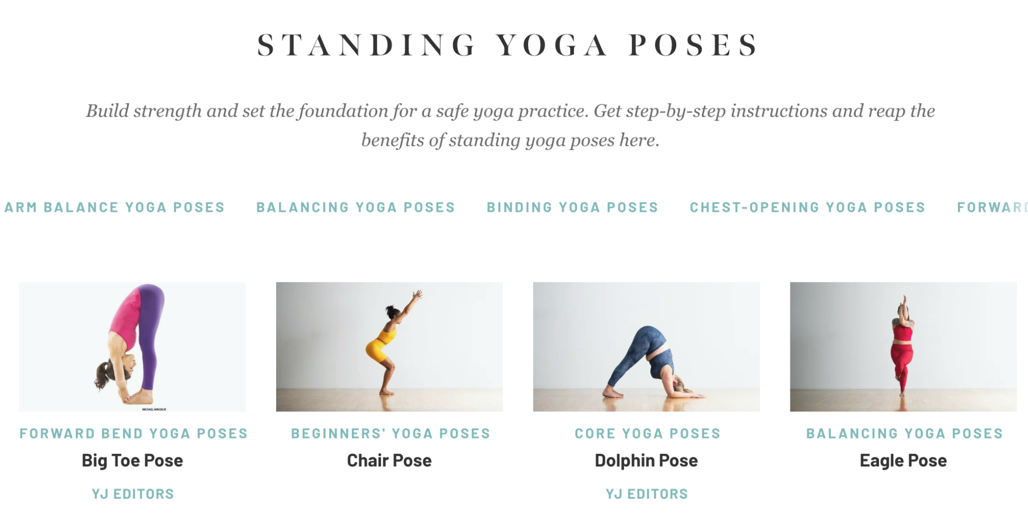
What I also like is that Yoga Journal has added an extra column on the type of pose each yoga pose belongs to. If we click on any of the pose types, we’re directed to a category page where you can find similar kinds of poses:
Takeaway
The A-Z format can be a good format for your pillar page if the broad topic you’re targeting fits the style (e.g., dance moves, freestyle football tricks, etc.).
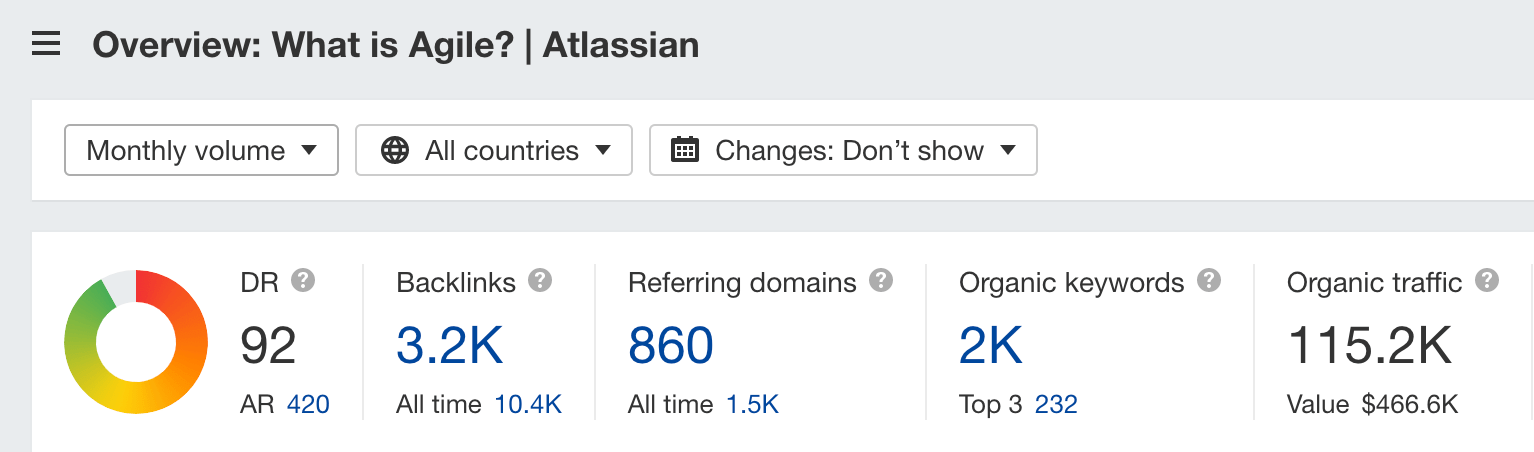
Key stats
Estimated organic traffic: 115,200
Backlinks: 3,200
Referring domains: 860
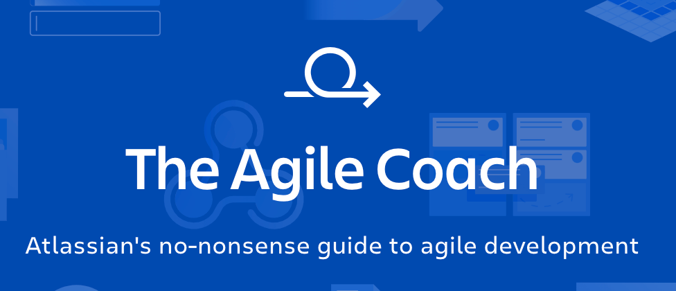
Atlassian is a software company. You’ve probably heard of its products: Jira, Confluence, Trello, etc. Its pillar page is on agile development.
Why I like it
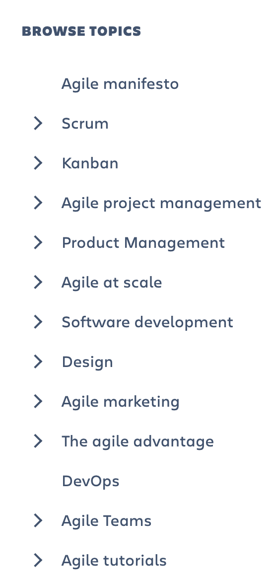
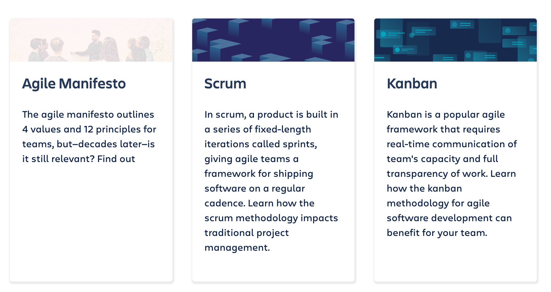
Atlassian’s pillar page is split into different topics related to agile development. It then has internal links to each topic—both as a sticky table of contents and card-style widgets after the introduction:
I also like the “Up next” feature at the bottom of the pillar page, which makes it seem like an online book rather than a page.

Takeaway
Consider adding a table of contents to your pillar page.

Key stats
Estimated organic traffic: 114,400
Backlinks: 2,900
Referring domains: 592
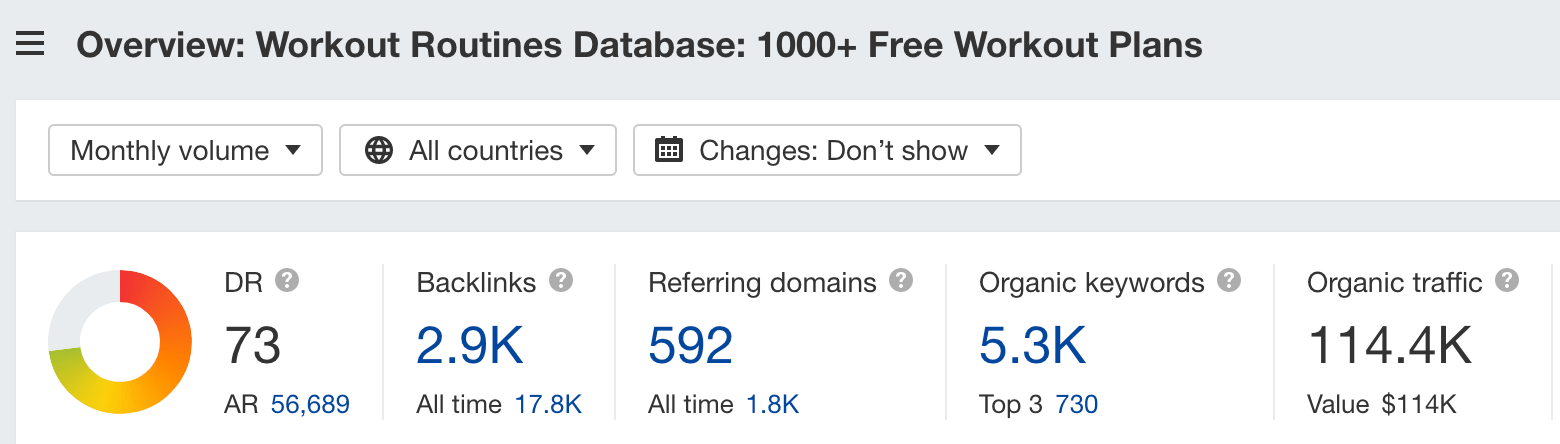
Muscle and Strength’s pillar page is a massive database linking to various categories of workouts.
Why I like it
Calling it a pillar page seems to be an understatement. Muscle and Strength’s free workouts page appears to be more like a website.
When you open the page, you’ll see that it’s neatly split into multiple categories, such as “workouts for men,” “workouts for women,” “biceps,” “abs,” etc.
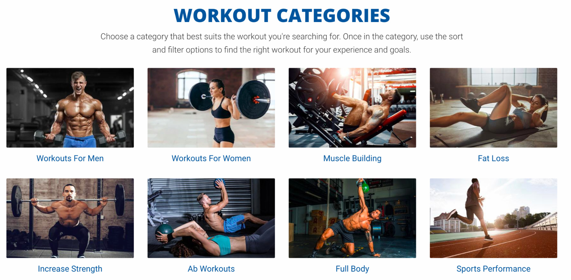
Clicking through to any of them leads us to a category page containing all sorts of workouts:
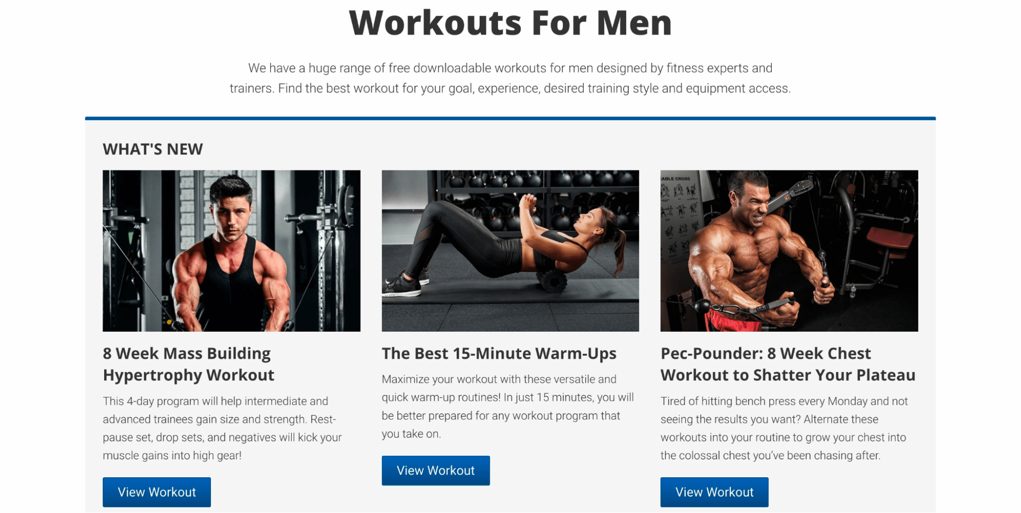
Compared to the other pillar pages on this list, where they’re linking to other subpages, Muscle and Strength’s pillar page links to other category pages, which then link to their subpages, i.e., its massive archive of free workouts.
Takeaway
Content databases, such as the one above, are a huge undertaking for a pillar page but can be worth it if the broad topic you’re targeting fits a format like this. Ideally, the topic should be about something where the content for it is ever-growing (e.g., workout plans, recipes, email templates, etc.).

Key stats
Estimated organic traffic: 39,100
Backlinks: 1,100
Referring domains: 308
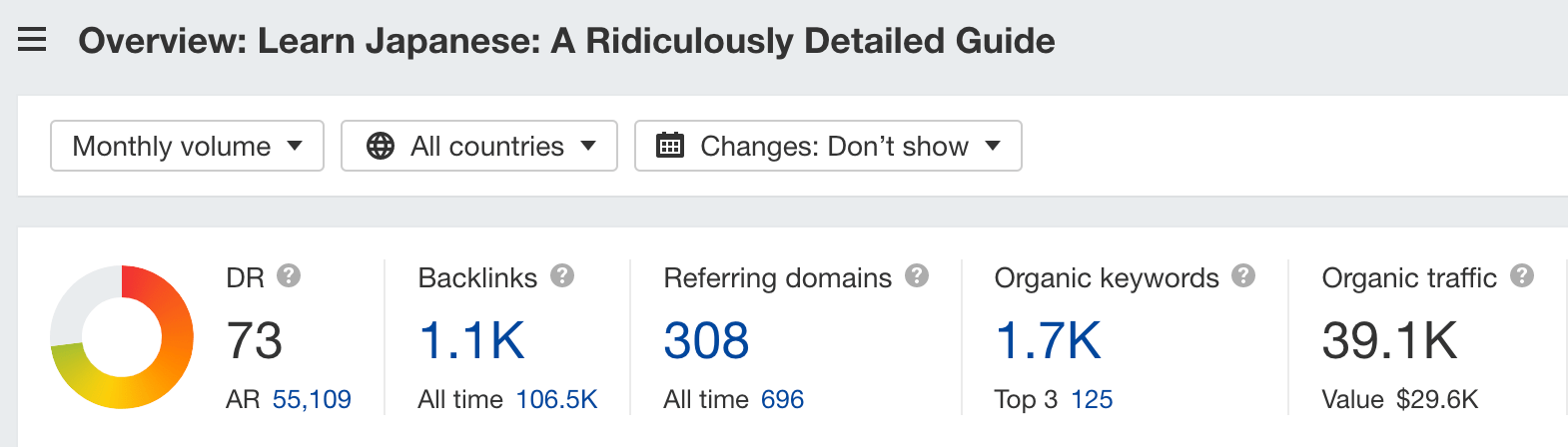
Tofugu is a site about learning Japanese. And its pillar page is about, well, learning Japanese.
Why I like it
This is an incredible (and yes, ridiculously good) guide to learning Japanese from scratch. It covers every stage you’ll go through as a complete beginner—from knowing no Japanese to having intermediate proficiency in the language.
Unlike other pillar pages where information is usually scarce and simply links out to further resources, this page holds nothing back. Under each section, there is great detail about what that section is, why it’s important, how it works, and even an estimated time of how long that stage takes to complete.
Another interesting aspect is how Tofugu has structured its internal links as active CTAs. Rather than “Learn more” or “Read more,” it’s all about encouraging users to do a task and completing that stage.

Takeaway
Two takeaways here:
- Pillar pages can be ridiculously comprehensive. It depends on the topic you’re targeting and how competitive it is.
- CTAs can be more exciting than merely just “Read more.”
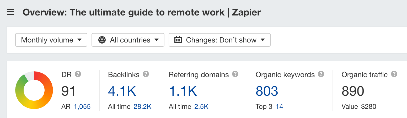
Key stats
Estimated organic traffic: 890
Backlinks: 4,100
Referring domains: 1,100
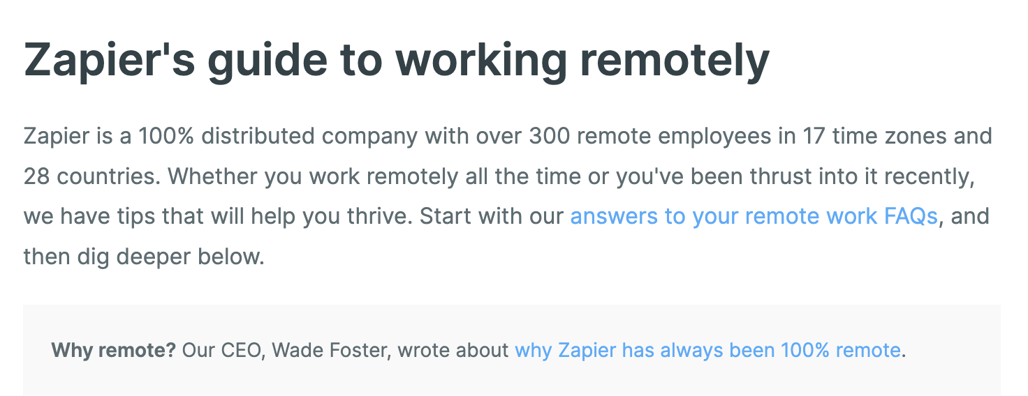
Zapier allows users to connect multiple software products together via “zaps.” It’s a 100% remote company, and its pillar page is about remote work.
Why I like it
Zapier’s pillar page is basically like Wine Folly’s pillar page. Break a topic into subsections, add a couple of links of text, and then add internal links to further resources.
In the examples above, we’ve seen all sorts of execution for pillar pages. There are those with custom designs and others that are crazily comprehensive.
But sometimes, all a pillar page needs is a simple design with links.
Takeaway
If you already have a bunch of existing content on your website, you can create a simple pillar page like this to organize your content for your readers.
Keep learning
Inspired by these examples and want to create your own pillar page? Learn how to successfully do so with these two guides:
Any questions or comments? Let me know on Twitter.