A mobile strategy is critical to your business presence, considering the saturation of mobile devices.
This is where app store optimization (ASO) comes into play.
In this article, you’ll learn:
- What is app store optimization?
- How does app store optimization work?
- How do you optimize for Google Play & Apple App Store?
Whether you are new to app store optimization or simply keen to refine your approach to ASO, this post shares practical insights that are proven to maximize app store success.
What Is App Store Optimization?
Downloads, usage, and in-app spending continue to rise, but many users prefer to use a select few apps more consistently.
Discoverability has never been harder, but the rewards of locking in loyal users are bigger than ever – so maximizing visibility in app stores is crucial.
App store optimization (ASO) describes the process of optimizing the listing pages for your mobile app in app stores like Google Play and Apple’s App Store.
You may come across alternative phrases like “app store marketing” or “mobile app SEO,” but they all refer to the same thing.
The goal is to maximize the visibility (and downloads) of your app for relevant searches – basically, SEO for your mobile app rather than your website.
In many ways, the optimization process for ASO is very similar to SEO; in others, not so much.
Ultimately, ASO aims to maximize app installs while product development works on monetization, engagement, retention, etc.
An effective app store optimization strategy keeps new users coming in while your development team (hopefully) keeps existing ones active and spending.
With the right retention rates, app store optimization acquires the new users you need to drive meaningful growth.
The goal of ASO is nearly always app downloads, but supplemental goals can include items such as:
- Increased brand exposure.
- Positive app reviews and ratings.
- More frequent and increased volumes of app reviews.
- Audience engagement.
- Additional marketing channel diversification.
How Does App Store Optimization Work?
If you’re new to app store optimization, it might help to think of it as SEO for your mobile app.
Except, rather than optimizing a website to show in search engines, you’re optimizing your mobile app listings for the relevant app stores.
In this sense, you could argue ASO is more like optimizing a Google Business Profile to show in Maps and local results.
The other key difference is you’ve got two major mobile app stores to optimize for: Google Play and Apple’s App Store.
These aren’t the only two app stores worth considering, especially if you’re developing apps for other devices (TVs, games consoles, etc.), but they are the biggest – by far.
According to Statista insights from Q3 2022, here are the top three app stores based on the number of available apps:
- Google Play: 3.55 million.
- Apple App Store: 1.64 million.
- Amazon Appstore: 0.48 million.
As a result, most ASO guides focus on optimizing app listings for Google Play and Apple App Store. Aside from being the top two platforms, the optimization process is a little different for each.
This is mostly due to each app store having its own algorithm – much like different search engines.
In practice, most app store algorithms are more alike than they are different. So, the basic principles of app store optimization apply to all of them. However, some stores may use the odd ranking signal that others don’t.
To keep this guide simple, we’ll start by running through the most common ranking signals for app stores, in general.
Then, we’ll take a closer look at Google Play and Apple App Store to see how they’re different.
Organic Optimization: Your ASO Foundation
The key ingredient missing from many ASO marketing delivery approaches is organic search optimization and integration of app stores within the broader organic marketing mix.
There is more overlap between ASO and SEO than direct competition between the two.
The integration of these areas, and the application of consistent focus on ASO, can support numerous search marketing gains.
You may be surprised to discover that many of the traditional search engine optimization tactics that work for search engine performance, such as Google and Bing, can also be directly applied to ASO.
Examples of this include:
- App name, title, and URL optimization.
- Keyword research for ASO.
- App rating and reviews generation and handling.
- Deep linking within mobile apps.
- Indexation of Apps in Google search engine results pages (SERPs).
- Click-through rate (CTR) optimization.
The biggest marketing mistake, however, when it comes to integrating SEO and ASO is overlooking the role of the website in driving volumes of referral visits directly to your store page and app downloads section.
Your website should be seen as the driving force behind leading people throughout the information-seeking and buying funnel from your main online entity (your website) through to an engaged, ready-to-buy/download audience (your app store).
As content levels are limited within the app stores themselves, the more you can leverage your website content to increase app awareness and discovery to build external app authority and visibility, the greater the value, traffic, and downloads your app will receive.
The Most Important App Store Ranking Factors
Like search engines, app stores don’t reveal the details of their algorithms to the public.
That being said, the following seven ranking factors are key, functional components of all major app stores:
- App name or title.
- App descriptions (including keywords).
- Installs.
- Engagement.
- In-app purchases and events.
- User reviews.
- Updates.
You can break these ranking factors into three categories: discovery, conversion, and validation.
Discovery signals help app stores connect your app with relevant searches. This includes your app name /title, description, keywords, and other contextual signals.
Conversion signals tell app stores that your listing compels users to download your app – a strong indicator that your listing should show for more relevant searches.
Finally, you’ve got validation signals (engagement, in-app purchases/events, reviews, reports/flags, etc.). These help app stores determine whether users get a positive experience after installing your app.
Positive validation signals (strong engagement, positive reviews, etc.) are an even stronger indicator that app stores should show your app to similar users.
What Do Users Want From An App Store Listing?
Optimizing your app listing for visibility is one thing; getting users to actually download your app is something else entirely.
The catch-22 here is that installs directly impact your ranking in app stores.
The more people install your app, the higher it should rank. This, in turn, should result in more installs, higher rankings once again – and so forth.
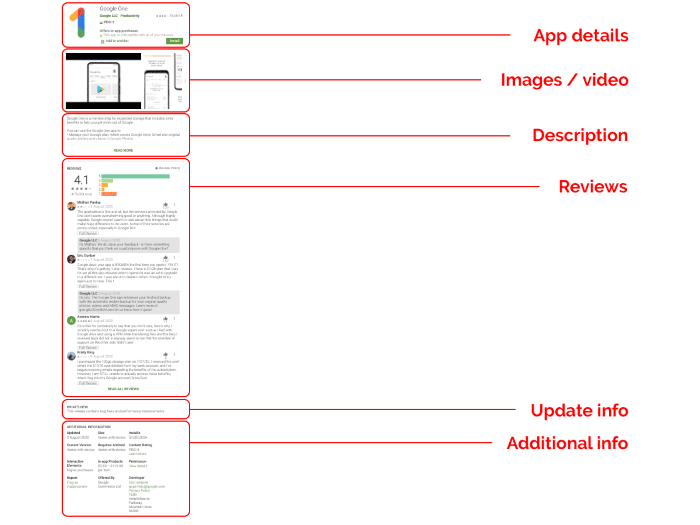
So, what are the key factors on your mobile app page that determine whether users hit the install button?
- App icon: On most app stores, your app icon is the most visually prominent element on results pages and recommendation lists.
- App details: This includes your app name/title and, usually, some short descriptive text explaining the purpose of your app.
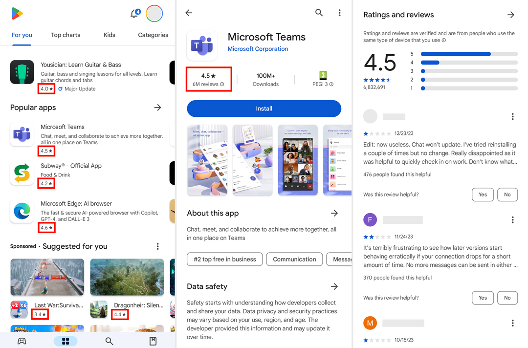
- App rating: Most platforms show the average rating/review score for your app in search results and at the top of your app listing page.
- App description: With Google Play and the App Store, users can see a brief description on your listing page and they can click to see the full description – so that first sentence or two is crucial.
- Visuals: This includes any feature images, screenshots, and demo videos that you can add to your listing, showcasing the key benefits and user experience of your app.
- User reviews: Unless users are already familiar with your app, they’re probably going to browse through some reviews from existing users.
Here, you can see this in action.
 Screenshot from Google Play, February 2024
Much like SEO, app store optimization is a careful balance of optimizing to maximize visibility in app stores while prioritizing the needs of your users.
Google Play Vs. App Store: Key Differences
Google Play and the App Store are more similar than different when it comes to app store optimization.
Firstly, the ranking factors are very similar, and the differences are mostly technical – for example, Google and Apple handle keywords differently.
Here’s a quick summary of the main ranking factors for Google Play and the App Store.
| App Store | Google Play |
| Listing | Listing |
| App name | App title |
| Subtitle | Short description |
| Long description | |
| Keywords (app name, keyword field) | Keywords (all inputs), incl. keyword density |
| Ratings & reviews | Ratings & reviews |
| Listing CTR | Listing CTR |
| App performance | App performance |
| Downloads | Downloads |
| Engagement | Engagement |
| Uninstall rate | Uninstall rate |
| In-app purchases | In-app purchases |
| Updates | Updates |
As you can see, there’s not much of a difference here – in fact, most of your time will be spent on things like specifications for icons, videos, and other assets for each app listing.
As a general rule, Apple is more strict with its developer guidelines and it’s usually harder to get an app approved for the App Store.
So, if you’re promoting iOS and Android apps, optimizing your listings for Apple’s guidelines will often satisfy both app stores while maintaining consistency and reducing workload.
Now, let’s take a closer look at app store optimization for Google Play and, then, the App Store.
App Store Optimization For Google Play
To give your app listing the best possible start, you’ll want to dedicate the most time to the following nine elements:
- App title.
- App category.
- App descriptions.
- App icon.
- Feature graphic.
- Screenshots.
- Promo video.
- App rating and reviews.
- Google Play Android Vitals.
We’ll take a closer look at optimizing each of these elements, but always refer to official Google guidelines while managing app listings for Google Play.
App Title
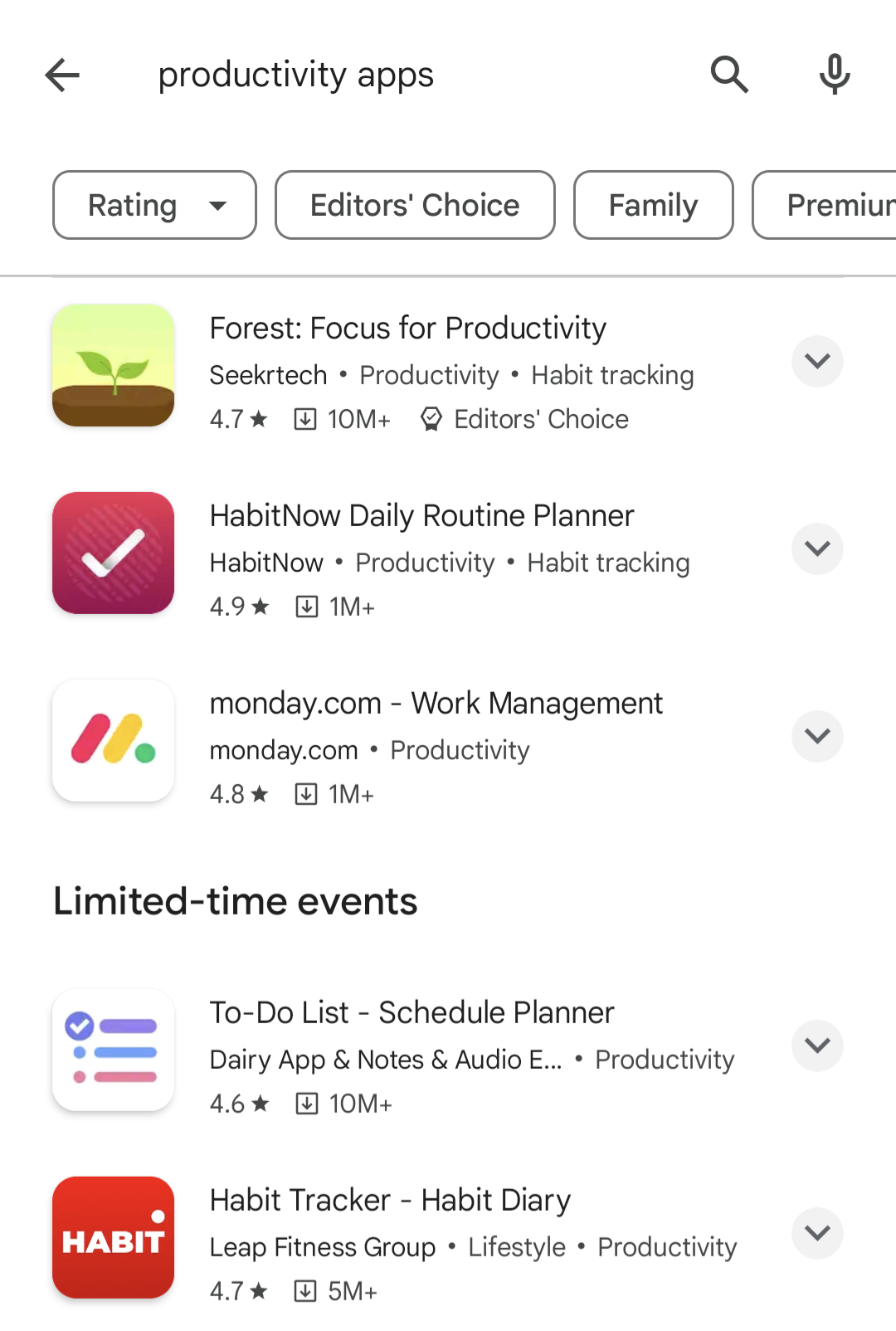
Optimizing your app title for Google Play will feel familiar if you’re used to optimizing website titles for search.
You want to start with the product/branded name of your app and then include a brief description – in no more than a few words – using your primary keyword.
 Screenshot from Google Play, February 2024
You can use up to 30 characters in your app title, but try to keep it as short and punchy as possible.
Prioritize accuracy over keyword targeting and highlight the key benefits of using your app.
App Category
Selecting the right category for your app is essential for matching with relevant searches.
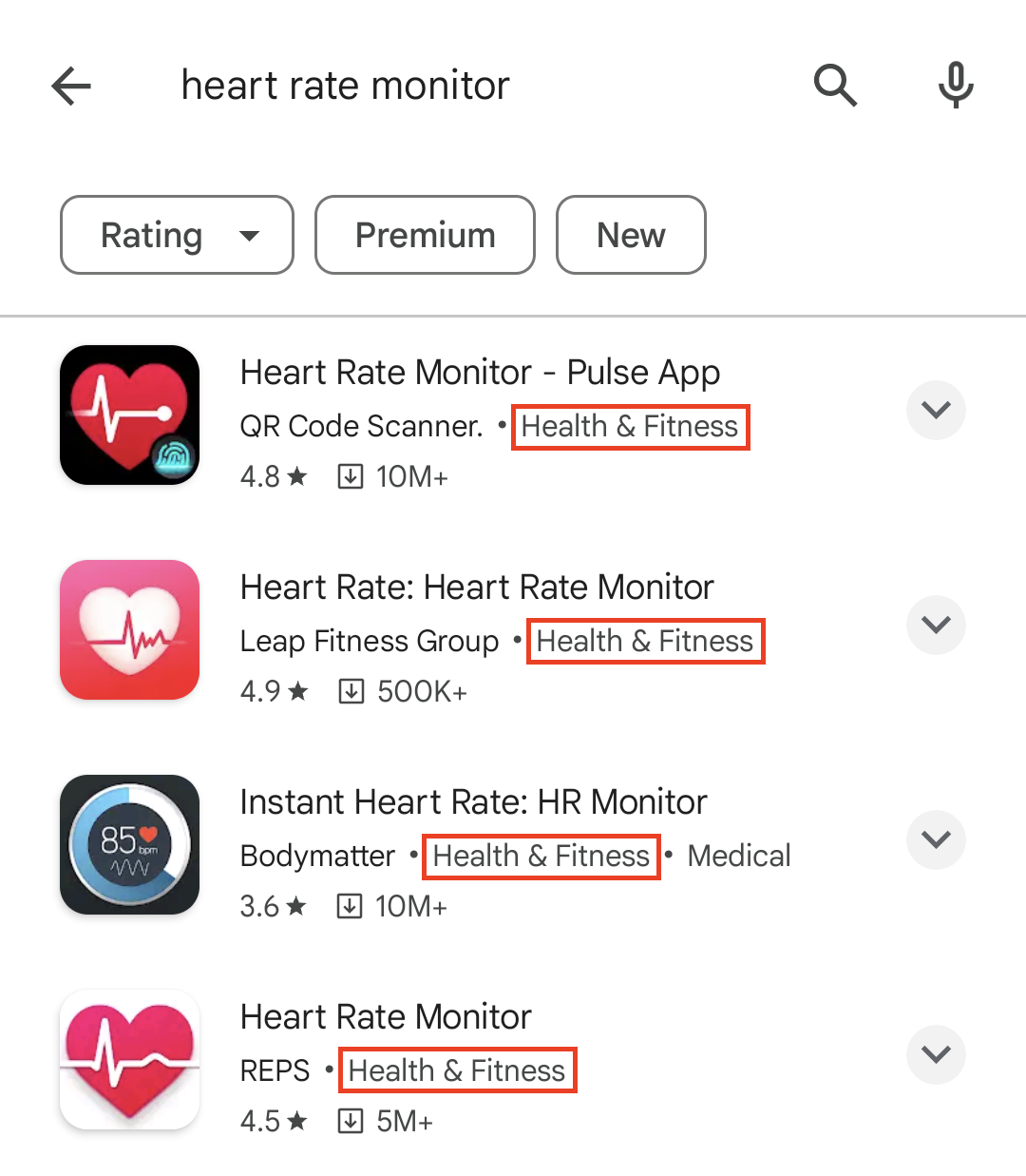
For example, let’s say you’re promoting a heart rate monitoring app. In this case, “Health and Fitness” is the most appropriate category.
 Screenshot from Google Play, February 2024
When users specifically search for “heart rate monitor,” the keywords in your title are a stronger signal.
However, your app category can help your app show for more general searches like “health and fitness apps” or “productivity apps.”
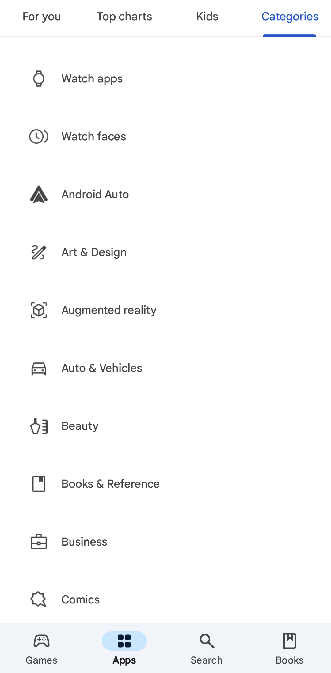
Crucially, users can also browse categories in the Google Play store to discover new apps without searching.
 Screenshot from Google Play, February 2024
For more info on selecting the right app category for Google Play, take a look at this Play Console Help page.
Short & Long Descriptions
In Google Play, your app listing includes two descriptions: A short description that shows under the About this app preview and a full description that users can reveal by clicking on the arrow highlighted below.
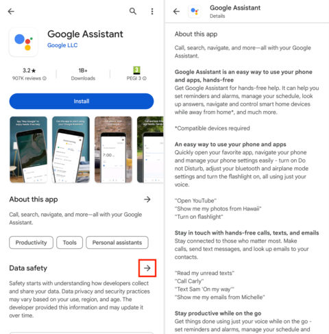
You can use up to 80 characters for your short description and 4,000 characters for your full description.
In your short description, try to describe the core functionality of your app in the most compelling way possible.
Accuracy is key here, but you want to convince users to install your app – so highlight the most attractive benefits.
Your full description provides a more in-depth summary of what your app offers.
Remember that most people won’t click through to read the full description, and those who do are looking for information, not a sales pitch.
You’ll find Google’s official guidelines for creating app descriptions under the “App descriptions” section of this Play Console Help page.
App Icon
App icons show on the left side of search listings in Google Play and the top-right of app listing pages.
![]()
These are the most prominent elements on app store results pages.
Ideally, you want an app icon that either visually describes the role of your app or leverages your brand image as a differentiator.
Designing a unique icon is more challenging if your app has a specific purpose and many competitors – e.g., a heart monitoring app.
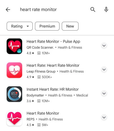
If this applies to your app, use design principles like contrast to make your listing stand out from other results.
Notice how Pulse App’s Heart Rate Monitor app stands out from the other listings above?
This is thanks to a combination of simple iconography with strong contrast, using a black background to stand out from the white Google Play results page.
Compare this to the REPS app, which uses similar iconography without a black background, and the Bodymatter app, which uses a black background but a more complex design.
Google Codelabs has an excellent tutorial on designing and previewing app icons. It includes best practices and tips for making an icon that stands out on results pages and the latest Android features, such as adaptive icons.
Feature Graphic And Promo Video
Feature graphics show on your app listing page and can also show for branded searches, paid ads, or recommendation sections on Google Play.
Until recently, you could only use images as featured graphics, but you can now use promo videos in their place.
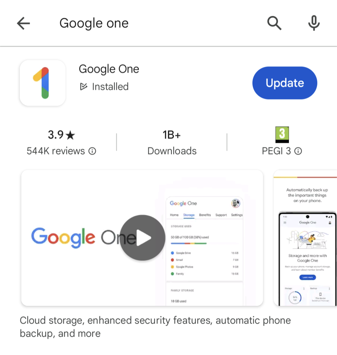 Screenshot from Google Play, February 2024
This is one of the most visible assets on your Google Play listing, so use feature graphics to capture attention and showcase the best of your app.
Google suggests:
“Use graphics that convey app or game experiences, and highlight the core value proposition, relevant context, or story-telling elements if needed.”
You’ll find more guidance on creating feature graphics under the Preview assets section of this Play Console Help page.
App Screenshots
App screenshots show in the same horizontal panel as feature graphics on your app listing page.
They’re designed to showcase the best features of your apps while showing users what the in-app experience looks like.
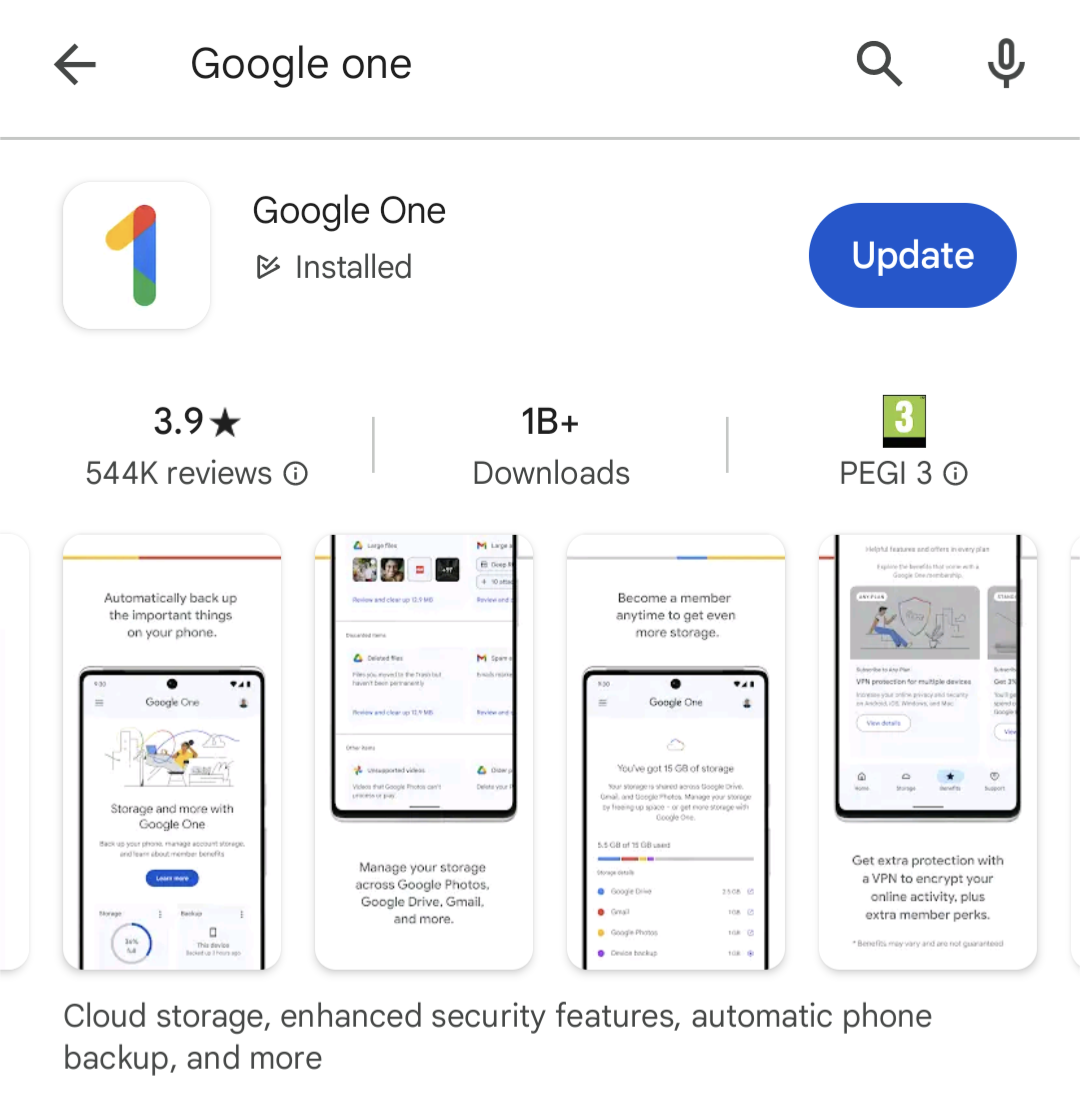 Screenshot from Google Play, February 2024
You can include descriptive text in your screenshots to emphasize the key benefits of your app’s most important features.
Keep things descriptive, though.
Google prohibits the inclusion of performative or ranking text in screenshots, such as “app of the year” or “most popular…” and promotional information like “10% off” or “free account.”
If your app supports multiple languages, you’ll need to provide screenshots for each language version, including any translated descriptive text.
See the screenshots section of this Play Console Help page for more info.
App Ratings & Reviews
App ratings show prominently in results and at the top of the app listing pages in Google Play. Besides this, you’ve also got a prominent Ratings and reviews section as the largest element on your listing page.
 Screenshot from Google Play, February 2024
Aside from being a ranking factor, app ratings and reviews are one of the biggest trust factors that help users choose which apps to install.
You don’t need perfect review scores but a positive (3.5+ stars) is a great asset for rankings and installs.
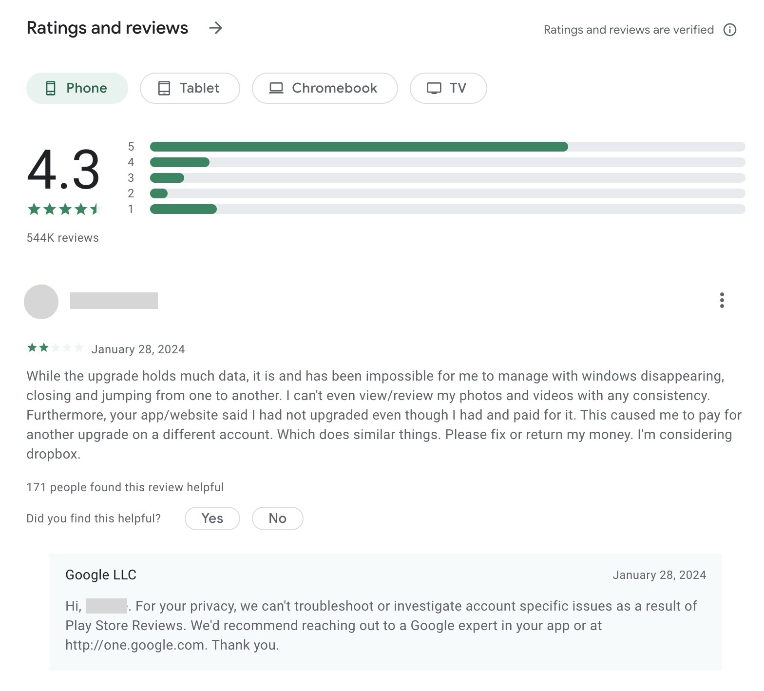
Your review profile also allows users to view the feedback left by others – and how you respond. Once again, how you deal with user problems is often more important than the scores or feedback itself.
You’ll need a framework in place for generating regular reviews and replying to them, engaging with reviewers, and solving user issues.
Your replies are also visible, so avoid generic responses – show new, potential users how good you are at dealing with problems.
In fact, don’t take inspiration from Google’s own support team for Google One. Privacy is great, but the tone of the reply below is more dismissive than helpful, and the exact same response appears throughout replies.
 Screenshot from Google Play, February 2024
This feedback can also help you develop a stronger product, and users often edit their reviews, following updates or resolved tickets.
Always remember: Long-term revenue is the goal, which starts with quality app experiences, engagement, and retention.
Google Play Android Vitals
Google provides an extensive toolkit for optimizing your mobile app. Its Android vitals initiative sets out the most important usability metrics that affect the visibility of your app on Google Play.
If you’re used to optimizing websites for search, this will sound a lot like Google’s Core Web Vitals.
The principle Android vitals is similar in terms of performance affecting your search ranking, but this is a far more extensive initiative than Core Web Vitals, as it stands.
Android vitals are broken into two key components:
Core vitals
All other vitals
To maximize the visibility of your app in Google Play, keep the user-perceived crash rate below 1.09% across all devices and 8% per device, with the user-perceived ANR rate below 0.47% across all devices and 8% per device.
 Screenshot from developer.android.com, February 2024
Take a look at the official Android vitals documentation page for more information.
App Store Optimization For App Store
For the App Store, we’ve also got nine key elements to optimize, but they’re not quite the same as Google Play:
- App name.
- App subtitle.
- Categories.
- Keywords.
- Description.
- App icon.
- App previews.
- Screenshots.
- App ratings and reviews.
One of the key differences here is how the two platforms handle keywords. While Google analyzes your whole listing for keywords, Apple provides a single field for you to add keywords.
Again, always refer to official Apple documentation when optimizing listings for the App Store.
App Name
In the App Store, your app name simply provides a recognizable and memorable name for your mobile app.
You don’t need to worry about keywords or descriptive text here – that comes later.
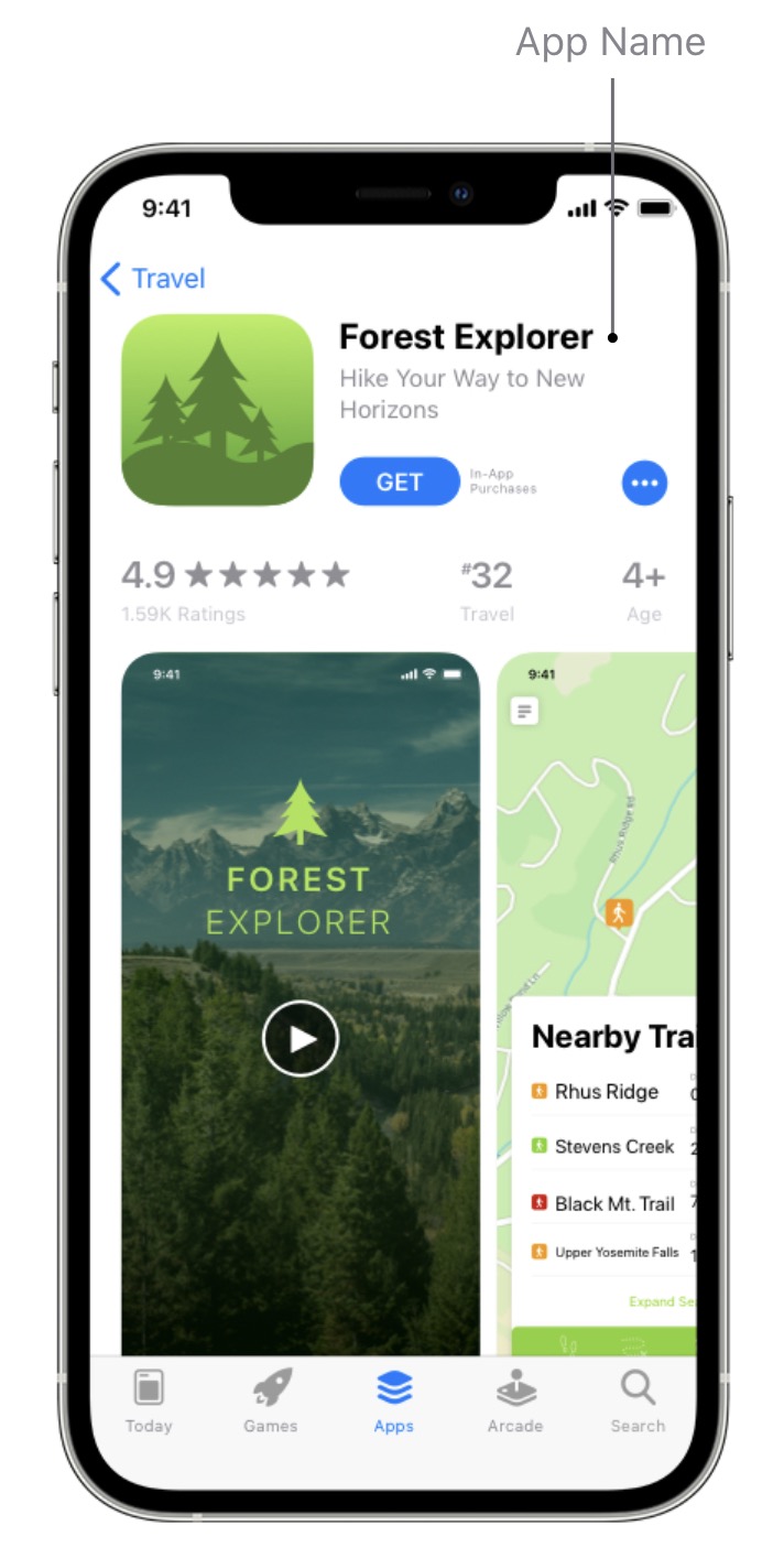 Screenshot from App Store, February 2024
For now, concentrate on coming up with an app name that’s easy to remember and spell while somewhat describing what your app does.
Apple offers the following advice:
“Choose a simple, memorable name that is easy to spell and hints at what your app does. Be distinctive. Avoid names that use generic terms or are too similar to existing app names.”
You can use up to 30 characters for your app name in the App Store, but try to keep it as short and punchy as possible.
App Icon
As with most app stores, the app icon is one of the most prominent elements as users browse the iOS app store. Apple provides extensive design guidelines for app icons and it’s more strict than most.
So, if you’re promoting your app across the App Store, Google Play, and any other platforms, you might want to start with Apple first. In most cases, this makes it easiest to maintain a consistent design across all platforms.
Generally speaking, the same design principles apply. Keep it simple and impactful with intelligent use of iconography, color, and contrast.
Look at your competitors and try to come up with something that stands out from the other apps your target audience is likely to see.
Subtitle
Your app subtitle provides a brief description below the app name. Use this to highlight the purpose and benefits of your app in the most compelling way possible.

This is your first opportunity to excite potential users about your app, so try to make an impression here. You’ve only got 30 characters to work with, which means punchy subtitles tend to do best.
You’ll want to test and refine your subtitles over time, paying close attention to CTRs and installs as you try different variations.
Categories
As with Google Play, categories are key for discoverability in the App Store.
You can assign primary and secondary categories for iOS apps to help users find your app; the primary category has the strongest weight. – so choose the most relevant one.
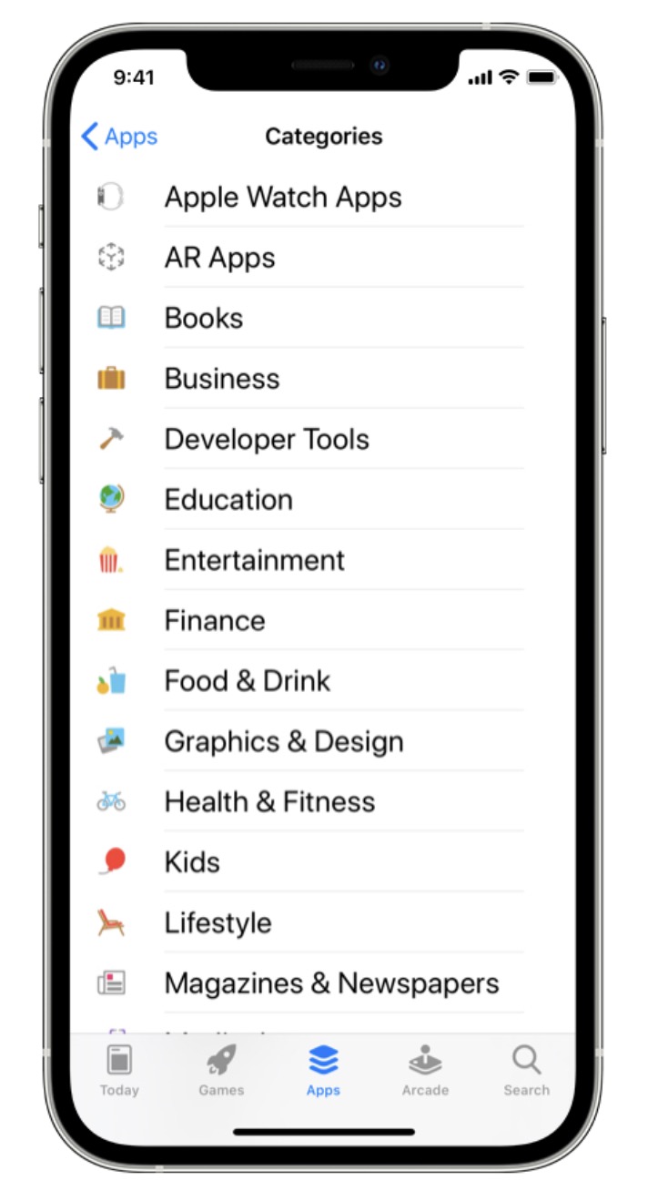 Screenshot from App Store, February 2024
Apple provides extensive guidance for choosing app categories. Make sure you follow Apple’s guidance because selecting the wrong categories violates the App Store guidelines.
In some cases, you may find multiple categories that match your app.
For example, if you’re running a photo-sharing social media app, you could select either Photo & Video or Social Networking as your primary category.
In such cases, Apple suggests considering the following:
- Your app’s purpose: Your primary category should be the one that best describes your app’s main function or subject matter.
- Where users look for an app like yours: Understanding your audience will help you identify the category in which they will likely look for your app. Will they consider your app more of a social network or a photography app?
- Which categories contain the same type of apps as yours?: Research how similar apps are categorized — users may already know to visit these categories to find this type of app.
If multiple categories accurately reflect the purpose of your app, you’re unlikely to run into any violation issues.
At this point, it’s more a question of which category matches the search and everyday use of your app – not only to maximize visibility but also to set the right expectations for users who install your app (think engagement and retention).
Keywords
While Google Play looks for keywords throughout your app listing (similar to how Google Search analyses web pages), the App Store provides a dedicated keywords field.
You can use up to 100 characters to add keywords (separated by commas – no spaces) to help users discover your app. Apple offers the following advice for choosing keywords:
“Choose keywords based on words you think your audience will use to find an app like yours.
Be specific when describing your app’s features and functionality to help the search algorithm surface your app in relevant searches.”
Apple also recommends considering “the trade-off” between ranking well for less common terms versus ranking lower for popular terms.
The most popular keywords may generate a lot of impressions and traffic, but they’re also the most competitive, which can impact CTRs and installs.
App Description
Your app description should provide a short, compelling – and informative – description of your app, highlighting its main purpose and benefits.
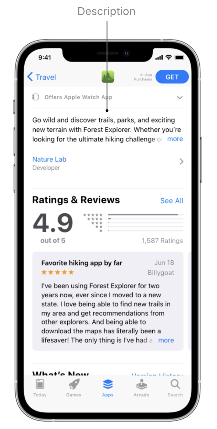
Similar to Google Play, you can use up to 4,000 characters in your app description, but users can only see the first two lines (and most of the third) without clicking to see more.
Apple suggests the following:
“Communicate in the tone of your brand, and use terminology your target audience will appreciate and understand. The first sentence of your description is the most important — this is what users can read without having to tap to read more.”
 Screenshot from App Store, February 2024
If you want to update your app description, you’ll have to resubmit your app listing, so it’s important to try and get this right and only make considered changes.
You can also add up to 170 characters of promotional text to the top of your app description.
Crucially, you can change this text at any time without having to resubmit your app listing, making this a great place to share the latest news and info about your app – such as limited-time sales, the latest features, or fixes from the last update.
App Previews
App previews are the App Store equivalent of promo videos.
You can add up to 30 seconds of footage to illustrate the key benefits of your app and the experience of using it.
 Screenshot from App Store, February 2024
Again, Apple has strict guidelines and specifications for app previews – make sure you tick all the right boxes.
As with most things, if you’re listing your app in the App Store and Google Play, getting your app preview approved for the App Store first should mean you can use the same format for Google Play – as long as you include footage from the Android version of your app.
Screenshots
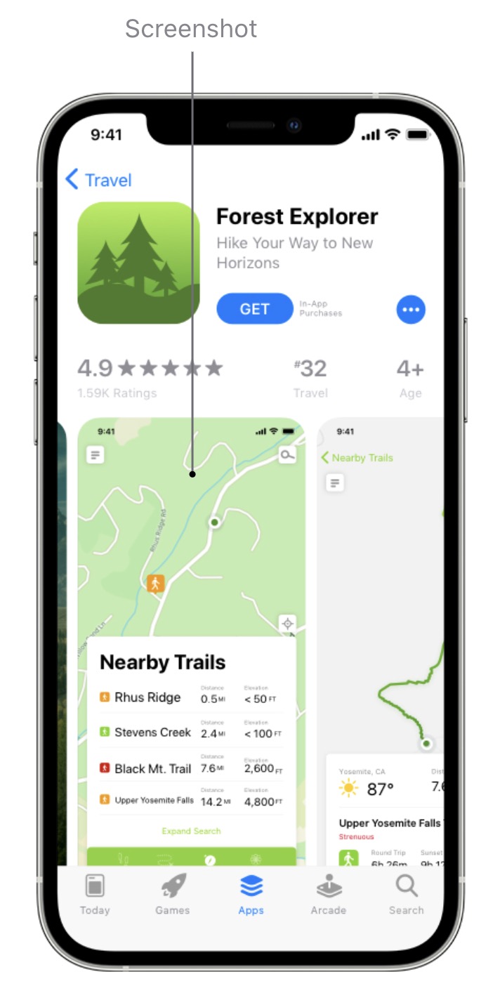
You can add up to 10 screenshots to your app listing for the App Store.
If you don’t have an app preview, the first one to three screenshots will show in search results, so make sure these highlight the core purpose of your app.
 Screenshot from App Store, February 2024
In your remaining screenshots, you can focus on the main features or benefits of using your app.
Try to stick to one feature or benefit per screenshot to communicate each purpose clearly.
App Ratings & Reviews
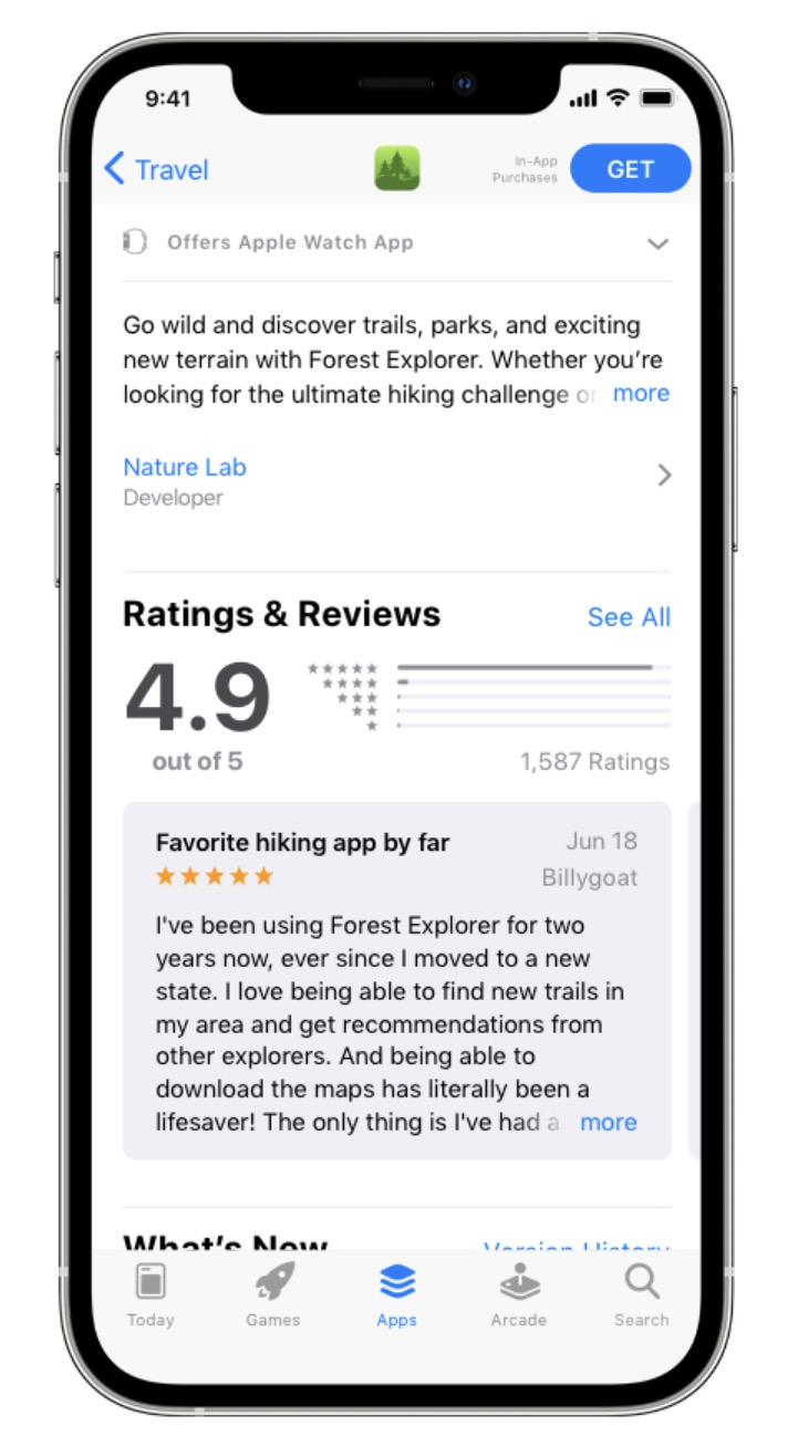
Once again, app ratings and reviews are important for maximizing visibility and installs in the App Store.
If anything, user reviews are more prominent in the App Store than Google Play, but we can’t say whether this has any meaningful impact on downloads.
 Screenshot from App Store, February 2024
The same general principles apply here: try to develop a regular stream of reviews and manage a positive app rating.
Again, you don’t need perfect scores, but you do need to respond to user reviews and address potential issues.
Prioritize negative reviews and respond as quickly as possible with responses that deal with issues – avoid generic, unhelpful responses.
Extra App Store Optimization Tips
App store optimization is an ongoing process that needs ongoing attention. Getting your listings approved for app stores is only the beginning.
Maximizing visibility and – more importantly – revenue from your mobile apps requires a complete product development strategy.
Here are some final, additional tips to help you drive long-term success from app store optimization:
- Know your KPIs: Don’t get distracted by the wrong metrics and KPIs – know what you’re optimizing for and center every decision around your business goals.
- Prioritize user experience: Visibility is one thing, but you’re not going to maximize it or take full advantage of it if people uninstall your app or rarely use it – so make sure quality product development and UX design are at the heart of your ASO strategy.
- A/B test key app store elements: Test and optimize the most important elements on your app listings to increase visibility, CTRs, installs, and retention (descriptions, videos, screenshots, reviews, etc).
- Master each app store’s analytics system: Google Play and the App Store both provide capable (albeit in different ways) analytics systems to help you improve visibility, revenue, and product quality – so make full use of them.
- Promote your app with ads: Both Google and Apple provide dedicated ad systems for their respective app stores to get your app in front of more eyes.
- Promote your apps outside of app stores: Use other marketing channels to promote your apps – social media, app directory websites, app review websites, affiliate marketers, tech publications, etc.
- Localize your app listings: App stores can connect you with global audiences, but only if you optimize your listings for each target language and location (this is called localization) – with translated text, screenshots, videos, etc.
Conclusion
The mobile app industry still shows growth despite smartphone penetration being way past saturation.
Smartphones aren’t the only devices in people’s lives anymore, either.
Apple Vision Pro launched with over 600 compatible apps, opening another space for mobile experiences beyond the confines of traditional smartphones.
App store optimization (ASO) will become more complex as new devices and app stores emerge.
However, the rewards will also grow, and the companies already mastering ASO for today’s app stores will be first in line to benefit as emerging technologies bring new opportunities.
More Resources:
Featured Image: Billion Photos/Shutterstock
