Great navigation is a crucial element to get right on your website for two main reasons.
First, it affects your user experience—helping users find what they want will result in more conversions.
Second, it helps search engines. Because good navigation will help them better understand how you’ve organized your site and ensure PageRank flows to the most beneficial pages.
But how can you improve navigation to help users find what they’re looking for and benefit your SEO?
This article will explain precisely that.
Website navigation is the process of a user interacting with a website by selecting links, buttons, and other elements to discover the content on a site.
While website navigation describes users clicking on links, there are standard components that facilitate that navigation. Some of these include:
- Breadcrumbs
- Sidebars
- Mega menus
- Dropdowns
- Tabs
- Accordions
I’ll explain each one and how you can use them later on in the guide.
Before we dive into the navigation components and how they can help users navigate websites, it’s important to understand how users actually navigate sites.
There are three main ways, starting with forward navigation.
Forward navigation
This type of navigation helps users explore deeper within a site hierarchy, often to find more specific content within the same topic area.
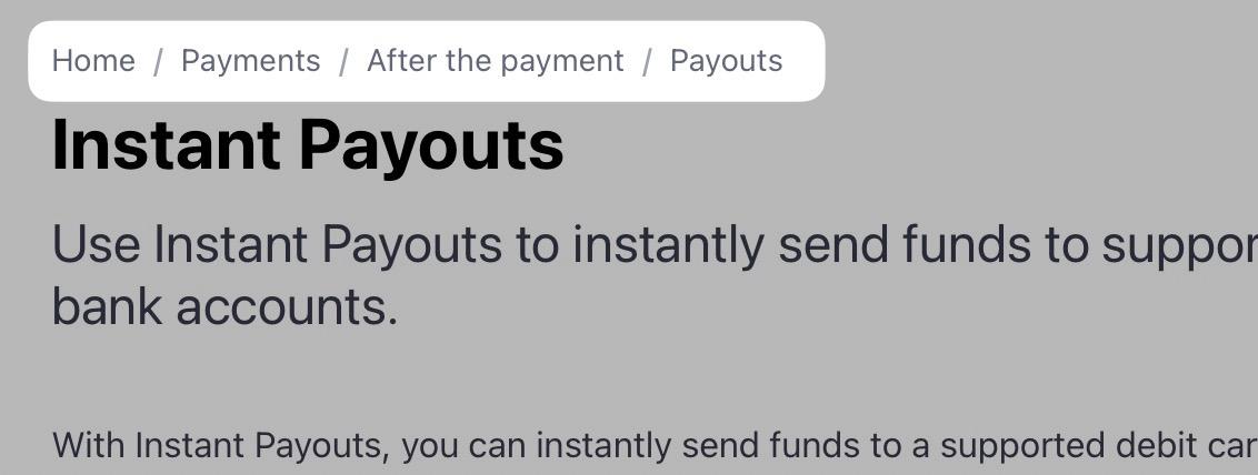
Here’s an example of typical forward navigation using Stripe’s documentation area.
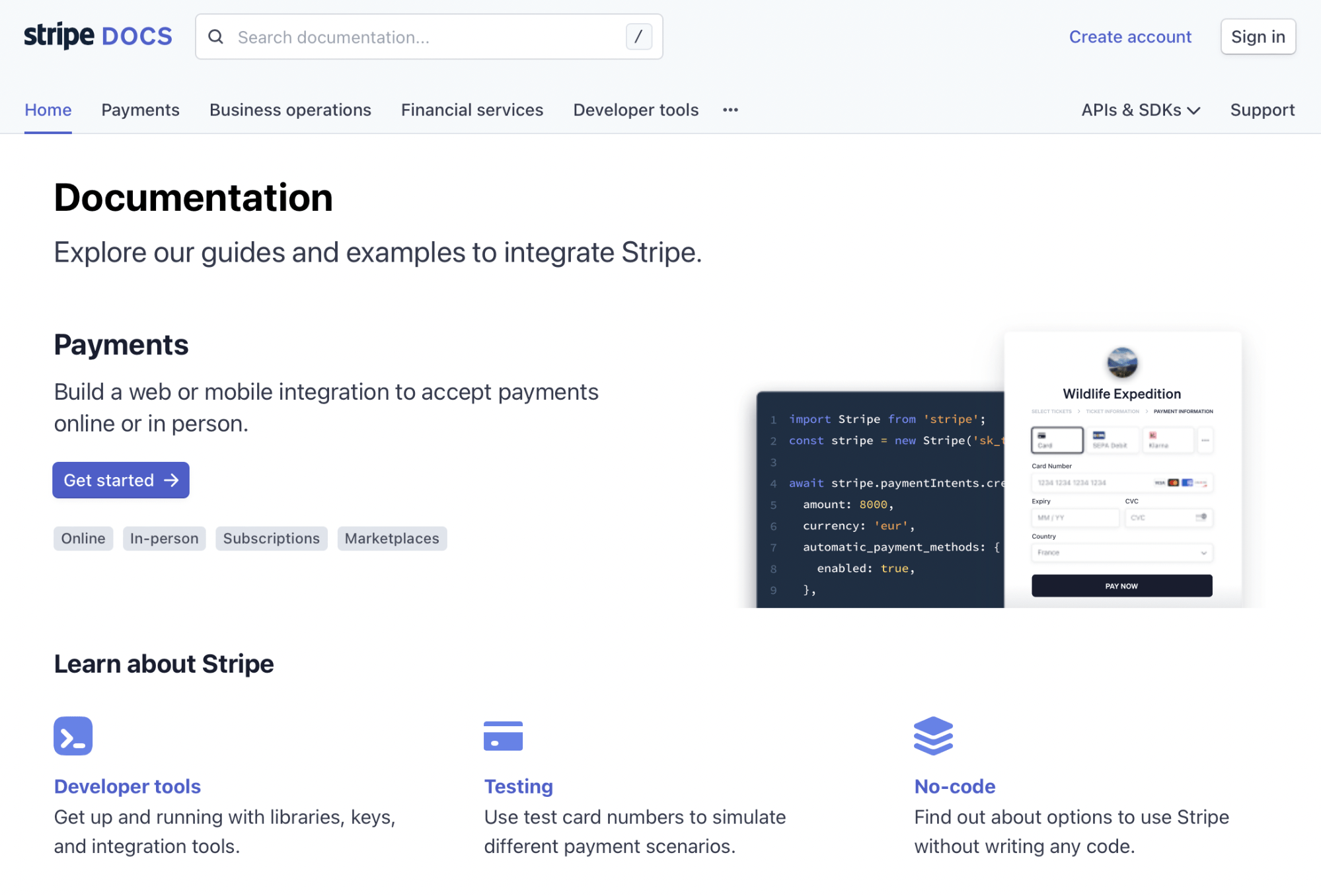
First, a user may start on the main documentation page. They then scroll and select the payments documentation link.
On the next page, they select to view all “After the payment” documentation.
Then they navigate to “Receive payouts.”
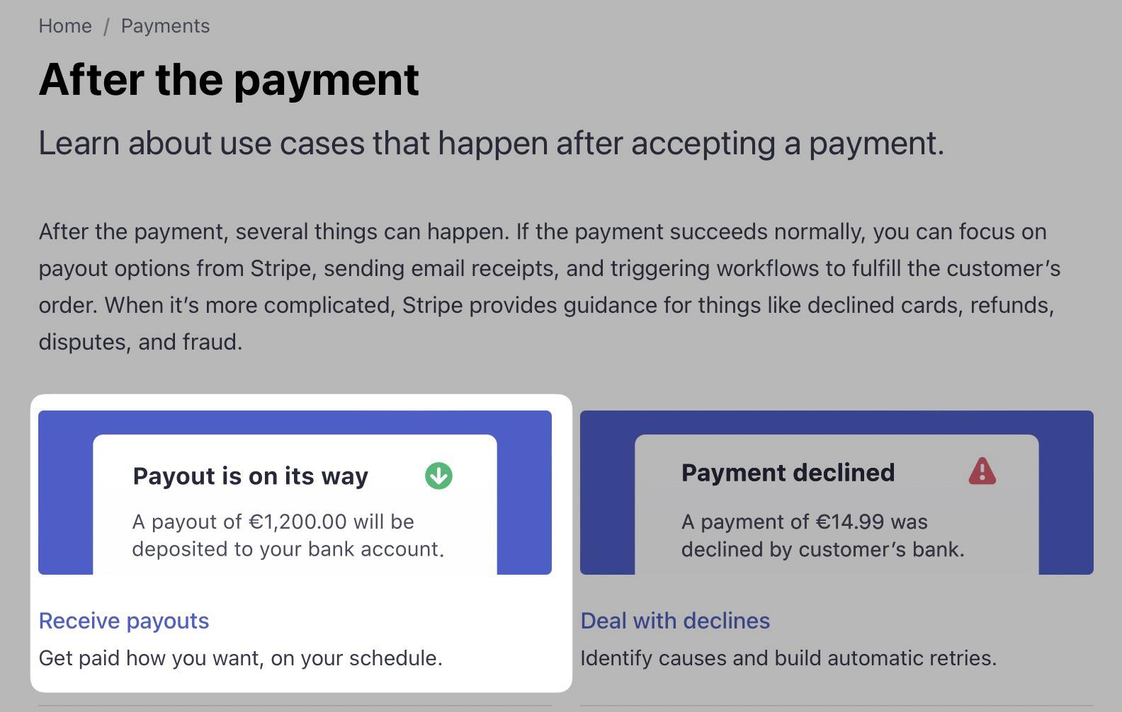
And finally, to “Instant Payouts.”
In this scenario, the user has navigated deeper within the site hierarchy, going from a broad topic like documentation to more specific subtopics like payments and payouts.
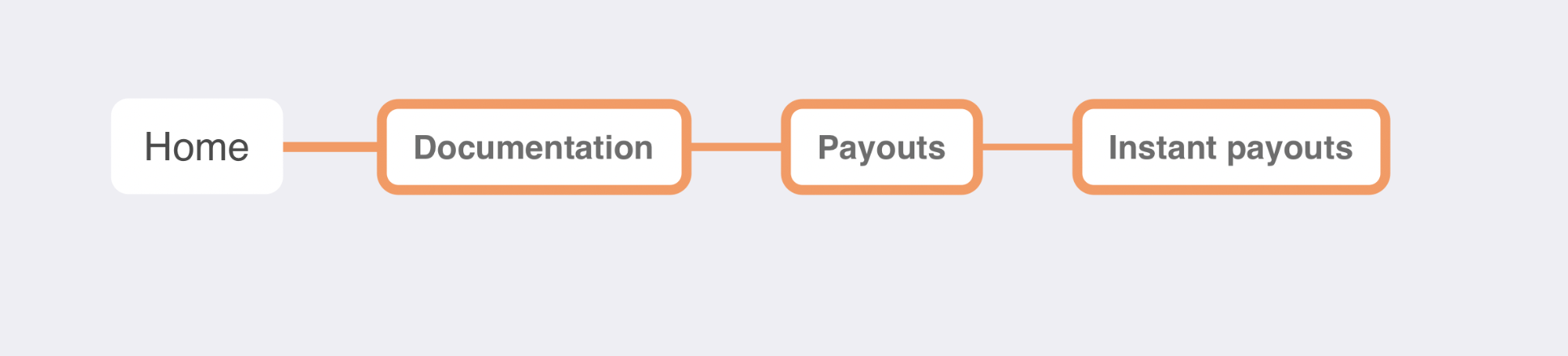
This is forward navigation.
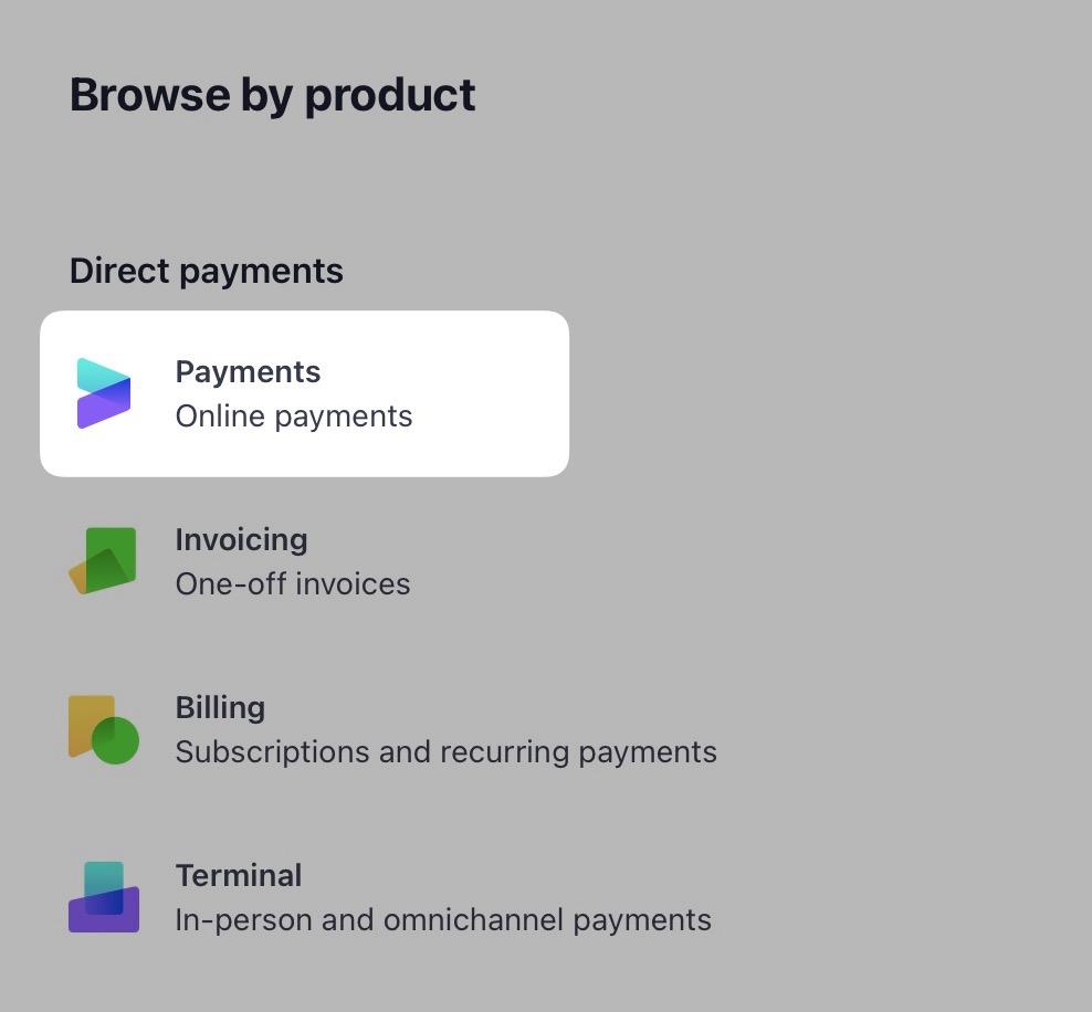
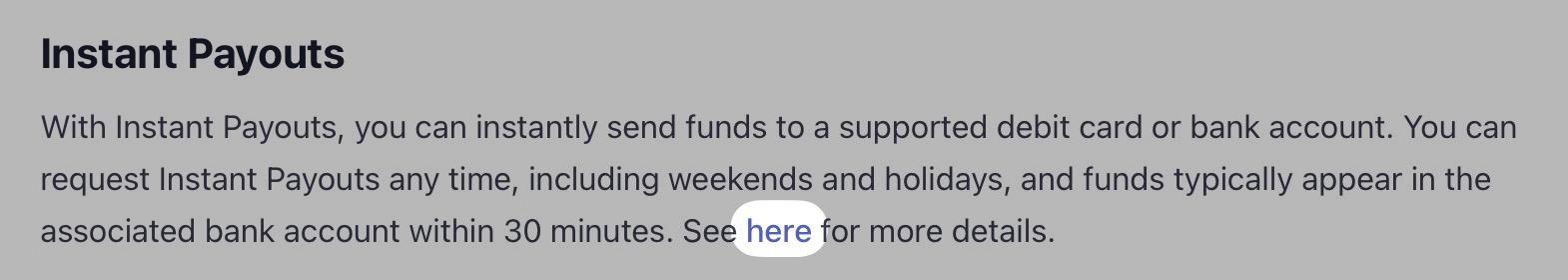
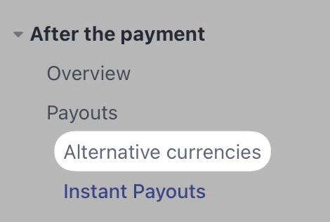
Sideward navigation
Secondly, there is sideward navigation. This helps users explore content related to what they are currently viewing but isn’t a subtopic.
For example, if you’re on Stripe’s “Instant Payouts” page, the sidebar links you to other payout-related content, such as “Alternative currencies.”
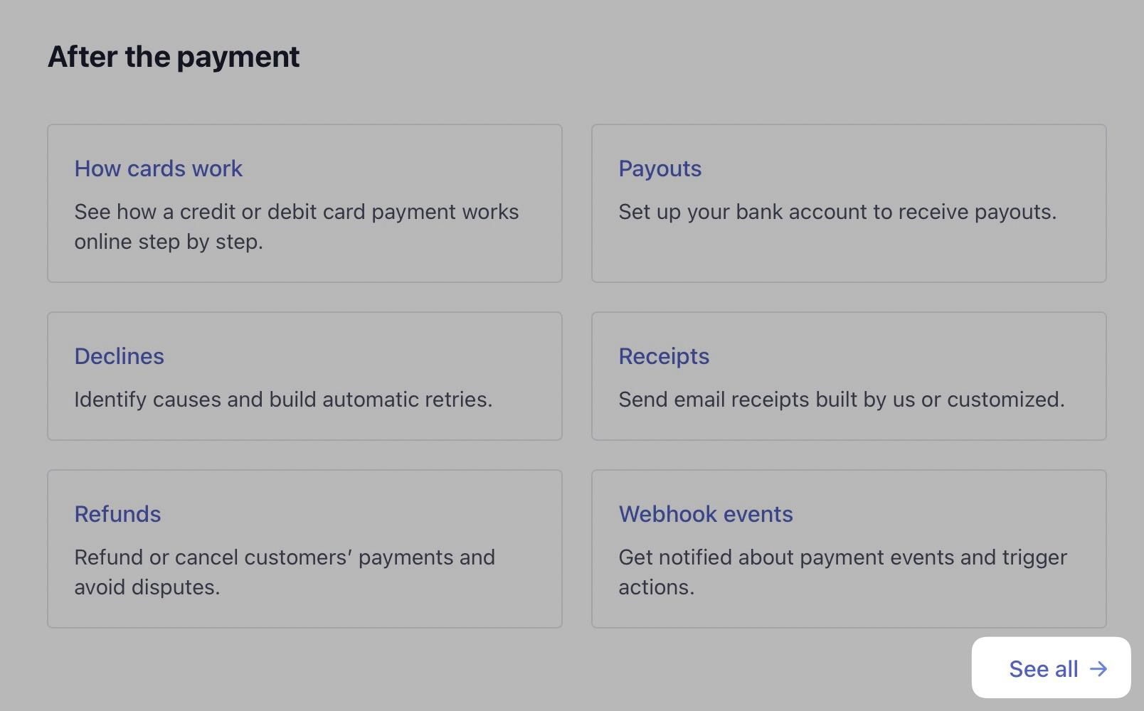
Backward navigation
Finally, there is backward navigation. This navigation helps users return to a previous page or step within a process.
The most common way to facilitate this is with breadcrumbs, which you can see within the Stripe documentation.
When you build your website, you’ll think of it in terms of navigation components. Here are some examples of those.
Navigation menus
Starting with a simple navigation component—menus.
You’ll see these in multiple website areas, often horizontally in a header (sometimes called a navigation bar).

Vertically in the footer:
Within sidebars:
Sometimes, their appearance can change. But the concept is the same—a list of links, vertically or horizontally, often organized by topic.
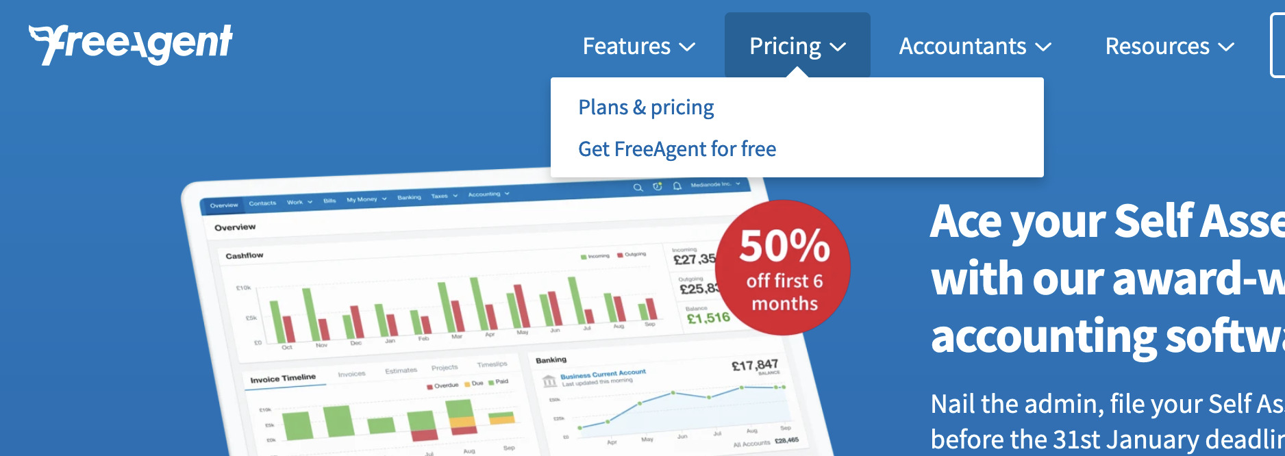
Dropdown menus
The key element of a dropdown menu is that it’s hidden, and then it displays when users hover or click on another element, like a navigation bar in the header.
Dropdown navigation is often straightforward, with a single vertical list of links, like this example on FreeAgent.
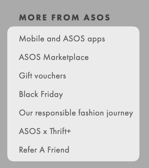
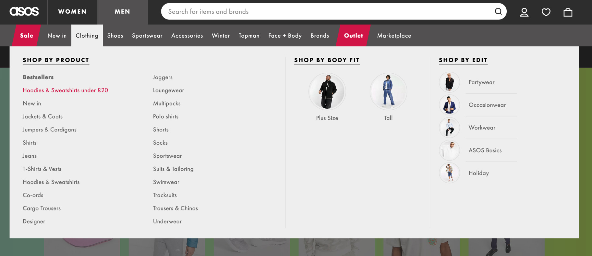
Mega menus
There is a more visually complex dropdown type, a mega menu. Both menus display in the same way (via hover or click)—the main difference being the number of content/links contained, like in this example from ASOS.
Mega menus are better than simple dropdowns, as the Nielsen Norman Group confirmed.
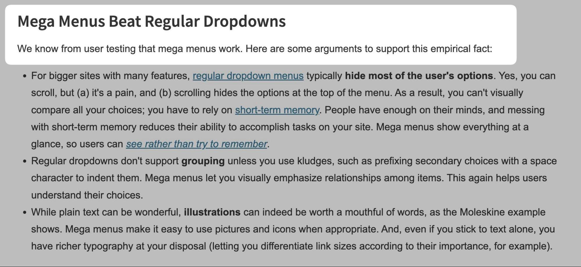
Why mega menus are better can be summarized into a few key reasons:
- You can include more links within a mega menu.
- You can group related links easier.
- You can include imagery and illustrations.
Burger menus
Burger menus (or mobile menus) are similar to dropdown menus, but sites hide them behind an icon that looks like a burger (hence the name).
This type of navigation is often seen on mobile devices, like in this example on my website.

But they’re also becoming more commonly seen on desktop sites, like this example on Amazon.
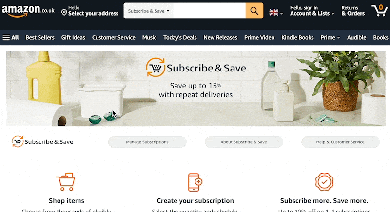
Hidden menus like this should not be used as the primary way you expect users to navigate. Hidden navigation is less discoverable, so make it visible by default if it’s important.
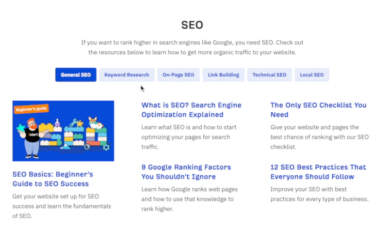
Tabbed navigation
Tabbed navigation replaces content when users select to view a subset of information.
Here’s how I’ve implemented that on my SEOToolbelt resource.
You can also see tabs implemented on the Ahrefs Blog’s homepage.
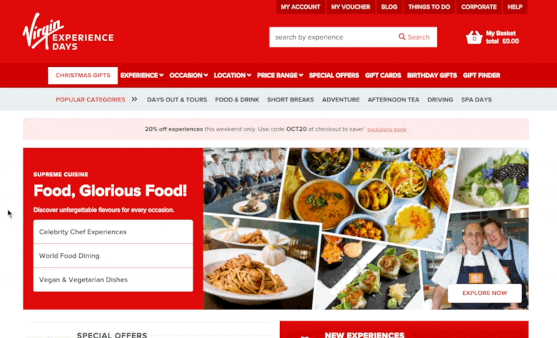
Sometimes, sites have tabbed navigation within mega menus, and content is shown on hover—like in this example on Virgin Experience Days.
Accordion navigation
Accordions are similar to tabs, but the two main differences are that:
- There is the option for no content to be displayed.
- Multiple accordions can optionally be opened at once.
I made an example of an accordion where only one can be open at once.
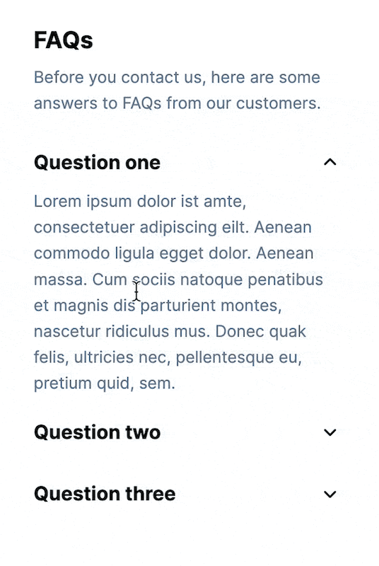
And here it is if you allow multiple accordions to open at once.

Tabs and accordions can present a challenge for JavaScript SEO. If you want the content to be ranked, the HTML source should include the content rather than setting it to inject via JavaScript on click.
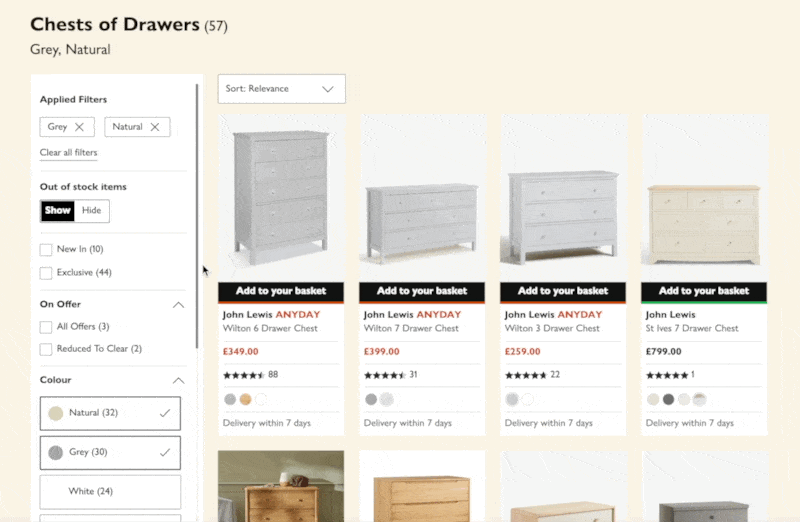
Faceted navigation
Faceted navigation (also known as filtered navigation) allows users to select different filters to view subsets of information on the page. Again, I’ve implemented this on my blog using the brilliant Isotope JS package.
Like this example on John Lewis, you’ll also commonly see filtered navigation on an e-commerce store.
Anchor link navigation
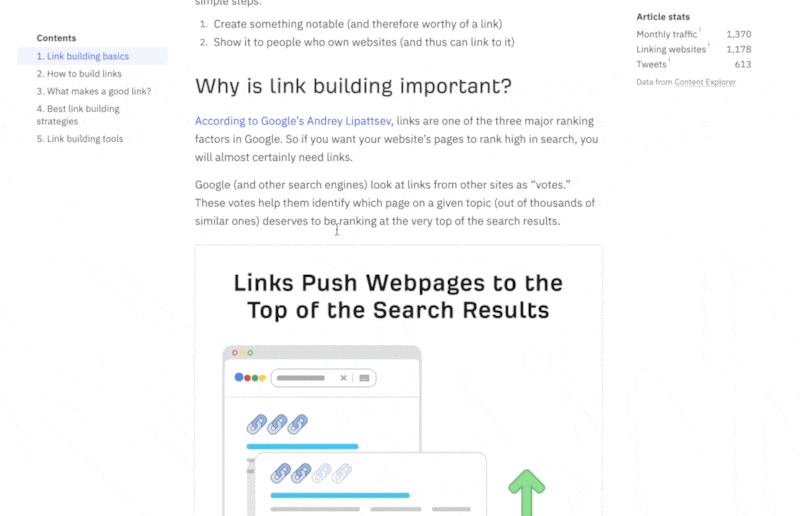
Anchor links are navigation that helps users jump to a particular part of a long page, like an article.
The Ahrefs Blog uses this, like in this link building article.
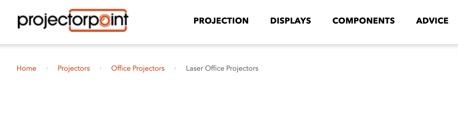
Hierarchical navigation
Hierarchical navigation helps users move backward or forward across a site hierarchy. Often, you’ll see this in practice by using breadcrumbs, where a user is shown the current page’s parent page. Here’s an example of that on an e-commerce store called Projectorpoint.
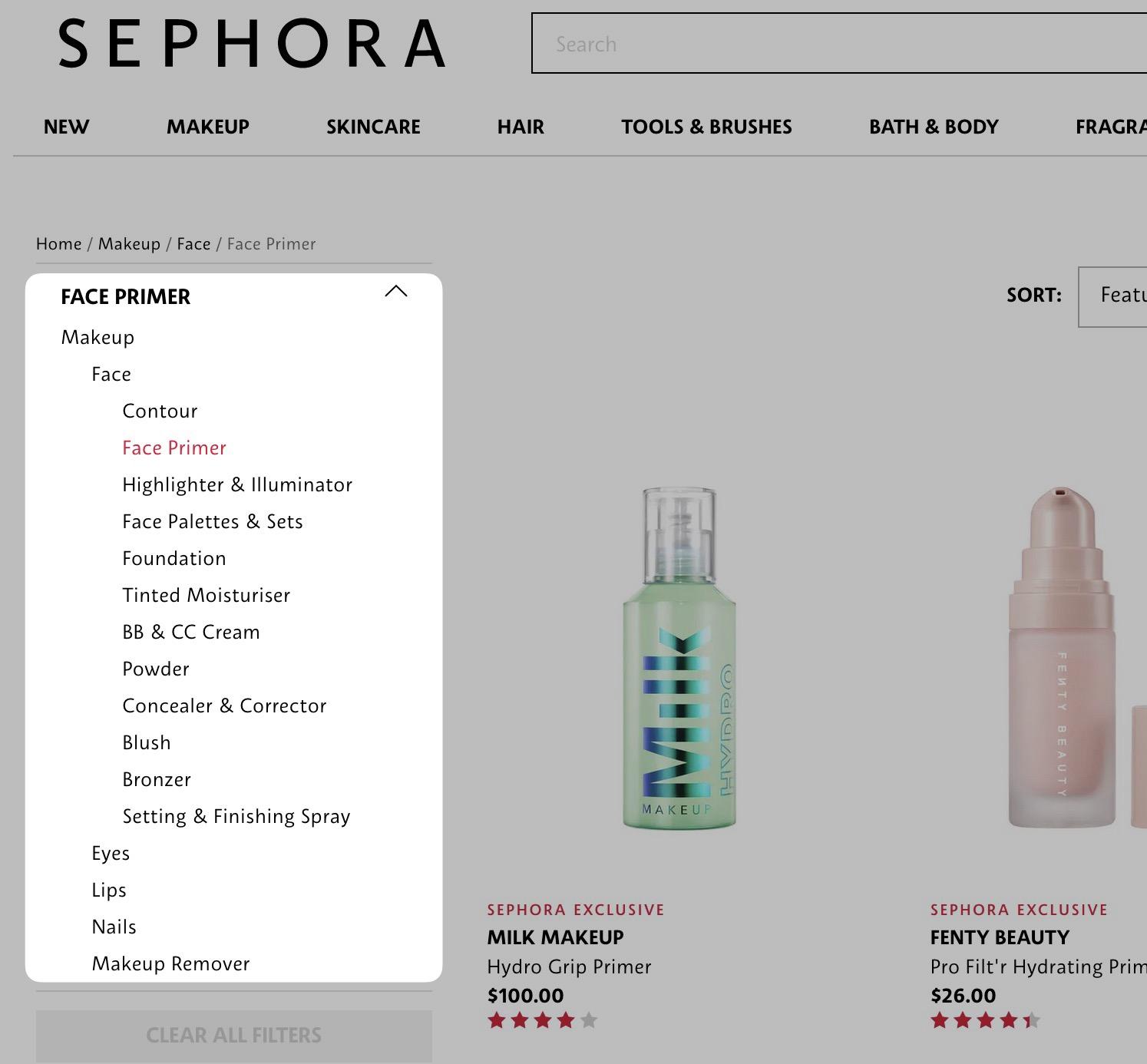
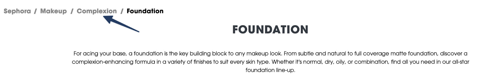
You also sometimes see hierarchical navigation in the form of sidebar links. For example, on Sephora, the entire site hierarchy is shown in these links (alongside the current page’s sibling pages).
Related navigation
Related navigation helps users move sideways across a site hierarchy to other associated pages (sometimes called sibling pages). There are a few ways sites usually implement related navigation:
- By pages sharing the same taxonomy – For example, if two products on an e-commerce store were in the 4K TV category, they’d display as related products.
- By pages having the same parent page – For example, if the 4K TV category and the 1080p TV category both had “TV set” as their parent category, links would be added between the two.
- By pages having similar content – Sometimes, related navigation is built based on an index of page content, and then links are automatically added between pages depending on the content similarity.
- By products being frequently bought together
You can manually add these types of links. But ideally, you’d automate them to reduce the burden on site admins.
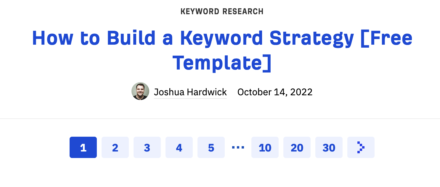
Pagination navigation
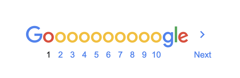
Sites use pagination to show a subset of content from a page, often used on pages that list links to other pages, like on the Ahrefs Blog archive pages.
Or even Google search results.
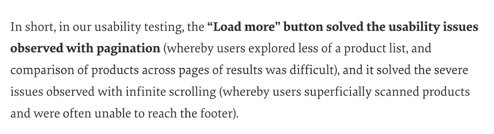
Nowadays, you don’t just get numbered pagination, as I’ve shown above. You also get “load more” buttons, like the one below.
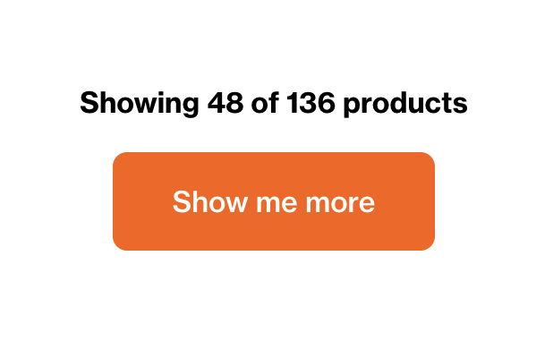
Most studies say that users prefer “load more” buttons, such as this one by Smashing Magazine.
Now you know how people navigate sites and the common components that help users navigate, here are 12 best practices to create website navigation that users and search engines will love.
1. Research the pages you want to create
Excellent navigation starts with great pages to navigate to. So you’ll want to start by planning the pages on your site into a sitemap (not an HTML or XML sitemap, just a list of the pages you want on your site in a spreadsheet).
Ideally, you only want to add pages to your sitemap if a user will be interested in the contents of that page (or you’ll waste your time creating it).
But how do you decide if a user will be interested?
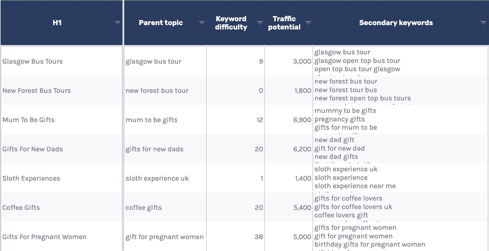
One of the best methods to figure that out is keyword research. But that’s a vast topic. So if you don’t know how to do it, head to this keyword research guide. The process you’ll follow goes like this. You can:
- Use a keyword research tool, like Keywords Explorer, to find what users search for, or check competitors’ sites using Site Explorer.
- Group semantically related keywords together (Ahrefs’ Parent Topic feature can help here).
- Create a list of all the parent topics and secondary keywords. Below is an example of that for a gifting client of mine.
2. Create a hierarchy
Now you have your list of pages, you should group those pages to create a site hierarchy/information architecture.
First, you should group them into a few broad page types, such as top-level product categories, articles, company information, or whatever suits your site. This shows the types of content you’ll have.
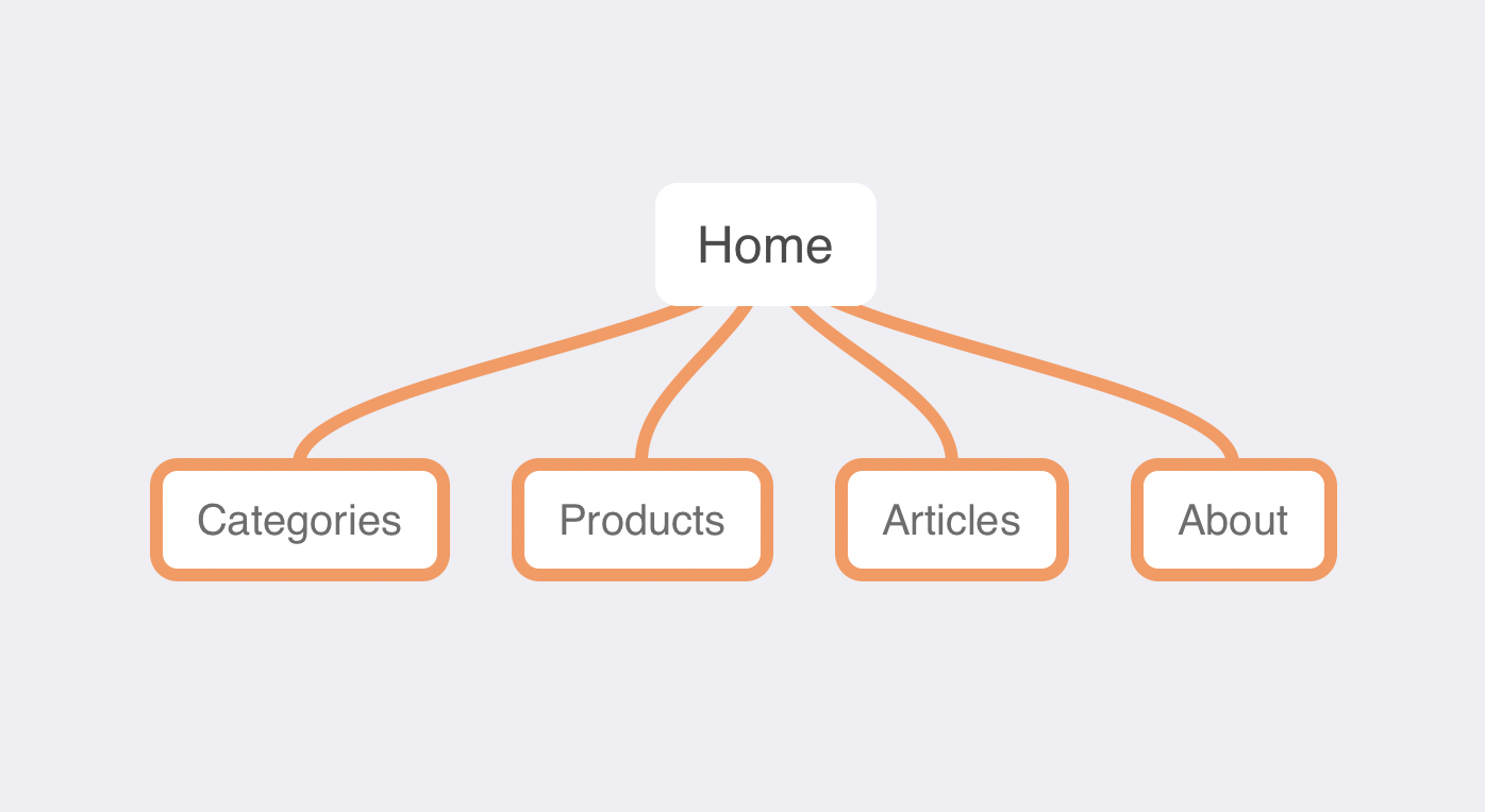
You’ll then want to create a hierarchy of pages within each page type. Hierarchies get more specific the deeper into them you go. So for a clothing e-commerce store, that could look something like this:
Home > Men’s clothing > Shoes > Boots > Black boots
Home > Blog > Trends > Winter clothing trends 2022
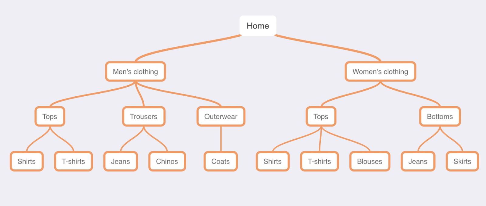
I use a Mac App called MindNode that makes it easy to create organization charts that display an information architecture. Here’s a quick example of a category structure for a clothing brand.
Card sorting is a valuable technique for understanding how different people organize content. Sometimes, it’s not clear-cut. There can be many ways to organize a site.
It can also help to look at what competing sites do. By examining breadcrumbs and other navigation elements, you can understand how even large, complex sites have decided to organize information.
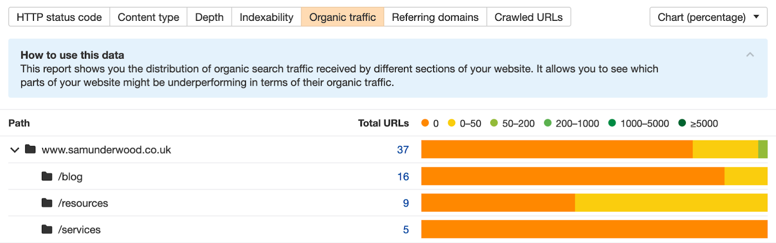
One method to understand site structure is to examine URL structure. That’s easy, thanks to the Structure explorer report in Ahrefs’ Site Audit.
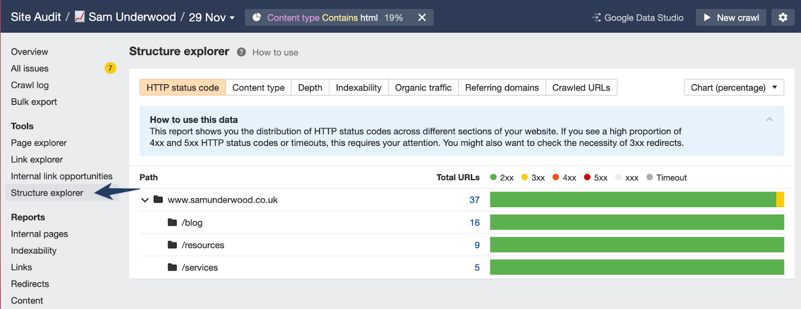
This report has a brilliant feature where you can view various types of data according to the structure. For instance, when auditing any website, you can view Ahrefs’ organic traffic estimate by directory.
RECOMMENDATION
Are you analyzing a website without structured URLs? If so, I recently wrote a guide on using breadcrumbs and URL structure to analyze competitors’ site structures quickly. It provides great insights for planning your structure, so it’s worth a read.
3. Build navigation elements around that hierarchy
Now that you have set up your hierarchy, you can develop a clear plan for how breadcrumb will work. You can also begin using different navigation components to help with forward and sideward navigation.
For example, if the current page has child pages, you can use different navigation components to ensure they are linked.
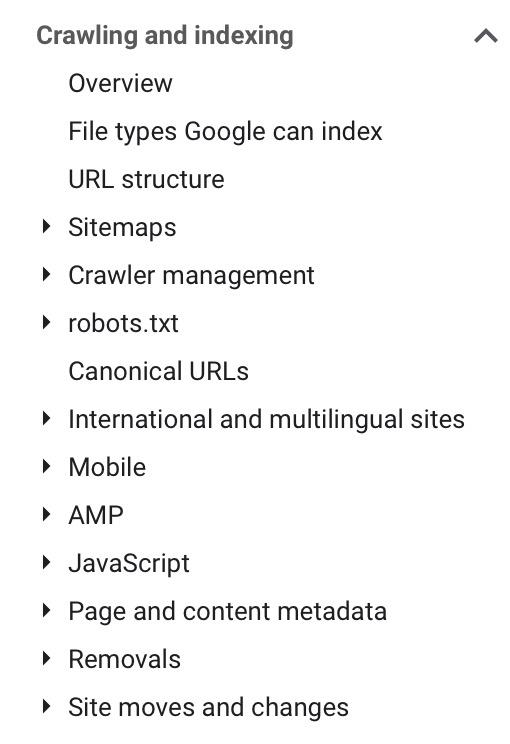
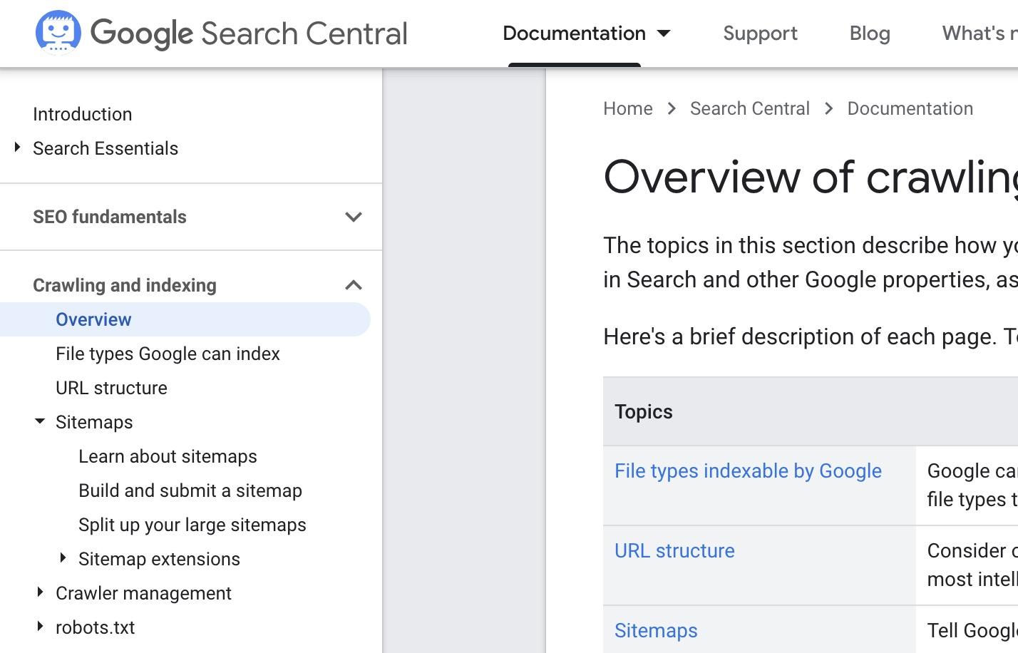
For Google’s SEO documentation, it’s built its sidebar around that hierarchy.
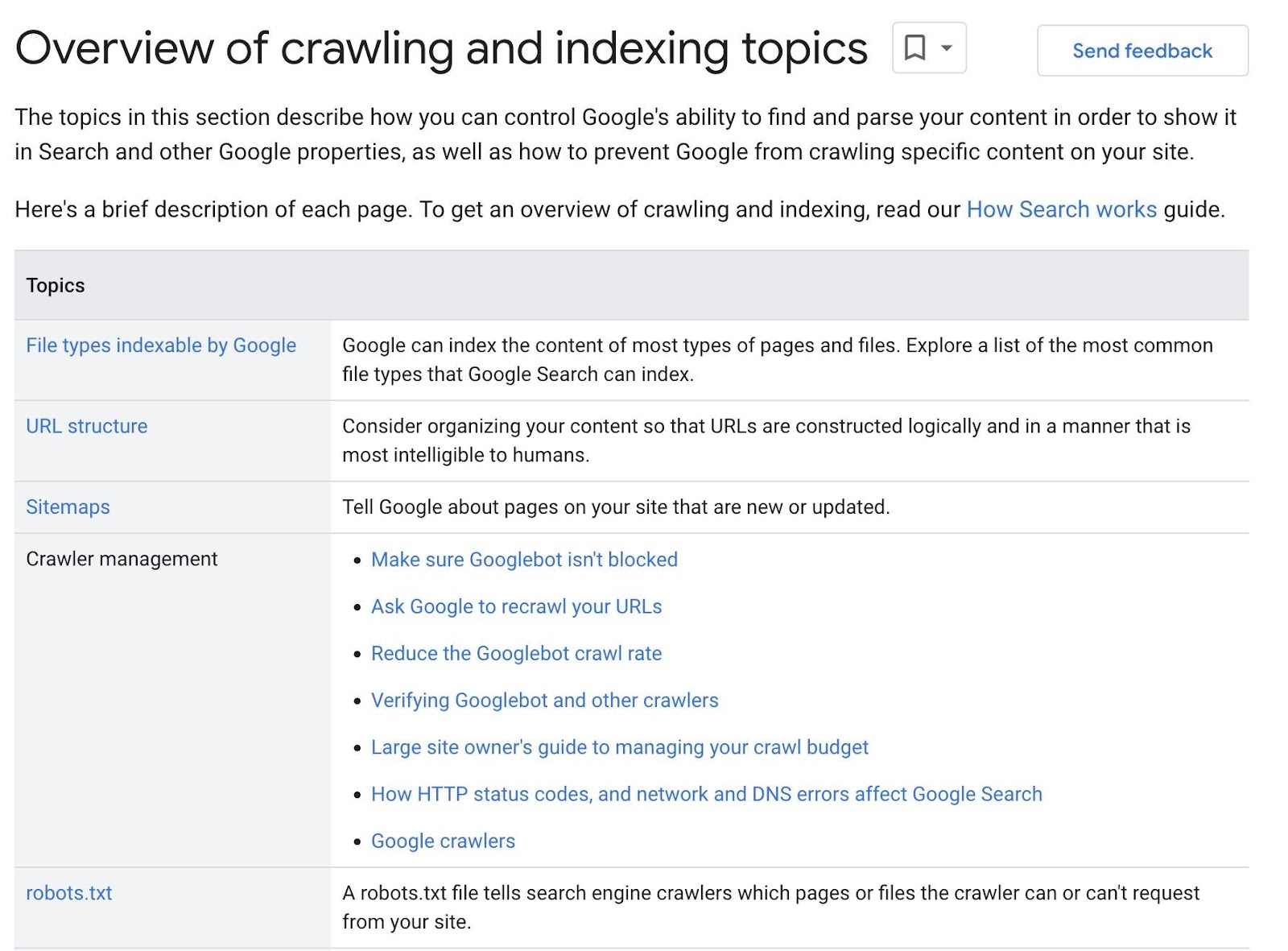
And then, on topic overview pages, like its “crawling” one, it’s created a table that links to all of that page’s subpages.
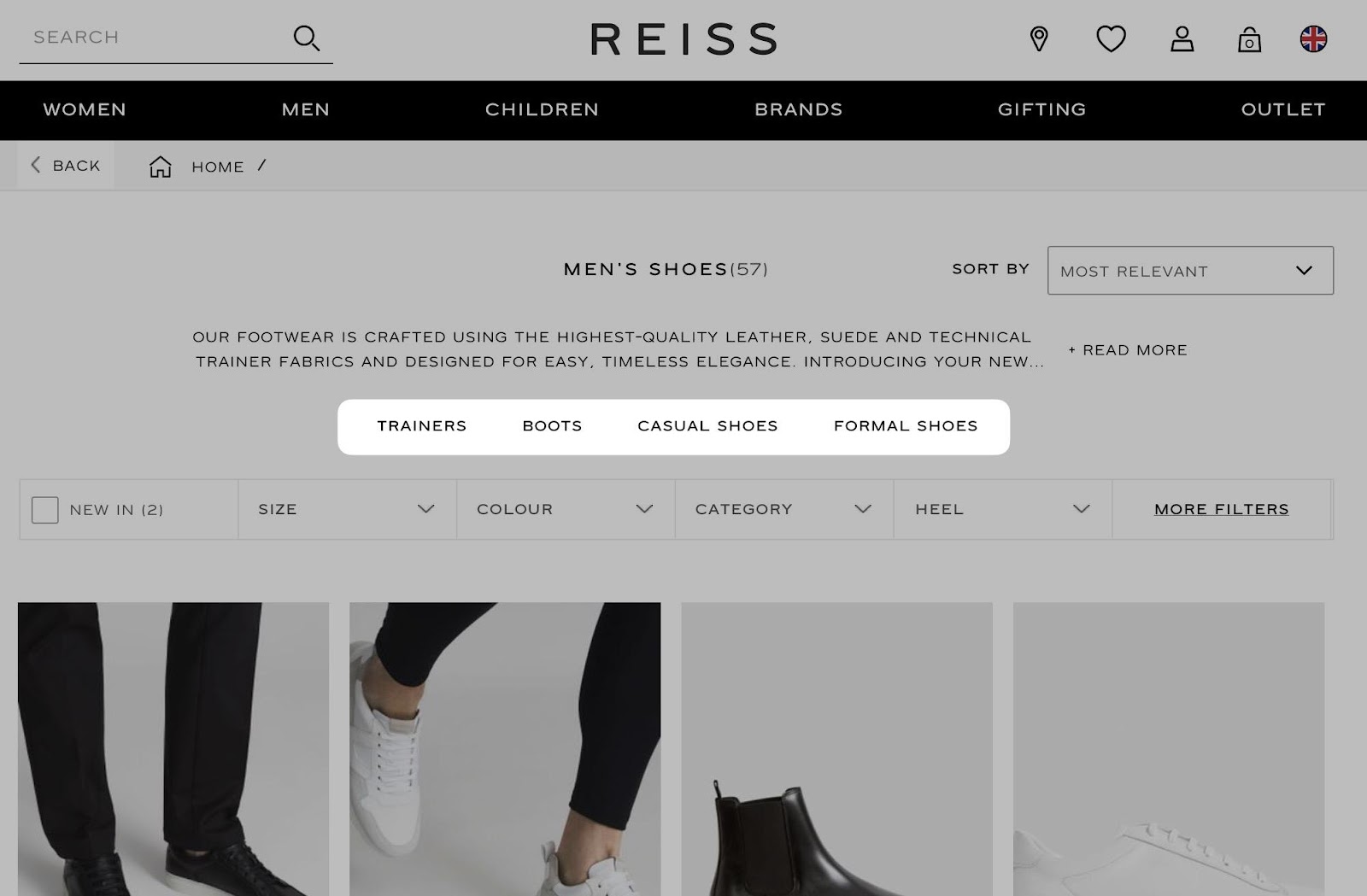
Sites that have more simplistic navigation implement small menus with the main content with links to subpages. For e-commerce stores, you’ll often see this presented as a list of horizontal links, like this example:
You can automate these links entirely by querying the parent/child relationships between pages, which I’ve written about recently in my guide for improving e-commerce category pages.
4. Don’t forget forward navigation
When planning your website navigation, it’s surprisingly easy to miss out on forward navigation.
A common culprit for this is e-commerce category pages. Users can use JavaScript-based filtering navigation to navigate forwards, so links to subcategories of the current category are sometimes omitted.
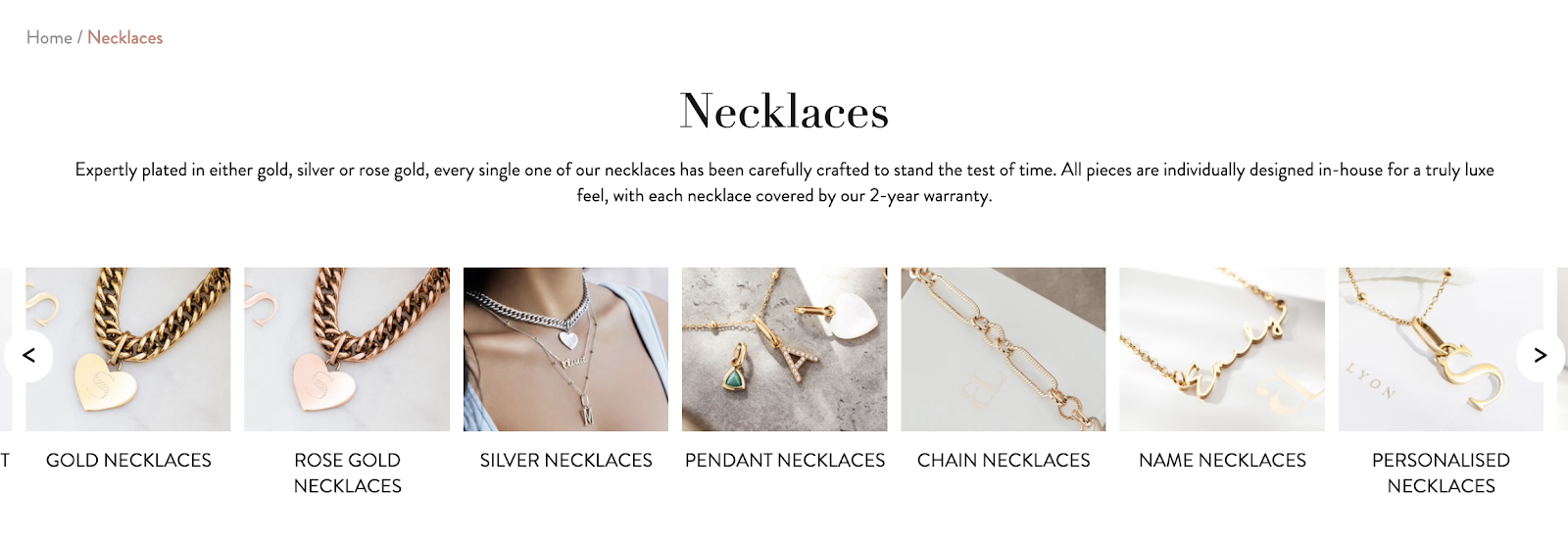
I worked with jewelry brand Abbott Lyon in mid-2021. I found it needed longer-tail categories and components for forward navigation on categories.
It fixed the issue by December 2021 and started to see the reward by March 2022. It has continuously grown since the fix, setting itself up for an excellent peak season in December 2022.
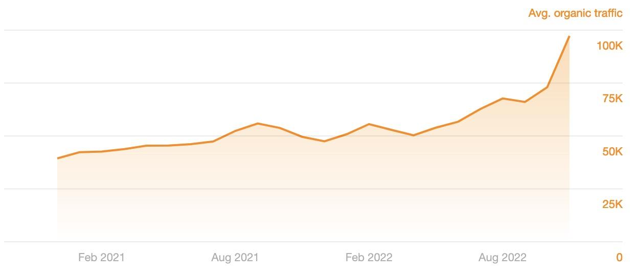
But how specifically did it improve navigation? It was as simple as adding a block of links to subcategories in each category.
This nicely displays the influence navigation components can have on SEO.
5. Link to important pages globally
Burger and mega menus help users quickly and easily find the important pages of your site. I’ve seen advice to make all your site pages one click away using mega menus—don’t do that.
Mega menus give you the option to link to more pages. But you should still only include the pages that are most important to you for two reasons:
- You don’t want to clutter the interface, making it harder for users to find important information.
- You want to consolidate PageRank into the pages that would have the most commercial benefit to your business if you ranked well for them.
Refer to the sitemap I suggested in tip #1 and use the search demand data to decide what to include. Then, use the hierarchy you’ve set to determine how to organize it.
I take a data-led approach. So I usually end up with a sheet with multiple tables; each table looks like this.
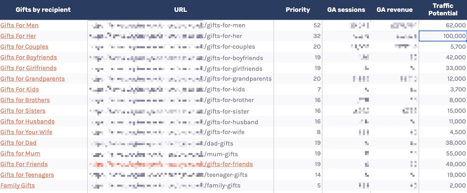
I used the potential traffic metric from Ahrefs’ Keywords Explorer, GA session, and revenue data. Then, I created a 0–100 priority score based on those three metrics. This makes it easier to figure out which pages to include.
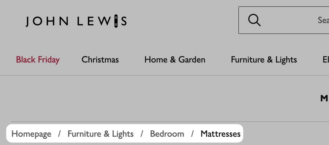
6. Show your site hierarchy with breadcrumbs
Breadcrumbs help users understand where they are within your site. If your site doesn’t have them, I recommend you add them.
In addition to helping users, they also benefit SEO by helping Google understand your hierarchy and distributing PageRank, as confirmed by Gary Illyses.
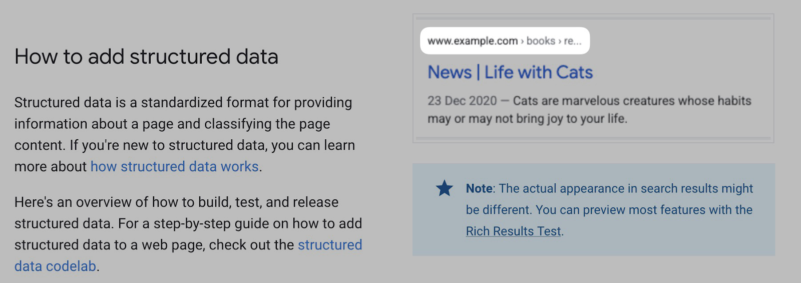
If you add breadcrumb structured data, you also increase the likelihood of breadcrumbs showing on search results, like in this example in Google documentation:
The convention for breadcrumb placement is high up on the page under the header. Here’s an example on Search Engine Roundtable.
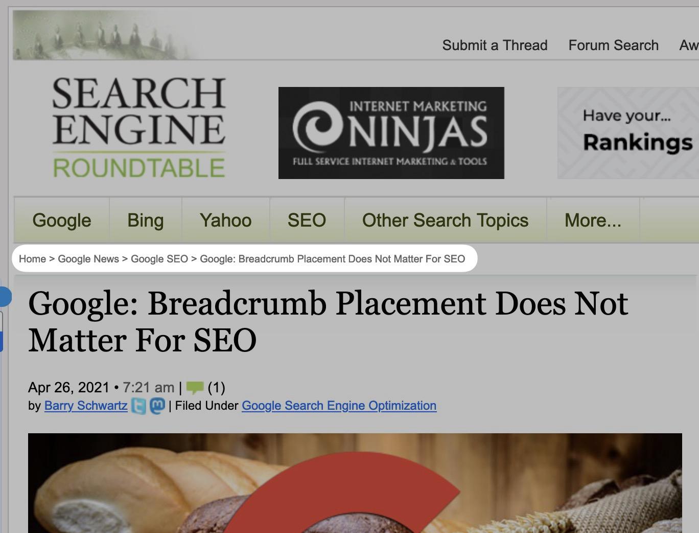
You don’t necessarily need to place them highly. It’s something you’ll need to test to see how it affects users achieving the primary goals you set for your site. The placement won’t impact your SEO.
7. Feature popular pages throughout your site
Wherever it makes sense, add links to your most popular pages throughout your site.
Sephora does a great job of this on top-level categories, like its makeup page. This category has a grid of links to various makeup-related categories.
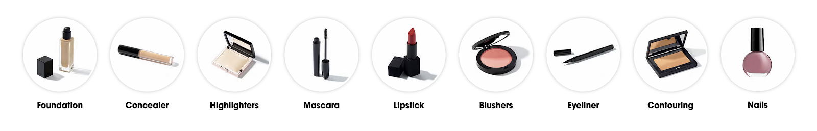
None of these are direct child pages of the makeup category; there is another category below makeup before you reach these pages.
Still, Sephora has added links because they’re popular with users.
This keeps the site structure flat rather than deep. If internal links were based purely on hierarchy, users would have to make multiple clicks to reach pages deeper within the site, even if they’re popular.
8. Don’t hide important navigation on mobile
Mobile navigation can be more challenging due to the reduced amount of space. But the solution isn’t hiding essential navigation elements on mobile.
Take a look at the mega menu on Stripe, for example.

There are a lot of links on desktop; ideally, we’ll also want to make it easy for users to find those links on mobile.
Stripe’s solution is to use a slider and take advantage of vertical space and users’ tendency to scroll on mobile.
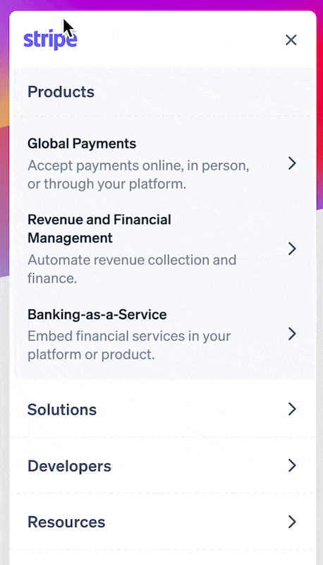
This is a brilliant example of keeping consistency between mobile and desktop UX. If you’re looking for a JS library to simplify creating a similar menu, I recommend mmenu.
For SEO, using tabs, accordions, and sliders on mobile devices rather than removing content also means you’re less likely to be negatively impacted by mobile indexing in Google.
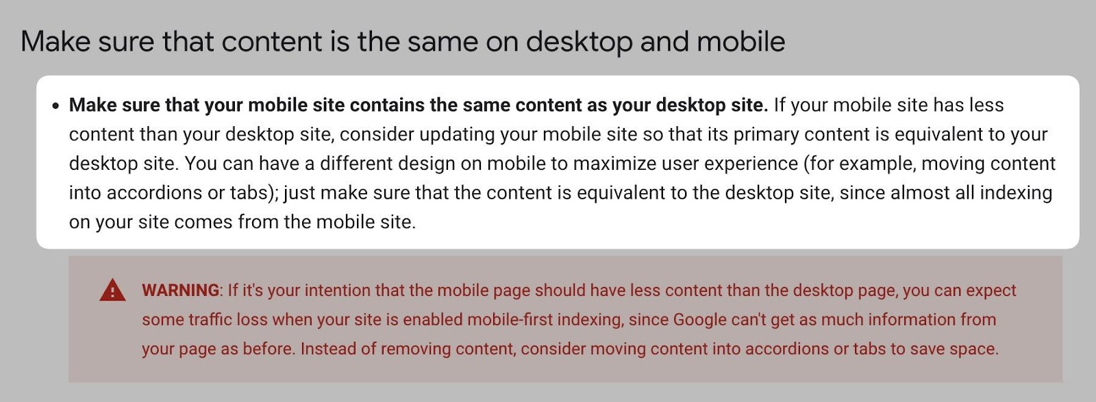
Although, you’re unlikely to run into issues with hiding content on mobile if your site is responsive (unless you’re using JS to remove content from the HTML on load).
9. Keep anchor text descriptive
Anchor text that is too short can confuse users about which page they will end up on after clicking the link.
This can also cause problems for SEO since anchor text is one way search engines determine page relevancy, as John Mueller has confirmed.
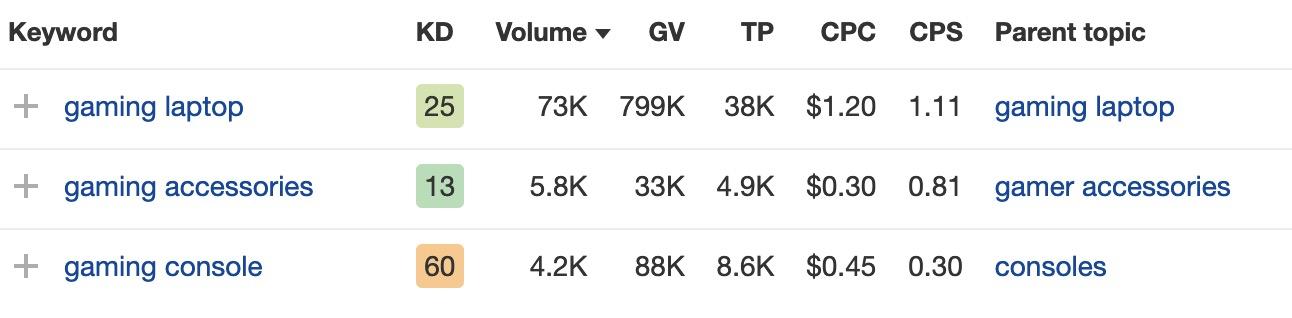
For example, say you had a site that sold gaming equipment. Within a menu, you could have a list of links like this.
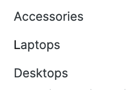
Rather than just saying “laptops,” be more specific about the type of accessories, laptops, and desktops you’re selling. In this example, it’s likely as simple as pre-appending “Gaming” to each link.
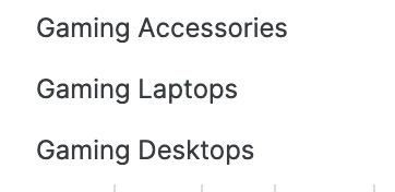
This will reduce uncertainty for users and help search engines figure out which of these two topics you’re targeting.
Keep your anchor text descriptive, but don’t go overboard. For example, you don’t need to repeat words multiple times in breadcrumbs like this:

As breadcrumbs are hierarchical, you can shorten them; they’ll still make sense to users, and you can put more descriptive anchor text elsewhere on the site, like in menus or hierarchical links.

10. Order navigation by popularity
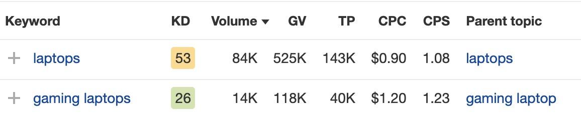
When creating your navigation components, order them based on how likely a user is to click a link. If you’re making a new site and doing thorough keyword research, you can understand the relative popularity of different topics by looking at search volumes.
Keywords Explorer shows that gaming laptops are much more popular than other pages. So unless there’s a business reason not to, I should promote them more prominently.
If your site receives a reasonable amount of traffic, you can use Google Analytics event tracking to see which links users click most.
Doing this using Google Tag Manager is simple; you’ll need to set up a GA event tag with an appropriate category and action label, then set the “Label” Click Text like this.
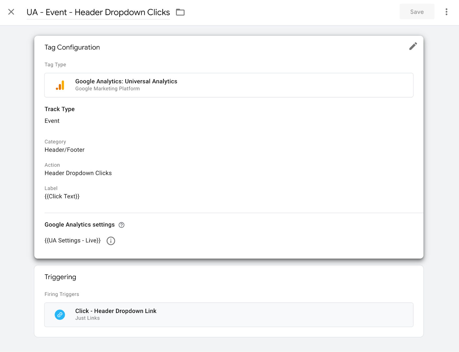
“Click Text” will use the anchor text of the clicked link as the label, making it easy to identify the link.
Next, add a trigger to the tag. This will fire the event when a user clicks the links you want to track. To do this, set the trigger type as “Click – Just Links.” Then set it to only trigger on some link clicks. Finally, fire the tag based upon the “Click Element” matching a CSS selector.
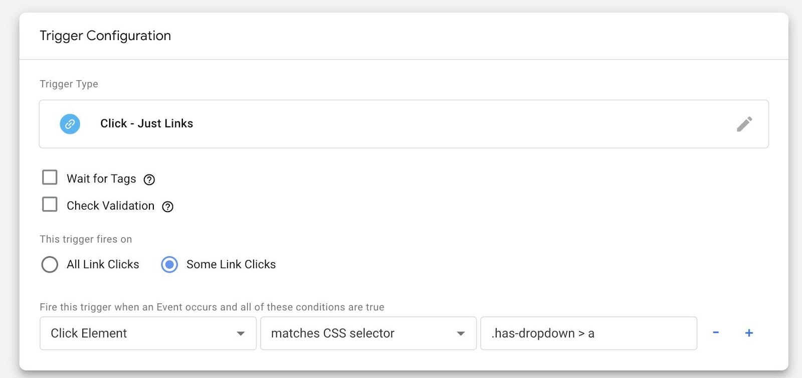
In the above example, I’m tracking a sub-menu in a dropdown.
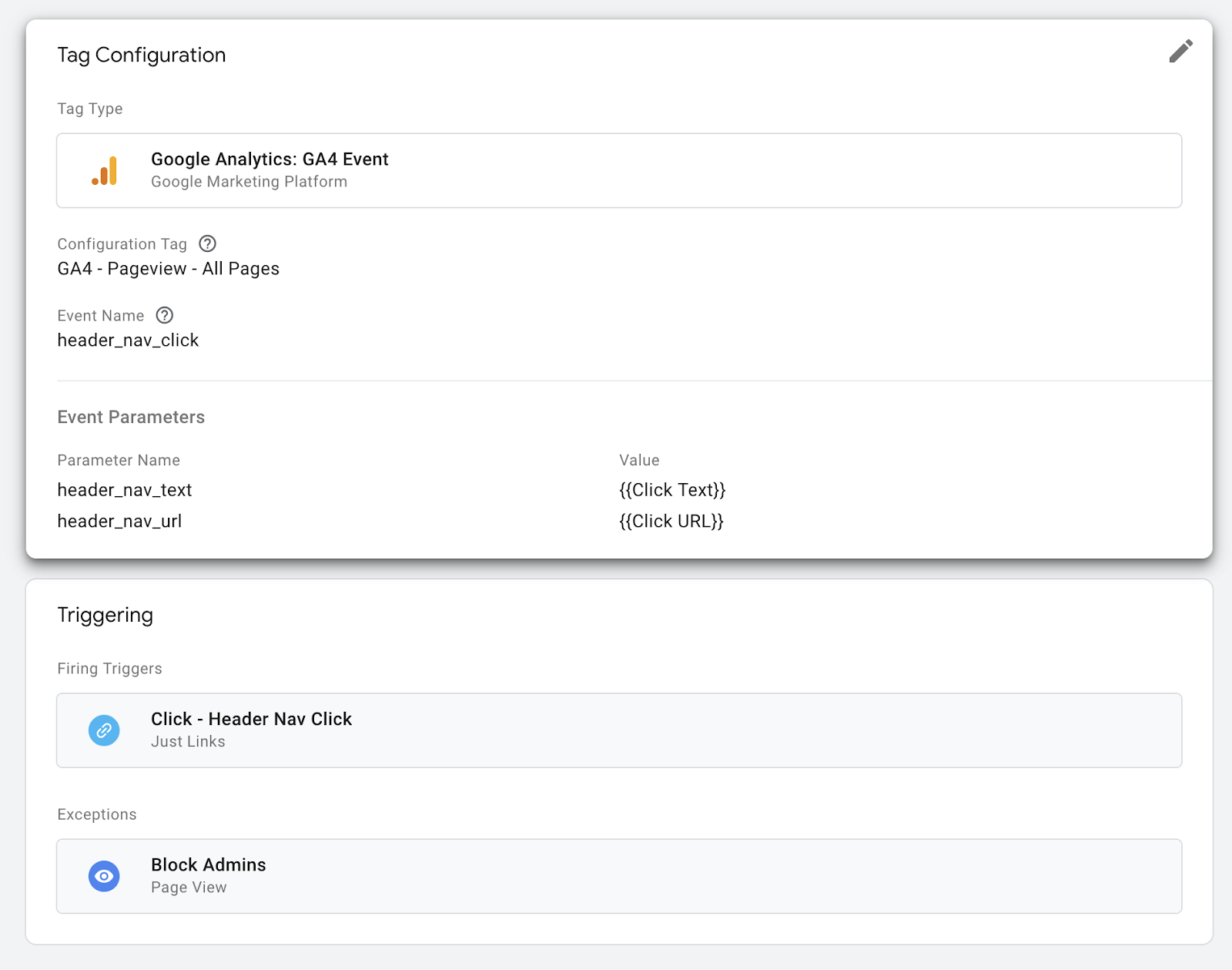
If you’ve moved to GA4, the process is quite similar. You can reuse the same trigger and configure the event parameters to send the click text and URL. Here’s how that should look:
Here’s an example of the report you’ll see in GA once you’ve set this up:
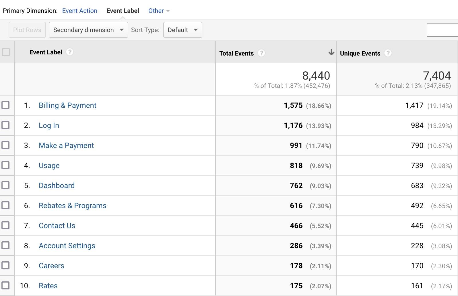
Now you can easily decide how to order different items on your menus.
You may be wondering, “Does this impact SEO?”
Potentially, yes. Google has filed patents on something called the “Reasonable Surfer Model.” This replaces part of the old “PageRank” algorithm, which relied on a “Random Surfer Model.”
The main difference between the two models is how they weigh the amount of PageRank passed. The Reasonable Surfer Model weighs the amount of PageRank passed based on the likelihood of a user clicking a link. The other model evenly distributes PageRank between all links.
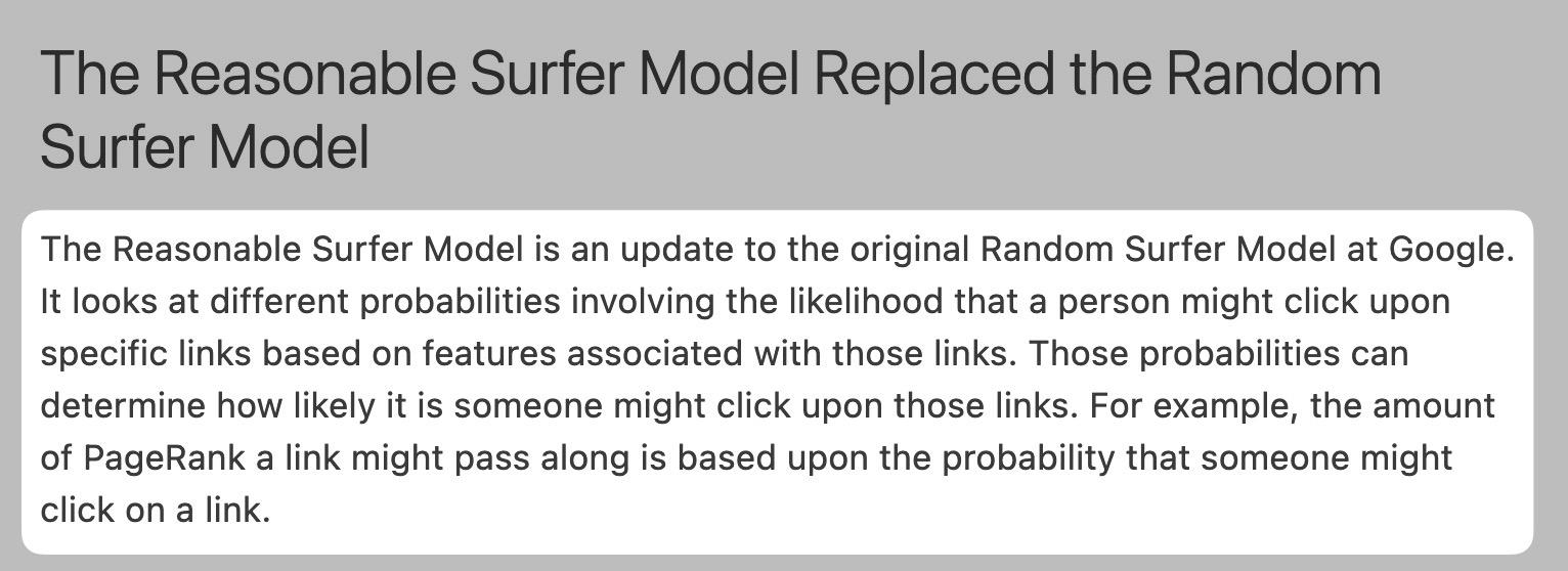
In short, if you reorganize links within a component or move different navigation components higher up the page, the more prominently displayed links may have more PageRank flow through them, so the target page could end up ranking better.
11. Don’t make users think
The best website navigation is the one that follows web design conventions. This applies to all aspects of web design. That means following standard web practices like:
- Keeping your primary header navigation at the top of the page rather than on the side.
- Using breadcrumbs to help users understand structure.
- Adding a link to the logo that takes you back to the homepage.
- Keeping the header/footer consistent between pages.
- Styling links and other elements in a standardized way.
If you’d like to explore this topic further, I recommend Steve Krug’s book titled “Don’t Make Me Think.”
12. Test, test, test
To make your navigation more effective, use split-testing tools like Optimizely or VWO to create variants of your navigation and identify areas for improvement. Test things like link labels, placements, colors, and styles, as well as different types of navigation like dropdown menus, tabs, and mega menus.
By making small changes and measuring their performance, you can improve the usability of your navigation and help visitors easily find the content they’re looking for.
If you’re unsure of what to test, consider using a behavior analytics tool like Hotjar to gather insights via heatmaps, surveys, and recordings.
Changing navigation can be challenging. This is because multiple stakeholders with different areas of expertise have their own demands. The merchandising, UX, customer service, and SEO teams all need to be satisfied.
Often, difficulties with changing navigation occur for two reasons:
- Usability isn’t the primary reason for making the change.
- There is a lack of data to suggest the change will be worthwhile.
For reason #1, if the change does not improve usability, the UX team will likely reject it. For instance, SEO teams often concentrate on PageRank and what search engines want. To persuade a UX expert, do not talk about that. Instead, discuss the secondary effect the change will have on users—that’s the more important element after all.
For reason #2, any team could reject the change. Start by gathering insights on why you think the change will be positive. This can be:
- Search demand data.
- Behavioral analytics data from Google Analytics or similar.
- Customer service feedback.
- Sales and revenue data.
The ideal scenario here is each team works together using the different data they use daily to form the ideal navigation based on their expertise.
Final thoughts
Website navigation is a broad topic. Each component has a lot of nuances and, usually, the decision on what components there will be and how they’ll function has input from people with different types of expertise.
Still, the return on implementing excellent site navigation is worth the time investment. Hopefully, this article has inspired how yours will work.
Any further questions on website navigation? Find me on Twitter.